Preview image. Unlock full-res
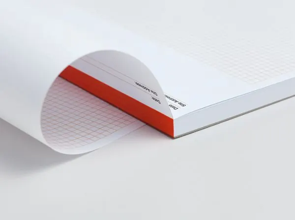
A type specimen notebook with bold burnt-orange stripe accent, open at an angle to reveal a subtle grid pattern and minimal sans-serif typography.
Summary
An open notebook with creased pages, a burnt-orange spine stripe, and subtle body copy, demonstrates how a single warm accent elevates minimal stationery branding.
Visual description
A notebook or bound notepad tilted at roughly 45 degrees, shot from above. White front cover with light gray borders and black sans-serif typography centered near the top. A thick burnt-orange or terracotta stripe runs down the spine and edge. The interior pages are visible where the cover is open, revealing a fine grid pattern printed in a very light gray. The overall composition is soft and photographed against a neutral background. The typography is small and precise. No color gradients or decorative elements beyond the stripe and grid structure.
Key takeaway
A single bold accent stripe applied strategically to break an otherwise monochromatic palette. The restraint of the grid as pure functional pattern rather than visual decoration. The angled reveal of the interior pages, which shows craft and material thickness without requiring ornament. The lack of a brand name or logo, letting the object itself speak.
Reuse notes
Strong template for editorial, design studio, or agency stationery systems. Works for publishers, architectural firms, or any brand valuing precision and quiet confidence. The warm earth tone pairs well with black and white but can be swapped to brand colors without losing the structure. Photograph-heavy branding systems (portfolios, photography studios) should use this as a reference for understated printed materials. Less suited to playful or bright brands.
More like this


Keep what you find
A free account saves references to boards and can send you a weekly email of picks based on what you save.
To see every result, go Pro.