Preview image. Unlock full-res
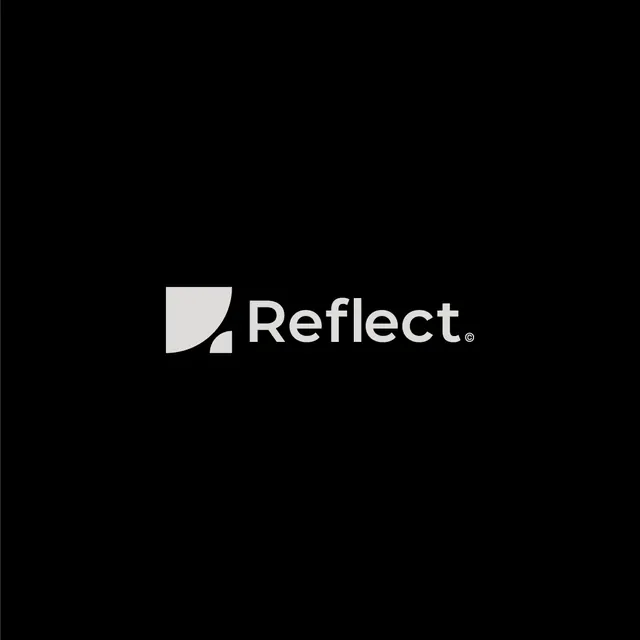
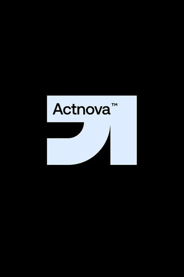
A minimalist brand identity for Reflect featuring a geometric curved quarter-circle mark paired with a clean, modern sans-serif wordmark in white on black.
Summary
A monochrome brand mark for a software company, combining a simple curved geometric form with a modern sans-serif wordmark, presented centered on a pure black field.
Visual description
A centered composition on a full black background. The primary mark is a light gray quarter-circle or curved segment positioned to the left of the wordmark "Reflect" in white, sans-serif, all-caps. The mark uses subtle geometric curves (no sharp angles) and appears to suggest motion or reflection. The wordmark uses a contemporary display sans with consistent letter spacing and is sized to balance the geometric mark. A registered trademark symbol (R) sits inline at the end. The overall effect is confident and precise, with ample negative space around the mark and word, emphasizing clarity and modernity.
Key takeaway
The use of a single geometric shape as the primary brand identifier, paired with a strong wordmark rather than replacing it. The high-contrast black/white palette that ensures instant recognition at any scale. The inline treatment of the trademark symbol as part of the composition rather than a footnote.
Reuse notes
Ideal for tech startups, software, analytics, or developer-facing brands where clarity and modernity signal trustworthiness. The minimal palette works across all media (digital, print, app icons). The centered presentation suits logos, but the mark and wordmark can be separated for horizontal or vertical lockups. Avoid using on busy backgrounds; the design depends on contrast.
More like this




Keep what you find
A free account saves references to boards and can send you a weekly email of picks based on what you save.
To see every result, go Pro.