Preview image. Unlock full-res
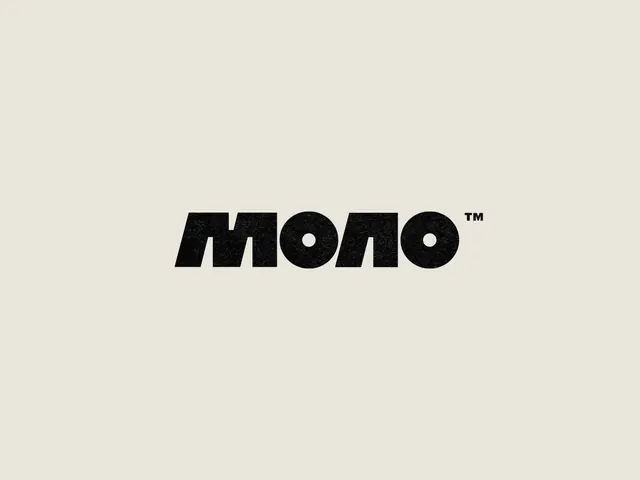
Bold black sans-serif MONO wordmark with trademark symbol centered on warm beige, using heavy geometric letterforms with uniform stroke weight.
Summary
The wordmark "MONO" in heavy-weight black sans-serif, centered on a neutral beige background with a superscript trademark symbol.
Visual description
Warm beige background (#E9E6DB) provides neutral ground. The word "MONO" is set in a bold geometric sans-serif with uniform stroke weight and clean geometric proportions. Each letter demonstrates consistent letterform weight and geometry, with the two O's featuring characteristic punctured counter spaces. A small TM symbol is positioned as a superscript in the upper right. The composition is centered with substantial negative space surrounding the type, emphasizing simplicity and confidence.
Key takeaway
The all-caps, heavy-weight treatment commands immediate presence without decoration. Geometric letterforms with perfectly uniform stroke weight feel precise and intentional. The warm beige background (instead of white) softens the stark contrast while maintaining legibility and professional tone. The clean composition with generous negative space prevents visual strain and reads well at all sizes.
Reuse notes
Ideal for design studios, creative agencies, or tech-forward brands seeking a confident, contemporary identity. The monochromatic palette translates perfectly across media (print, digital, physical applications). Heavyweight sans-serif demands careful spacing at small sizes; best suited for headlines and brand mark contexts. The centered, symmetrical layout may feel too formal for playful or experimental brands.