Preview image. Unlock full-res
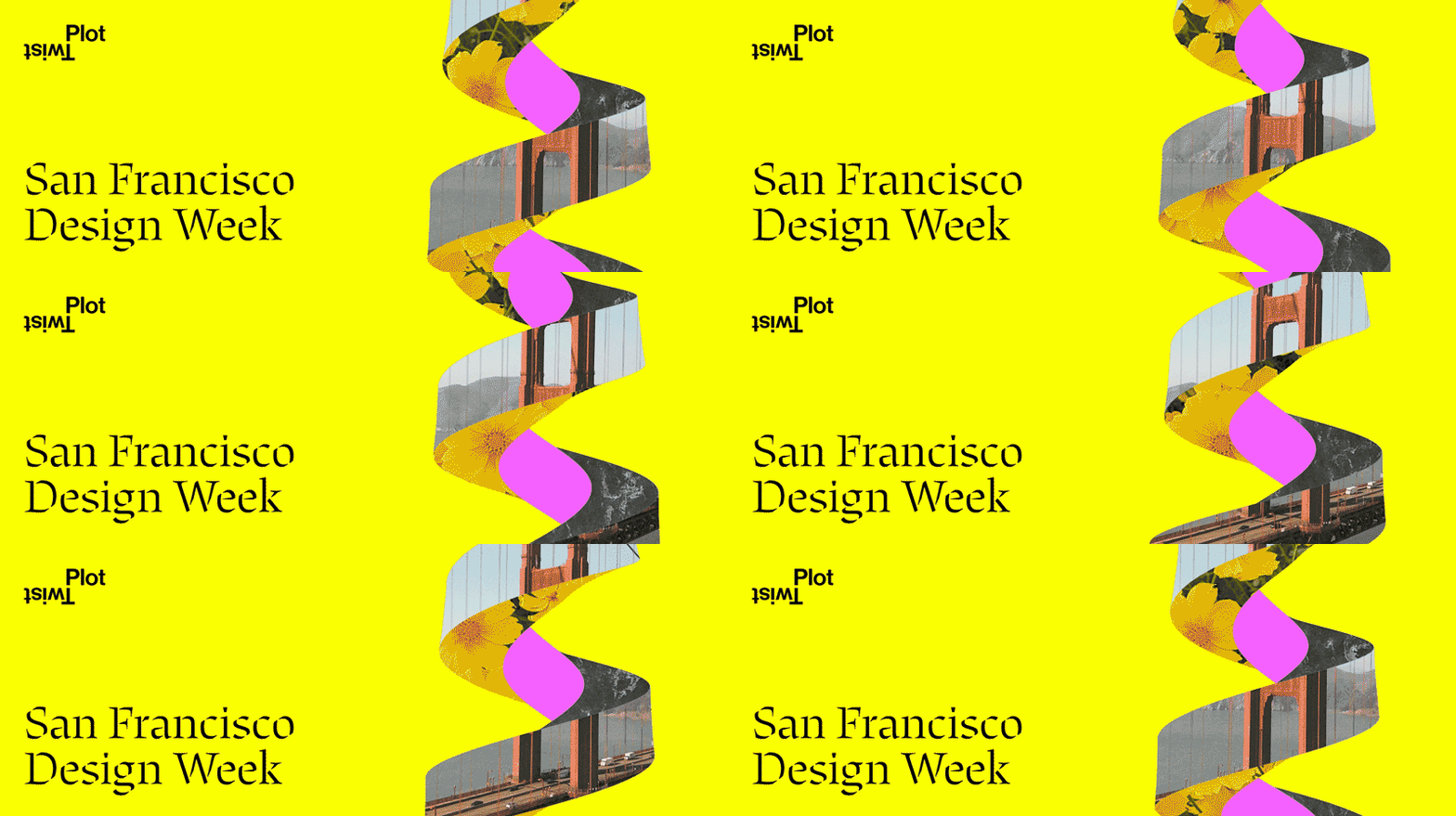
A serif headline 'San Francisco Design Week' paired with a dynamic, color-blocked abstract shape mixing photographic fragments (window, textile) and flat magenta forms on bright yellow.
Summary
Bright yellow poster featuring the serif-set headline "San Francisco Design Week" with an overlapping abstract collage of photographic textures (fabric, architectural window) and bold magenta geometric shapes creating a dynamic diagonal motion.
Visual description
Neon yellow background. On the left, the words "San Francisco Design Week" in a generous serif typeface (likely transitional or slab serif) set in black. On the right, a vertically stacked composition of abstract elements: a cropped architectural photograph (window grid in grey and pale blue), a textured woven fabric in warm ochre, and two flat magenta rounded rectangles layered to create depth and forward thrust. The entire shape leans diagonally to suggest movement and energy.
Key takeaway
The pairing of a static, grounded serif word mark with a kinetic abstract visual element is a winning division of labor: the type anchors the brand, the collage energizes it. The magenta-on-yellow high-saturation contrast is impossible to ignore and reads "event" instantly. Mixing photographic realism with flat vector shapes breaks visual monotony while remaining cohesive.
Reuse notes
Ideal for creative events, design conferences, and festivals where boldness signals no-apologies confidence. The serif weight balances the chaos of the right side—remove it and the design tips toward mayhem. Works best at large scale or in digital contexts where the vibrant yellow doesn't exhaust print budgets. The abstract shape's diagonal thrust pairs well with dynamic event photography or speaker names overlaid.
More like this
Keep what you find
A free account saves references to boards and can send you a weekly email of picks based on what you save.
To see every result, go Pro.