Preview image. Unlock full-res
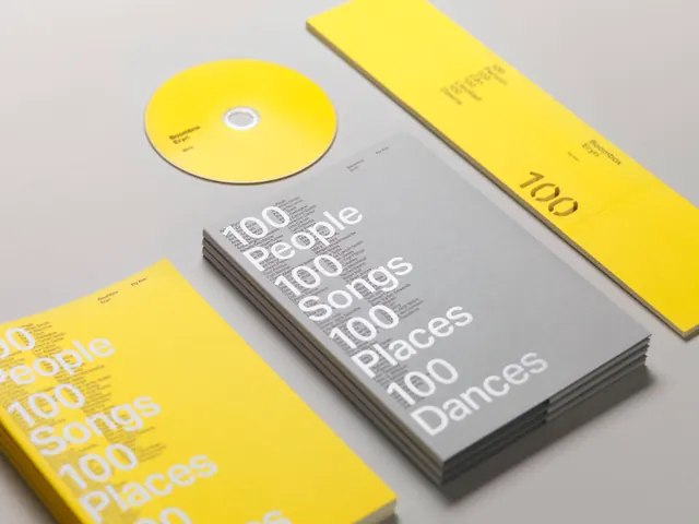
Product packaging and collectible type system for music-related items, demonstrating typographic application across 3D card stock and disc media through color-blocked layers and sans-serif hierarchy.
Summary
Product packaging and collectible type system for music-related items, demonstrating typographic application across 3D card stock and disc media through color-blocked layers and sans-serif hierarchy.
Visual description
Three dimensional product mockup arranged diagonally to show depth: a bright yellow disc with white printed type sits atop yellow and gray rectangular cards printed with numerical data and sans-serif typography. The cards are staggered in overlapping planes, each featuring a two-tone color blocking strategy (one side yellow, one side gray, with white text and numbers). The composition reveals how the type system scales and aligns across different product formats and orientations. Small, tightly-spaced digits and text create an information-dense, organized appearance that reads as systematic and precise. Neutral background emphasizes the vivid yellow-gray contrast and the three-dimensional arrangement.
Key takeaway
The discipline of applying a single type system (sans-serif scale, weight, and color palette) across radically different product substrates (disc, flat card, stacked package) while maintaining both legibility and branded identity. The yellow-on-gray and gray-on-yellow reversal strategy that creates visual rhythm without introducing additional colors. The use of numerical data as visual texture that reinforces the systematic, collection-worthy nature of the product line.
Reuse notes
Strong reference for music, publishing, or collectible brands designing physical product families. The staggered-card presentation is particularly effective in packaging design, lookbooks, or physical catalogs showing product breadth. The high-contrast color palette works across print, web, and environmental applications. Consider this approach when designing systems that live across multiple scales and orientations; the type principle remains consistent even as the medium changes.
More like this


Keep what you find
A free account saves references to boards and can send you a weekly email of picks based on what you save.
To see every result, go Pro.