Preview image. Unlock full-res
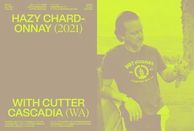
Documentary-style event promotion pairing bold display type in neon lime against muted tan, with a central figure wearing branded merchandise.
Summary
A wine event promotion spliced diagonally into tan and neon-lime halves, with oversized display type on the left and a documentary-style photograph on the right.
Visual description
Left side: oversized sans-serif headlines in pure neon lime set solid against warm tan, with small metadata lines above (credit lines, URL, year/brand). Right side: a muted tan-and-lime tinted photograph of a figure wearing a branded t-shirt, holding wine bottles, backdropped by grapevines. The lime overlay creates a duotone effect where the photograph and its subject are visible but fully subordinate to the neon letterforms. A horizontal split divides the layout clean at roughly center.
Key takeaway
The diagonal lime-and-tan split creates rhythm without symmetry. Neon display type at maximum size overwhelms neutral documentary photography. The color constraint (just two hues: warm tan and electric lime) reads as deliberate and branded, not accidental. Oversized typography can anchor a split layout when the opposite side is photographic and recessive.
Reuse notes
Ideal for wine, beverage, or agricultural events where documentary-style photography lends authenticity. Works at large scale (posters, signage). The neon-on-muted split reads premium and editorial. Test pairing with serif type if the event needs formality. Lime works best on dark or mid-tone backgrounds.
More like this

Keep what you find
A free account saves references to boards and can send you a weekly email of picks based on what you save.
To see every result, go Pro.