Preview image. Unlock full-res
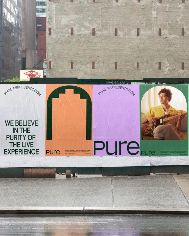
Outdoor billboard campaign for Pure brand using bold color planes, an arched logo form, and a lifestyle portrait to assert brand identity through contrast and spatial hierarchy.
Summary
Outdoor billboard campaign for Pure brand using bold color planes, an arched logo form, and a lifestyle portrait to assert brand identity through contrast and spatial hierarchy.
Visual description
A large-scale street-mounted billboard divides into distinct rectangular color fields: on the left, bold sans-serif text ("WE BELIEVE IN THE PURITY OF THE LIVE EXPERIENCE") in black on off-white; center-left, a peach-colored vertical panel with an arched negative-space logo form; center-right, the word "pure" in deep forest green serif type; far right, a lifestyle photograph of a person in a yellow shirt against a muted green background. Four narrower accent bands in beige, coral, purple, and green separate and frame each section, creating visual momentum. The overall effect balances sophisticated color theory (warm terracotta against cool olive green and purple) with structural clarity. Brick and concrete urban architecture frames the top and bottom, emphasizing the public-facing scale of the installation.
Key takeaway
The precision of dividing a large canvas into color-function zones (each color and section serving a specific narrative role) without feeling chaotic. The arched negative-space logo that reads as both abstract form and brand symbol. The use of a portrait photograph as a brand statement rather than decorative fill, anchoring the mural to human values. The restrained palette (five colors) and the interplay of serif and sans-serif type across the layout, creating both unity and hierarchy.
Reuse notes
Ideal for premium or lifestyle brands entering public spaces (retail, transit, hospitality, or cultural venues). The approach scales from large billboards to smaller facade treatments. Works best for brands with a strong color identity and a clear visual voice. The arched motif is distinctive; adapt cautiously to avoid direct imitation. Requires coordination between type, color, and photographic elements to sustain the refined mood.