Preview image. Unlock full-res
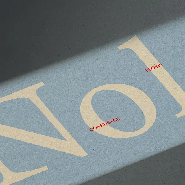
A large cream curved letterform against a muted blue-gray ground, with hard diagonal shadow and red italic accent words positioned asymmetrically.
Summary
A single cream-colored geometric letterform floats on a cool blue-gray field, anchored by a deep shadow cast diagonally across the plane, with red italic accent words overlaid in the negative space.
Visual description
One large cream-colored curved form (an open letterform or abstract curve) dominates a pale muted blue background. A strong diagonal shadow in dark charcoal stretches across the surface, creating depth and directional emphasis. Two lines of red italicized text appear in the open areas: "BEGINNING" and "CONFIDENCE," positioned to follow the flow of the shadow and negative space. The composition is spare, relying on scale contrast, lighting, and subtle color temperature shift (cool blue ground, warm cream form, warm red accent).
Key takeaway
Shadow as a compositional element that adds dimension without additional shape. The asymmetric placement of accent text in negative space keeps the focus on the primary form while adding typographic information. Minimal-palette editorial layouts benefit from this kind of depth-through-shadow approach.
Reuse notes
Effective for luxury or editorial type specimens, or for minimal brand identities that need subtle depth. The red accent works because it is small and positioned strategically. Works well for promotional materials that require elegance and restraint, or as a case study in using shadow as a primary design tool rather than mere rendering.
More like this





Keep what you find
A free account saves references to boards and can send you a weekly email of picks based on what you save.
To see every result, go Pro.