Preview image. Unlock full-res
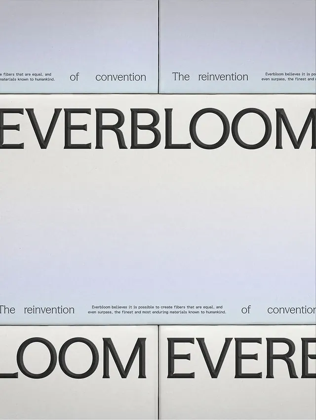
Everbloom brand wordmark deconstructed across a four-panel grid layout with supporting tagline and mission copy on a minimalist gray-white background.
Summary
Everbloom brand identity displayed as a deconstructed four-panel grid with the wordmark fragmented across panels, philosophical taglines, and mission copy in a monochromatic layout.
Visual description
A four-quadrant grid layout on pale gray-off-white ground, separated by thin black vertical divider lines. Top left: partial wordmark letter in bold heavy sans-serif. Top right: phrase "of convention" with "The reinvention" visible above. Center: large letters spelling "EVERBLOOM" split across upper and lower halves. Bottom right: tagline "The reinvention" paired with body text: "Everbloom believes it is possible to create fibers that are equal, and even surpass, the finest and most enduring materials known to humankind." Bottom left: repeated phrase "of convention." All type in high-contrast dark gray to black sans-serif, heavily weighted, with generous whitespace around each element. The grid creates visual tension through fragmentation while maintaining an ordered, contemplative rhythm.
Key takeaway
Deconstructing a wordmark across a grid creates intrigue and emphasizes the brand's modularity and thinking. Paired with an explanatory manifesto, it transforms the logo from symbol into statement. The limited palette and negative space make the typography breathe despite bold letterforms.
Reuse notes
Effective for ethical or sustainability-focused brands needing to communicate values alongside identity. The fragmented approach works best in print (large format, posters, packaging) where viewers can engage with the full composition. For digital applications, ensure the fragmentation doesn't confuse readability. Pairs well with long-form editorial content or impact reports.
More like this



Keep what you find
A free account saves references to boards and can send you a weekly email of picks based on what you save.
To see every result, go Pro.