Preview image. Unlock full-res
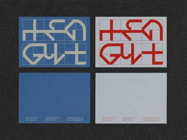
A 2x2 grid identity system exploring typographic letterforms in contrasting color pairs: blue-cream, red-cream, monochromatic blue, and grey, with business card application.
Summary
A geometric identity system exploring angular sans-serif letterforms through complementary and monochromatic color studies, paired with minimal business-card applications.
Visual description
A 2x2 grid composition on dark grey background. Top-left: angular geometric sans-serif letterforms rendered in warm cream on blue background. Top-right: same letterforms in red on off-white. Bottom-left: solid blue card with subtle cream text and address details. Bottom-right: solid grey card with matching red text. The letterforms are constructed from rectangular strokes and geometric angles, creating a technical, modular appearance. Typography is strictly sans-serif, high-contrast, and deliberately austere.
Key takeaway
The systematic color-pair exploration (using complementary hues and monochromatic variants) to test identity legibility and emotional range. The geometric letterform construction method using aligned strokes creates a distinctive, ownable character style. The pairing of graphic studies with real-world stationery applications shows design rigor.
Reuse notes
Strong reference for corporate identity, tech brands, or design studios seeking a systematic approach to color application. The extreme minimalism and geometric severity work best in B2B, agency, or portfolio contexts. Less suitable for consumer-facing brands requiring warmth or approachability.
More like this





Keep what you find
A free account saves references to boards and can send you a weekly email of picks based on what you save.
To see every result, go Pro.