Preview image. Unlock full-res
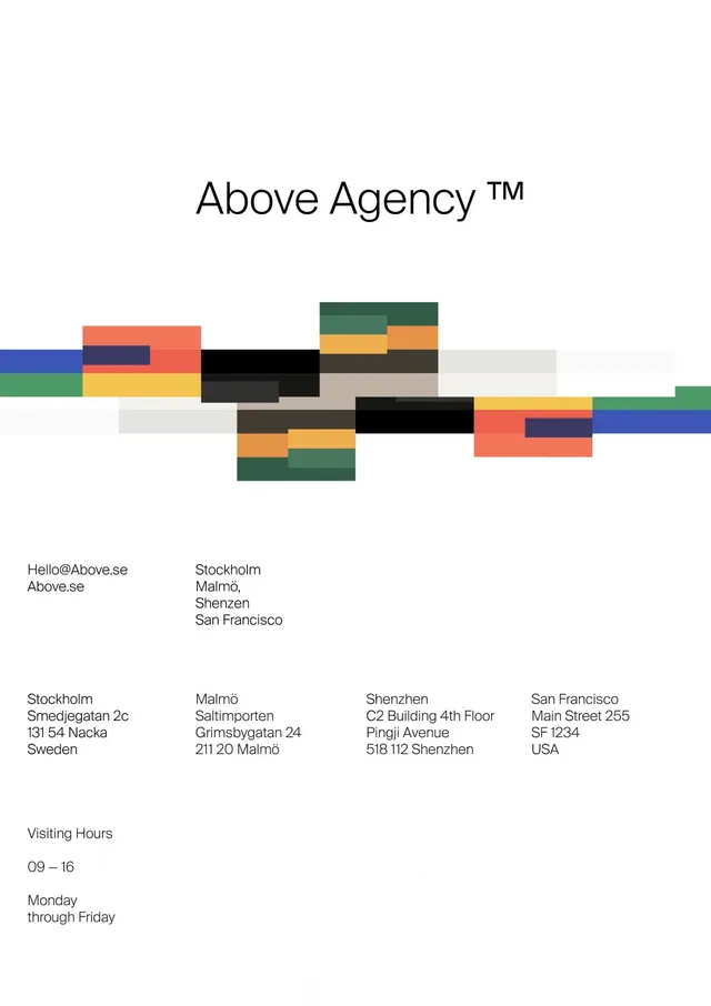
A minimalist creative agency identity built from stacked, offset color rectangles forming an abstract modular mark, paired with a clean serif wordmark and structured address/hours grid.
Summary
A creative agency identity system centered on a dynamic modular mark built from overlapping horizontal color rectangles, complemented by a formal serif wordmark and practical grid-based contact layout.
Visual description
Minimalist composition on white. The wordmark "Above Agency™" uses a serif display face with fine line weight. Below it, a horizontal abstract composition of offset rectangular blocks in navy, coral, mustard, forest green, gray, black, and cream stacks and interlocks in an asymmetric pattern, creating visual movement while maintaining geometric order. Contact information is presented in a structured three-column grid format, listing Stockholm, Malmö, Shenzhen, and San Francisco offices with street addresses. A small "Visiting Hours" section notes 09-16 availability, Monday through Friday, in clean sans-serif body text.
Key takeaway
The modular block system works as both a visual identity mark and a flexible pattern that could extend to supporting materials. The contrast between the formal serif wordmark and the dynamic geometric mark creates dual-mode branding (formal for stationery, playful for environmental/digital). The stacked rectangles feel structured yet energetic without being chaotic.
Reuse notes
Strong fit for creative services, design studios, tech agencies, or any forward-thinking B2B brand that wants to signal both professionalism and visual innovation. The geometric mark is simple enough to scale down or animate, making it adaptable to web and motion. Works particularly well when the color blocks are used as accent guides in supporting typography and photography.
More like this






Keep what you find
A free account saves references to boards and can send you a weekly email of picks based on what you save.
To see every result, go Pro.