Preview image. Unlock full-res
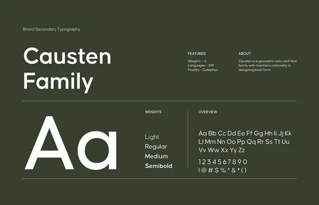
Comprehensive type specimen for a geometric sans-serif family, showing weights and character set against a sage green background with white text.
Summary
Comprehensive type specimen for a geometric sans-serif family, showing weights and character set against a sage green background with white text.
Visual description
A structured layout on muted sage-green presenting "Causten Family" in large bold type at the top left, followed by a thin horizontal rule. Below, a two-column grid displays the typeface: on the left, enlarged individual letterforms (A, Q) demonstrate the geometric proportion and stroke weight; on the right, four weight variants (Light, Regular, Medium, Semibold) stack vertically. A second section below the divider shows the full character set, uppercase and lowercase, numerals, and punctuation in consistent width. Labels in small caps identify weights, features (6 weights, 019 languages, Catephen foundry), and the design rationale.
Key takeaway
The clean two-tier structure separating specimen from specification. The use of negative space and typography hierarchy to make a dense font reference feel calm and navigable. The sage-green background softens the contrast while maintaining readability.
Reuse notes
A template for any multi-weight typeface introduction. Works well in design systems or brand guidelines where you need to show a family's versatility. The color and layout scale well to printed or digital formats.
More like this








Keep what you find
A free account saves references to boards and can send you a weekly email of picks based on what you save.
To see every result, go Pro.