Preview image. Unlock full-res
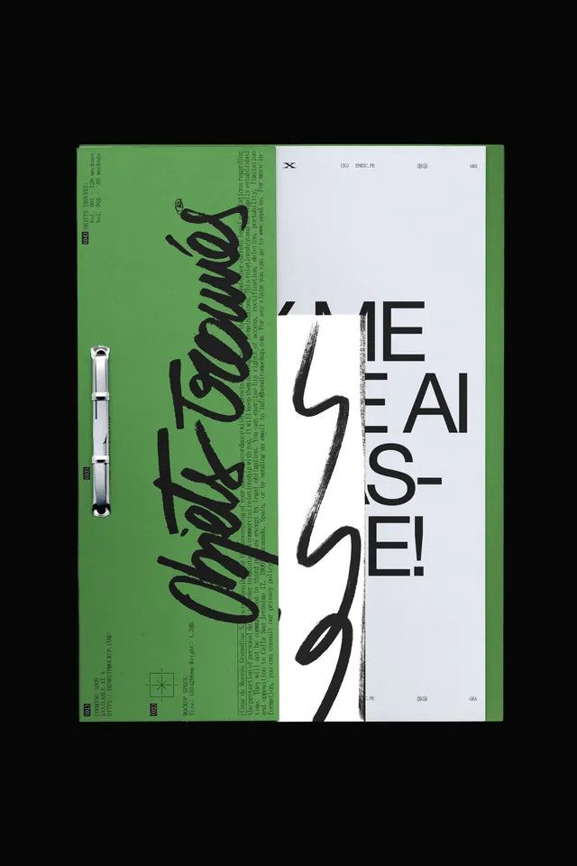
An editorial layout split between a dense, text-heavy olive-green left panel and a clean white right panel, anchored by bold, hand-drawn letterforms spelling out a title.
Summary
An editorial layout anchored by a hand-drawn title, split between a dense olive-green left panel (dense body text and metadata) and a stark white right panel with oversized typography, connected by a spiral binding.
Visual description
The layout is a bifold spread or booklet bound with a visible white spiral binding on the left edge. The left half is sage green, nearly black text in small sans-serif and decorative serif, densely packed with type and minimal whitespace, giving an archival or specimen-sheet feel. The right half is off-white, with the large hand-drawn or brush-stroke title occupying the center, rendered in expressive black ink with visible texture and weight variation. The contrast between the dense, information-rich left and the open, typographic right is the primary visual dynamic. Top and bottom margins carry small monochromatic details (icons, marks) in the corners.
Key takeaway
The split-density strategy: one half information-heavy, the other silent and type-focused. The hand-drawn headline gains impact because it's surrounded by breathing room. Spiral binding as a functional and tactile design detail that grounds the piece as a tangible object.
Reuse notes
Excellent for design portfolios, type specimens, artist or studio publications, or editorial projects where the design is part of the content. The handwritten element signals craft and human touch, working best when paired with editorial or creative industries. The dense/silent split works for art direction that wants to breathe, not for dense content-heavy applications.
More like this





Keep what you find
A free account saves references to boards and can send you a weekly email of picks based on what you save.
To see every result, go Pro.