Preview image. Unlock full-res
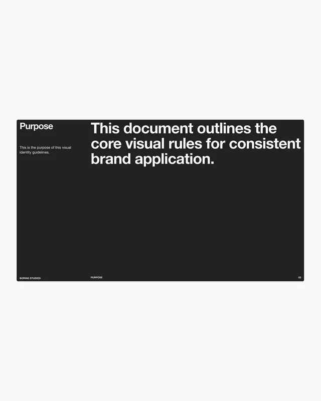
A purpose statement page from a brand guideline using high-contrast black and white, sans-serif typography, and left-aligned text blocks to establish design system authority.
Summary
A purpose statement page from a brand guidelines document using black and white contrast to define design philosophy with authoritative, minimal typography.
Visual description
Dark charcoal background with white sans-serif typography. Top left: "Purpose" label with explanation text in small white type. Main area: large centered white headline in extra-bold weight stating "This document outlines the core visual rules for consistent brand application." Bottom left: "BORING STUDIOS" credit; bottom center: "PURPOSE" label; bottom right: page number "03" in small white type. Wide left margin creates breathing room; text is left-aligned and size-hierarchical (label, body, headline).
Key takeaway
The pairing of one small label with one large statement makes each piece of hierarchy instantly legible. Charcoal-on-white (not pure black) feels less harsh. Footer typography at page-identifying scale (studio, section, number) anchors the grid.
Reuse notes
Classic opening spread for a brand guideline deck when you want to establish seriousness and control. Works for corporate, legal, or design-driven brands. Needs genuinely substantive headline text to justify the size.
More like this








Keep what you find
A free account saves references to boards and can send you a weekly email of picks based on what you save.
To see every result, go Pro.