Preview image. Unlock full-res
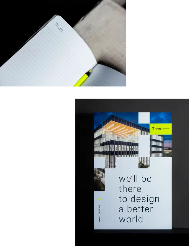
Notebook and framed architectural photograph paired to demonstrate a brand's aspirational messaging through minimalist typography and modern industrial imagery.
Summary
A brand identity system pairing a physical notebook with a framed architectural photograph to showcase a design studio's messaging: clean, minimalist visual language rooted in modern industry imagery.
Visual description
The composition has two layers. Top: a white lined notebook against a dark background with a bright yellow accent stripe visible on its spine. Bottom: a framed architectural photograph of a modernist building with regular window grid, overlaid with white space containing three lines of blue-gray sans-serif type reading "we'll be / there / to design / a better world". A small yellow tag labeled "There" sits in the upper right of the frame. The palette is restrained: white, black, grays, bright yellow, and muted blue-gray. Generous negative space emphasizes precision and calm professionalism.
Key takeaway
The tactic of pairing tactile mockup (notebook) with photographic context (architecture) to ground a brand's abstract claim in concrete work. The yellow accent as a small, repeated detail that ties the two halves together. The measured spacing and type sizing that make modest copy feel aspirational.
Reuse notes
Effective for design studios, architecture firms, or any creative practice that wants to demonstrate capability through imagery and messaging together. The tactile element (notebook) works well in print or portfolio contexts. Works best when the brand's actual work genuinely matches the architectural/industrial aesthetic shown.
More like this






Keep what you find
A free account saves references to boards and can send you a weekly email of picks based on what you save.
To see every result, go Pro.