Preview image. Unlock full-res
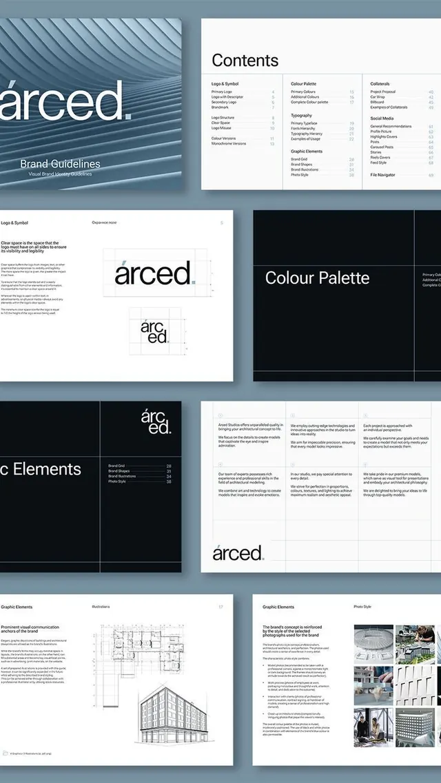
Comprehensive brand guidelines for an architecture firm, featuring a diagonal-lined wordmark and steel-blue color system across logo, typography, and grid-based layout documentation.
Summary
Comprehensive brand guidelines for an architecture firm, featuring a diagonal-lined wordmark and steel-blue color system across logo, typography, and grid-based layout documentation.
Visual description
The guideline spread shows multiple pages from a cohesive identity system. Top left displays a diagonal-striped background in blue-gray tones with a minimal sans-serif wordmark "arced." A contents page lists sections: Logo & Symbol, Logo Usage, Primary Typeface, Colour Palette, and Graphic Elements, with corresponding page numbers. Bottom sections show logo lockup variations, clear space specifications, a color palette grid on a black background, brand tone statements in a three-column text layout, and photographic examples of architectural projects demonstrating the identity system in real-world applications. Typography is consistent sans-serif throughout, set in a hierarchical grid structure.
Key takeaway
Diagonal-line pattern as a unifying visual motif echoed across brand applications. The modular grid-based layout system that accommodates both type and photography. A steel-toned palette that reads as both corporate and creative, with sufficient contrast between dark and light elements for legibility. The inclusion of real project photography to ground the identity in practical context.
Reuse notes
Strong template for professional services and architecture/design-focused firms. The diagonal pattern works particularly well at large scale. Color system benefits from an existing brand with sufficient variety in branded collateral (logos, business cards, environmental graphics) to justify the comprehensive guideline scope. Not ideal for highly playful or consumer brands.
More like this





Keep what you find
A free account saves references to boards and can send you a weekly email of picks based on what you save.
To see every result, go Pro.