Preview image. Unlock full-res
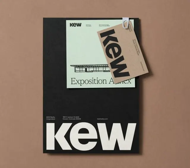
Comprehensive museum branding system featuring oversized sans-serif wordmark, editorial materials, and minimal typographic hierarchy on high-contrast backgrounds.
Summary
A museum identity system anchored by a bold, oversized "KEW" wordmark paired with clean editorial materials and architectural photography in a high-contrast dark and cream palette.
Visual description
The composition presents brand collateral layered on a warm taupe background: a black-cover publication with the enormous white "KEW" wordmark dominates the foreground, overlaid with cream and black printed materials. One sheet displays architectural photography (a building elevation) labeled "Exposition Annex," maintaining the oversized sans-serif typographic approach. The color palette consists of near-black, cream, warm taupe, and dark gray, creating strong visual contrast. The system relies entirely on typography and generous whitespace rather than decorative elements, emphasizing clarity and institutional gravitas. Grid-based layout and flush-left alignment reinforce the professional aesthetic.
Key takeaway
The discipline of oversized, single-style typographic branding combined with high contrast creates authority without illustration. The warm neutral background palette (taupe, black, cream) feels sophisticated and grounded. Unadorned, grid-locked layout makes the system feel intentional and replicable across applications.
Reuse notes
Ideal for cultural institutions, museums, galleries, or corporate identities where restraint and typographic strength signal expertise. Works particularly well in exhibition and printed contexts. The dark/cream contrast ensures legibility at all scales. Pair with architectural or documentary photography to enhance institutional credibility.
More like this






Keep what you find
A free account saves references to boards and can send you a weekly email of picks based on what you save.
To see every result, go Pro.