Preview image. Unlock full-res
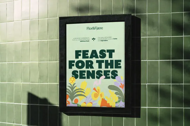
A mint poster in a black lightbox frame on a green tiled wall, with a slab headline over a band of flat floral illustration.
More like this
See all
Summary
A brand poster shown in a black lightbox case mounted on a glossy green tiled wall, built from a heavy three-line headline sitting on a band of flat floral illustration.
Visual description
The photograph is taken at an angle so the case reads as a shallow box with visible depth and a soft leaf shadow falling across the tiles to the left. Inside, the poster is a pale mint sheet. The wordmark sits small and centred at the top in a dark green serif with a tight ampersand joining the two words. Below it, two short blocks of mixed serif and sans copy sit either side of a small dark leaf and droplet mark, one describing a sensory experience with an italic middle line, the other describing the menu, both using bold to pick out a few words. The lower two thirds are dominated by the headline "FEAST FOR THE SENSES" set in a heavy dark green all-caps slab face, three lines, ranged centre, filling the width. Along the bottom edge a band of flat vector flowers grows up over the last line: yellow petals, orange trumpets, lilac fronds, deep green leaves and small red berries, all drawn as simple opaque shapes with no outline or shading.
Key takeaway
Letting the illustration band overlap the base of the headline stitches the two layers together and makes a flat poster feel like a planted bed. The two small copy blocks flanking a tiny mark give the top of the sheet structure without a rule or a box.
Reuse notes
Good reference for hospitality, garden and food venues that need warmth without photography. The pairing of a heavy slab headline with a fine serif wordmark is the load-bearing move and needs both extremes to be present. The busy illustrated strip crowds the last headline line, so keep the final line short.