Preview image. Unlock full-res
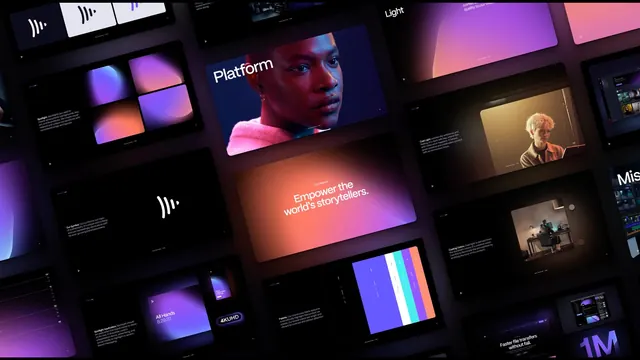
A dark, angled array of brand guideline slides showing the Frame.io symbol, gradient spotlights, mission statement, and palette.
More like this
See all


Summary
Roughly twenty brand guideline pages arranged as a tilted grid on near black, each page a dark card, so the whole guidelines document reads as one dramatic composition.
Visual description
Cards sit in staggered rows rotated a few degrees and set in slight perspective, larger toward the center of the frame and cropped at every edge. Nearly all have near black backgrounds. The center card is a warm orange to pink gradient panel carrying the line about empowering the world's storytellers in white, centered, with a small label above it. Above it a card shows a portrait of a person in a pink top lit in cool blue with the word Platform set large in white at the upper left. To the left, a card presents the symbol alone, a set of four curved white strokes of stepped heights, with a paragraph of explanatory copy in small type at the lower left corner; another shows four gradient tiles as a two by two study. On the right, cards show a warmly lit figure at a desk, a dark editing interface, and a large numeral one million against violet. Lower center, a card lays the palette out as vertical stripes in violet, white, teal, and coral beside a list of values. Small play triangles appear in the corners of several cards. Body copy throughout is tiny relative to the headings, and every page keeps wide black margins.
Key takeaway
Showing a guidelines document as a tilted, cropped array turns documentation into a hero image, and the shared black field lets the gradient pages read as light sources rather than as slides. Keeping headline type huge and body copy tiny is what makes the pages legible as a pattern at this scale.
Reuse notes
Good for a case study opener, a portfolio cover, or an announcement image where the deliverable is a system rather than a single artifact. Requires enough pages with strong single ideas, since text heavy pages become grey noise at this size. The perspective crop means no individual page can be read in full, so pair it with straight on detail frames.
More like this





Keep what you find
A free account saves references to boards and can send you a weekly email of picks based on what you save.
To see every result, go Pro.