Preview image. Unlock full-res
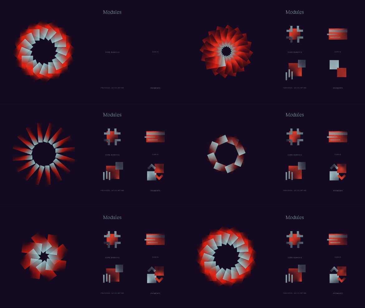
Dark two-column panel where a rotating gradient rosette assembles beside four module icons that fade in one by one under all-caps labels.
More like this
See all
Summary
A dark panel that pairs the identity's rotating gradient rosette on the left with a two-by-two set of module icons on the right, each icon appearing in sequence under a small all-caps caption.
Visual description
The field is a flat near-black plum. Left of centre sits a circular rosette built from a dozen or more rounded rectangles radiating from a common hub, each filled with a red to pale ice-blue gradient. Over the loop the rosette breaks apart into a loose ring of separated bars, spins, then packs back into a tight petal-like disc, alternating between a hollow ring with a visible dark core and a dense star. To its right, the word "Modules" sits centred in a light sans-serif at the top. Below it four small icons occupy a two-by-two grid, each built from the same red, grey and pale-blue rectangular blocks as the rosette: a cross or plus-shaped cluster, a set of stacked horizontal bars, a group of vertical strokes beside a square, and an overlapping pair of squares with a downward chevron. Tiny grey all-caps labels sit beneath each one reading core banking, cards, financial accounting and payments. The icons are absent in the first frames and fade in one after another as the loop runs, ending with all four held on screen.
Key takeaway
The same rectangular brick that builds the logo also builds every product icon, so the icon grid needs no outline style or container to feel like a set. Staging the icons in one at a time turns a static system slide into an explanation of how the modules stack up.
Reuse notes
A strong template for a modular product or platform page where the brand mark and the feature set should read as one language. Pairs naturally with a rotating or assembling hero mark elsewhere on the page. The captions are very small and low contrast here, so raise their weight or value if the panel is ever used at a smaller size.
More like this
Keep what you find
A free account saves references to boards and can send you a weekly email of picks based on what you save.
To see every result, go Pro.