
Preview image. Unlock full-res
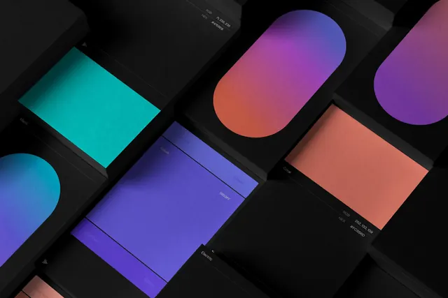
Four tilted capsule shapes carrying the brand's named gradients, each labelled in tiny rotated type on a near-black plum field.
More like this
See all


Summary
A gradient system shown as four rounded capsules laid out in a stepped diagonal row, each one named in hairline type running up its own length.
Visual description
The field is a very dark desaturated plum, slightly lighter at centre so the shapes sit in a soft pool of light. Four identical stadium shapes, all rotated about fifteen degrees clockwise, march left to right and step downward, each casting a faint coloured bloom onto the background. Left to right they carry a coral-to-magenta-to-blue blend, a magenta-to-coral-to-violet blend, a violet-to-blue-to-cyan blend, and a near-black charcoal blend. Each capsule holds a single line of very small white type set vertically along the shape's axis, reading in the pattern "Gradients /" followed by a place name: Santa Monica, Tribeca, Miami, Gotham. The labels sit at low opacity so they read as annotation rather than content. Generous empty space fills the top and bottom thirds of the frame.
Key takeaway
Naming gradients after places rather than numbering them gives a colour system a vocabulary a team will actually use in conversation. Presenting them as identical rotated capsules makes the blends comparable while the tilt keeps the row from reading as a chart.
Reuse notes
Reach for this when documenting a gradient set in a brand guideline or a design system page and you want the swatches to feel like brand rather than spec. The dark ground is doing a lot of work here; the same capsules on white would lose the glow and most of the drama. Keep labels small enough that they never compete with the colour itself.
More like this




Keep what you find
A free account saves references to boards and can send you a weekly email of picks based on what you save.
To see every result, go Pro.