Preview image. Unlock full-res
Food & Drink
Colormonochrome, vibrant, high-contrast, warm, earthy
Typedisplay, sans-serif
Industryfood
Tagsfood-drink, Typographic, Light, accented-neutral, warm, orange, neutral
Palette
#FBF7EE
#1C1C1C
#B5B2AC
Summary
Food & Drink
Visual description
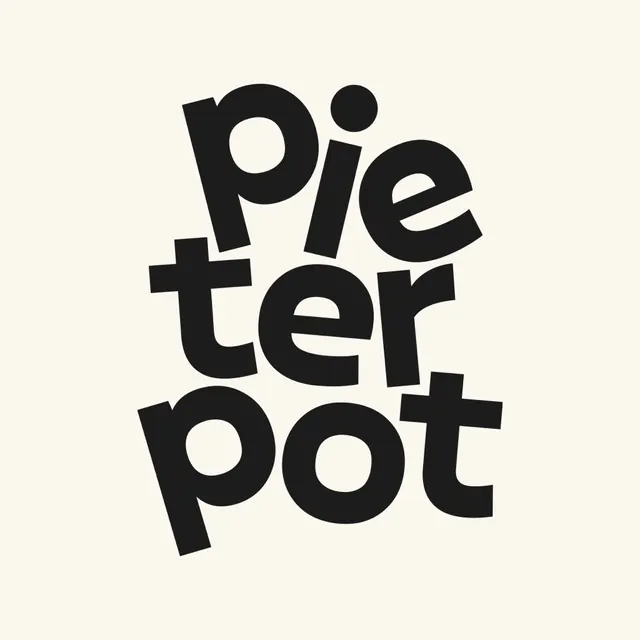
Black sans-serif typography reads "Pieter Pot" stacked in three lines on a cream background. The letters are thick, rounded, and irregularly scaled, with some characters overlapping or interlocking. The composition is centered and organic, avoiding a strict baseline.
Key takeaway
Use varying letter scales and overlapping characters to transform a standard wordmark into a cohesive, puzzle-like graphic shape.
Reuse notes
Reach for this as a icon reference. Pairs with typographic, minimal directions.
More like this





Keep what you find
A free account saves references to boards and can send you a weekly email of picks based on what you save.
To see every result, go Pro.