Preview image. Unlock full-res
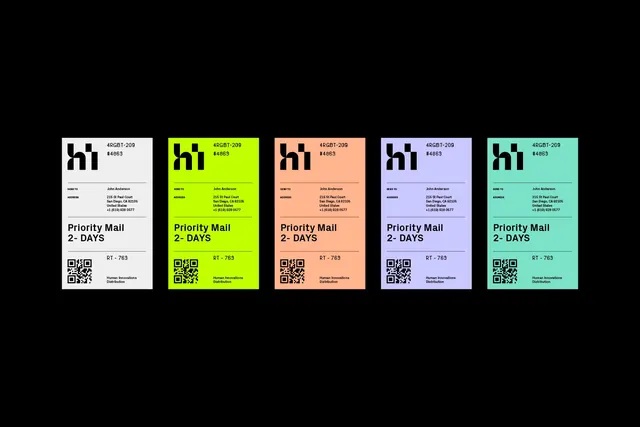
Five identical shipping labels laid out in a row on black, each in a different brand colorway, showing the system as one repeating layout.
More like this
See all
Summary
The same shipping label artwork repeated five times across a black field, changing only its background color, which turns a utility sticker into a visible palette chart.
Visual description
Five portrait labels of equal size sit in a single evenly spaced row, centered on a pure black background with generous empty space above and below. Left to right the stocks run off-white, acid lime, peach, periwinkle and mint. Every label carries identical black artwork: the "hi" monogram top left with two reference codes to its right, a hairline rule, a SEND TO and ADDRESS block with the recipient details set right-aligned, another rule, the heavy two-line "Priority Mail 2- DAYS" statement, a final rule, and a bottom row pairing a QR code at the left with a route code and the distribution line at the right. Because nothing but the fill changes, the eye reads the five as a swatch strip and the layout as a fixed template. All type is black; no color is used in the ink at any point.
Key takeaway
Locking the artwork and varying only the substrate color is the cheapest possible way to show a color system in use, and it proves the layout survives on every value in the palette. The black ground removes the labels from any product context so the system is judged on its own.
Reuse notes
Ideal as a case study or brand guidelines spread showing a color range applied to one template, or as a print spec sheet for label stock. Requires black type to hold contrast on every colorway, which rules out deep or saturated backgrounds. Not a mockup, so pair it with an applied shot on a real carton to sell the finish.
More like this
Keep what you find
A free account saves references to boards and can send you a weekly email of picks based on what you save.
To see every result, go Pro.