Preview image. Unlock full-res
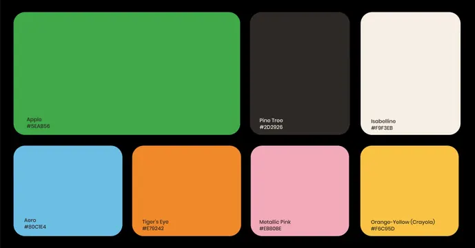
Seven named brand colours shown as rounded swatch tiles with hex values on a black board.
More like this
See all

Summary
A colour system page laid out as two rows of rounded tiles on black, each tile labelled in the bottom left with a colour name above its hex value.
Visual description
The top row holds three tiles of unequal width: a wide green occupying roughly half the board, then a near-black brown and a warm off-white of matching size. The bottom row holds four equal tiles in light blue, orange, pink and yellow. All tiles share the same generous corner radius and sit on a pure black background with even gutters. Labels are small, sentence-case sans-serif set in dark ink on the light tiles and in white on the dark one, always tucked into the lower left corner. Read in order they are Apple #5EAB56, Pine Tree #2D2926, Isabelline #F9F3EB, Aero #80C1E4, Tiger's Eye #E79242, Metallic Pink #EBB0BE and Orange-Yellow (Crayola) #F6C95D.
Key takeaway
Sizing the tiles unequally states the hierarchy of the palette without any primary and secondary labelling: the green is obviously the lead colour. Black rather than white as the board background lets the off-white swatch register as a colour instead of disappearing into the page.
Reuse notes
A clean template for the colour page of a brand guideline or a case study, and it scales to more or fewer swatches by adjusting the first row. Set label colour per tile for contrast rather than globally. Naming each colour makes the palette quotable in conversation, which matters more than the hex values for non-design stakeholders.
More like this



Keep what you find
A free account saves references to boards and can send you a weekly email of picks based on what you save.
To see every result, go Pro.