Preview image. Unlock full-res
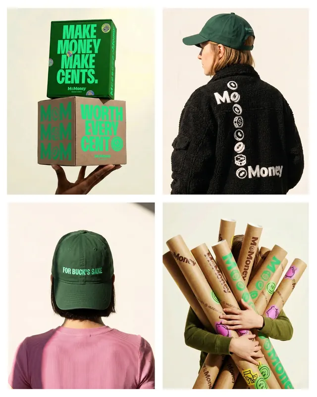
A playful, multi-color brand identity for Mo Money, an interactive museum exploring the history of money, with expressive typography, coin graphics, and energetic visual storytelling.

Summary
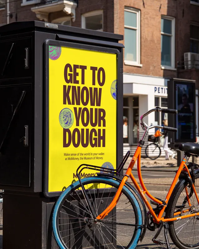
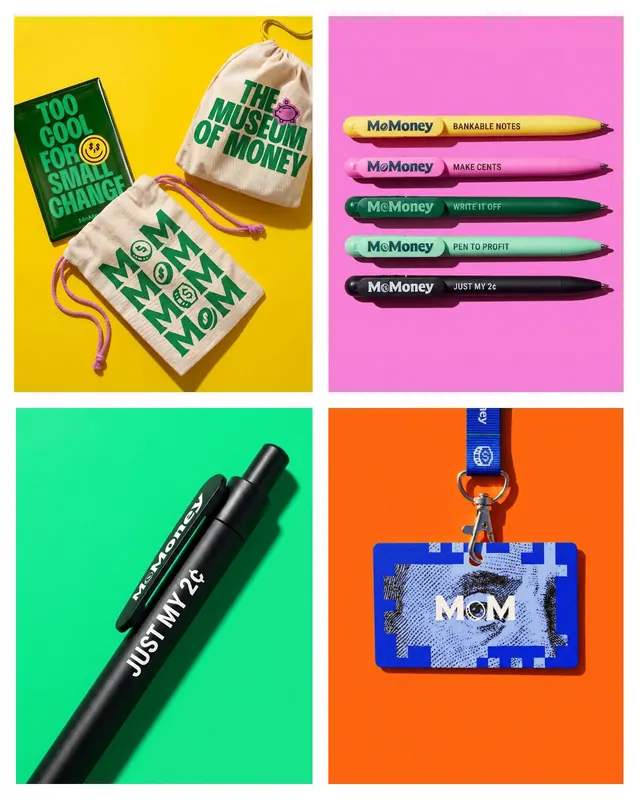
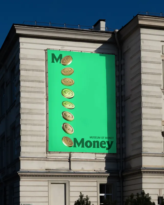
A complete brand identity for Mo Money, an interactive Dallas museum about currency history, featuring playful coin graphics, expressive typography, and a vibrant color system that spans logo, business cards, website, and environmental signage.
Visual description
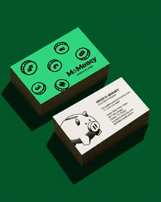
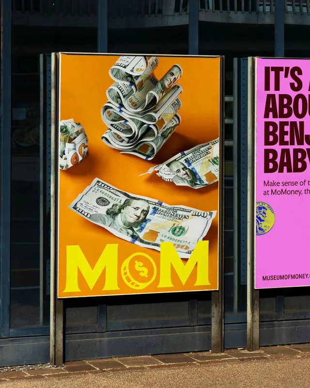
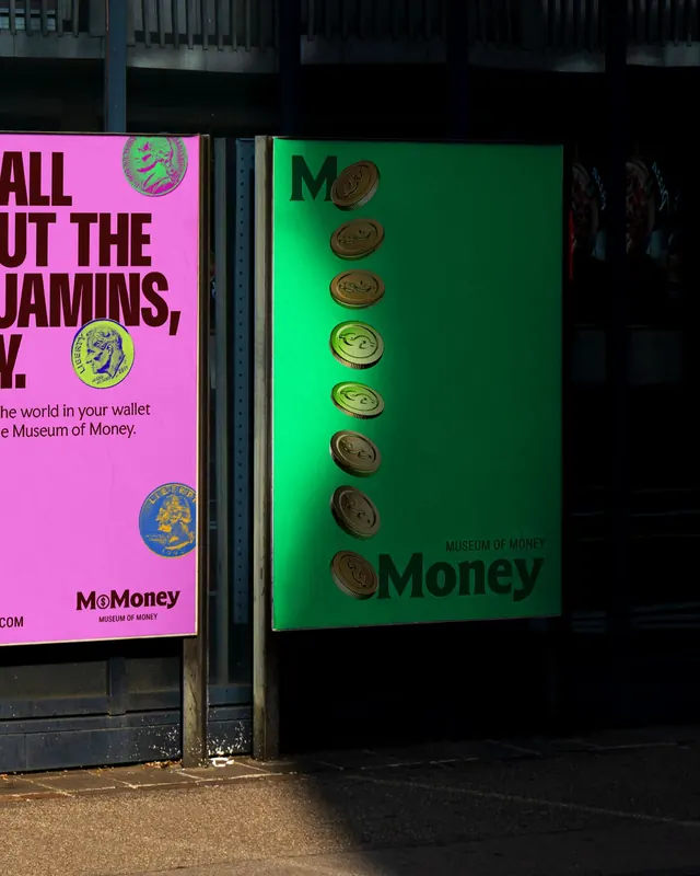
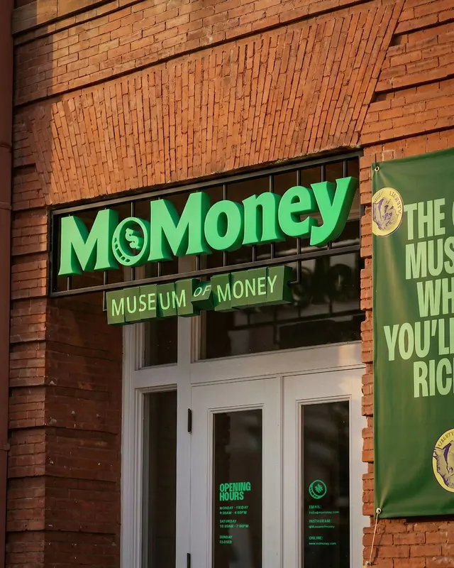
The carousel showcases a cohesive brand system with a dark primary palette punctuated by vibrant aquamarine, yellow, orange, and magenta accents. The logo uses playful, blobby coin shapes in neon colors stacked on a black background with oversized aquamarine sans-serif type. Business cards are shown on a bright aquamarine substrate with a whimsical piggy-bank illustration. The website hero features a split-color background (dark green lower, teal upper) with an oversized all-caps headline "GET TO KNOW YOUR DOUGH" in bright aquamarine, punctuated by illustrated coins. Physical environmental applications include a bright yellow and orange street-side billboard with dollar-bill collage imagery, and wayfinding signage with playful taglines and coin iconography, all maintaining the vibrant palette and expressive type treatment.
Key takeaway
The brand achieves accessibility and enthusiasm through color contrast and illustrated iconography that's both sophisticated (in execution detail) and playful (in personality). The consistency of the oversized, all-caps typographic voice across touchpoints, logo, web, and physical space, creates a memorable, energetic system that works at all scales.
Reuse notes
Ideal for institutions, entertainment venues, or educational brands that need to appeal to diverse audiences while maintaining a sense of fun. The multi-channel application (digital, print, environmental) is a strong reference for extending a brand system into physical spaces. Note the careful balance between visual noise (the illustrated coins, the vibrant colors) and clear hierarchy, which keeps the system readable even when densely layered.