Preview image. Unlock full-res
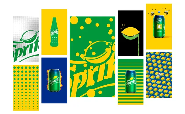
Sprite brand identity system featuring product bottles, geometric patterns, and illustrated fruit motifs arranged in a modular grid showcasing the brand's visual components in green, yellow, and navy.
Summary
Sprite's comprehensive beverage brand identity system presented as a modular grid of components including the Sprite bottle logo, product cans, geometric pattern tiles, and playful illustrated fruit characters.
Visual description
A grid layout of rectangular panels showcasing Sprite brand elements. Upper left: the green Sprite logo with dotted pattern background. Center and right panels display Sprite product cans on contrasting colored backgrounds (navy, white, yellow). Major center panel: large illustrated banana and lemon shapes in yellow and green with scattered yellow circles on a green background. Surrounding panels feature geometric patterns including yellow dots on green grids, horizontal yellow and green stripes with product cans, black section with a yellow lemon illustration, and a solid yellow panel with a cheerful Sprite can and cute bee characters. All elements maintain a strict palette of forest green, bright yellow, navy blue, and white, using bold color blocking and clean shapes. Typography is sans-serif and uppercase throughout.
Key takeaway
A refreshing identity system demonstrates how a limited, highly saturated color palette (plus neutrals) combined with repeating geometric shapes and whimsical fruit illustrations creates immediate brand recognition and playful energy. The modular grid format effectively showcases how individual components work independently and within the larger system without losing cohesion.
Reuse notes
Strong reference for youthful beverage or food brands seeking playful, geometric identity systems. Use as inspiration for pattern library organization, color coordination in energetic consumer applications, and illustrative mascot integration. The bold contrast and saturated colors work particularly well for reaching younger audiences and create memorable brand recognition in packaging and marketing collateral.
More like this

Keep what you find
A free account saves references to boards and can send you a weekly email of picks based on what you save.
To see every result, go Pro.