Preview image. Unlock full-res
Full brand redesign for Unify GTM platform, showcasing identity system, UI design, and physical applications including signage and merchandise.

Summary
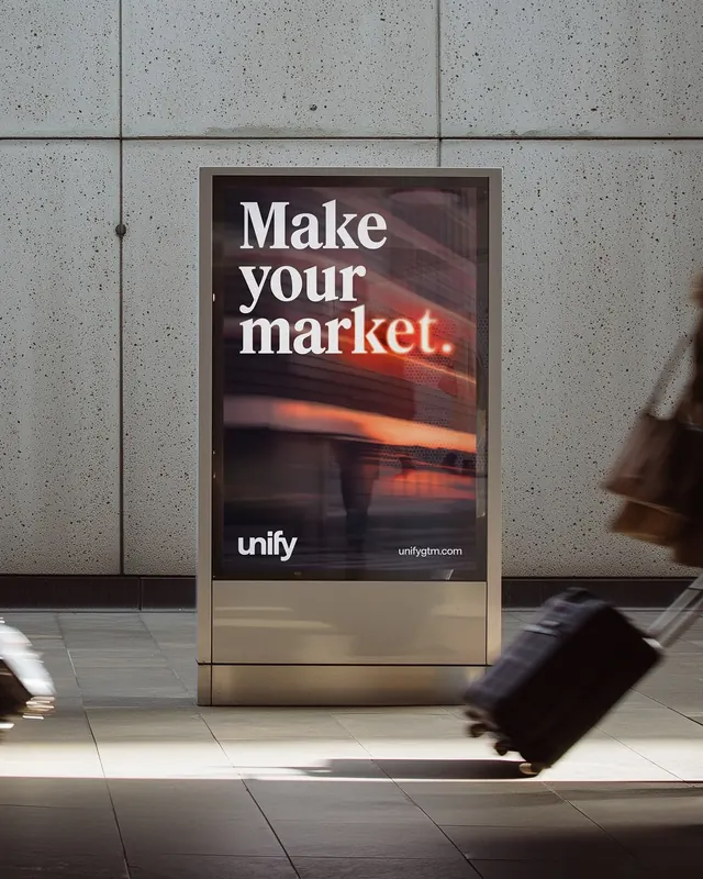
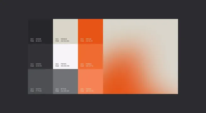
A comprehensive brand identity system for Unify, a go-to-market platform, featuring a refined wordmark with accent detail, dark mode aesthetic with warm gradient accents, UI design system documentation, and real-world applications across signage, merchandise, and digital products. The carousel demonstrates the breadth of the redesign from abstract design systems to physical environmental graphics.
Visual description
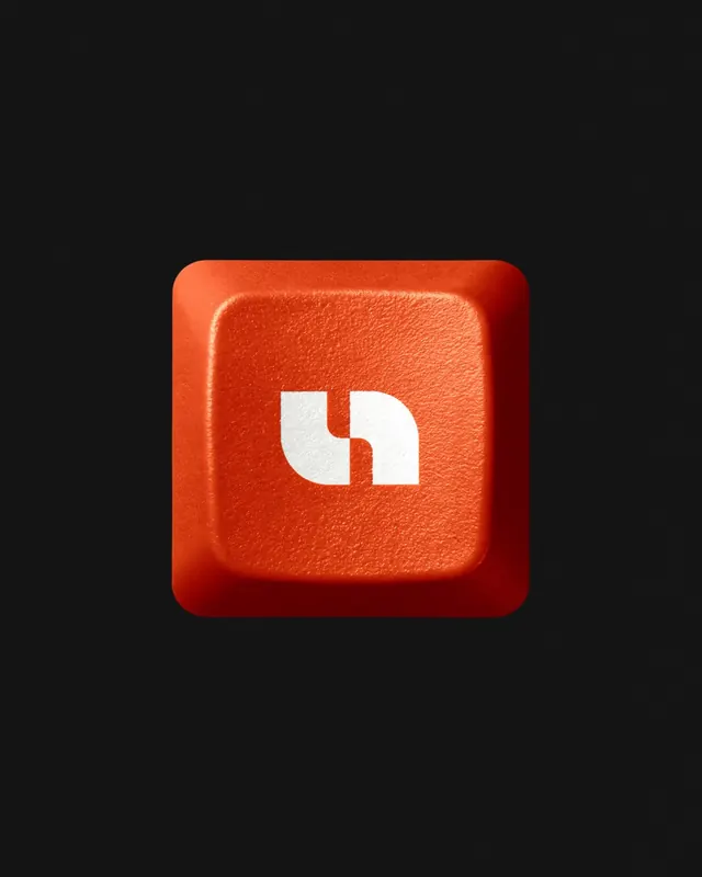
The carousel progresses from logo presentation through design system to physical applications. Early slides show the Unify wordmark centered on dark backgrounds with warm orange glow elements and curved UI control points. A laptop mockup displays the platform interface with warm-toned imagery and copy about AI-assisted signal-driven growth. Typography slides feature oversized sans-serif headlines ("Your best year is your new baseline") on dark gradients. Physical applications include an outdoor digital billboard with large white type and orange accent on dark backdrop, a 3D rendered red square button icon, a black baseball cap with small "Market Maker" branding, and final icon systems showing simplified wolf or dog silhouettes. Multiple slides incorporate video motion (indicated by the first, second, third, and seventh slides containing video files).
Key takeaway
The system balances premium dark aesthetics with warm accent colors across digital and physical touchpoints. Oversized, confident typography and minimal iconography create a cohesive brand voice from logo to environmental signage. The gradient-heavy approach and 3D rendering techniques convey technical sophistication while remaining approachable.
Reuse notes
Strong reference for B2B SaaS brand systems that span web UI, marketing materials, and physical environments. The dark-mode-with-warm-accents palette works particularly well for technical product categories (GTM, analytics, developer tools). The progression from abstract design elements to real-world applications is useful for case study presentations. Note the restraint in the color palette, relying on white, dark grays, and a single warm accent rather than a full spectrum.