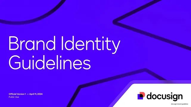
Preview image. Unlock full-res
A 102-page Docusign brand identity guideline deck built on an electric-violet and deep-indigo system, geometric DS Indigo type, the dog-eared "Nexus" mark, and a consistent label-left / content-right page grammar.
Summary
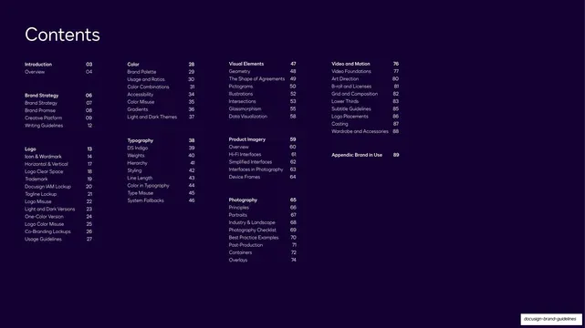
Docusign's official 2024 Brand Identity Guidelines: a 102-page system deck organized into numbered chapters (Introduction, Brand Strategy, Logo, Color, Typography, Visual Elements, Product Imagery, Photography, Video and Motion, and a Brand-in-Use appendix). Its personality comes from an electric-violet-and-indigo palette, a clean geometric sans, the dog-eared "Nexus" mark, and one repeated page grammar that keeps a very long document coherent.
Visual description
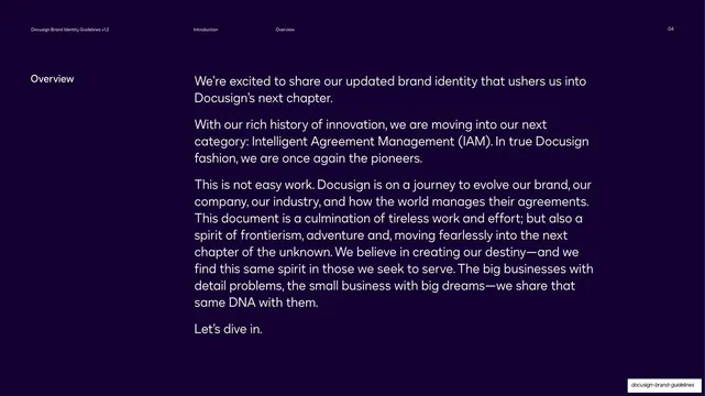
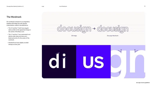
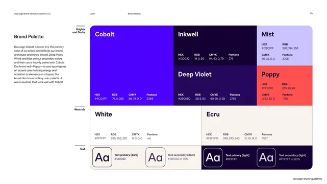
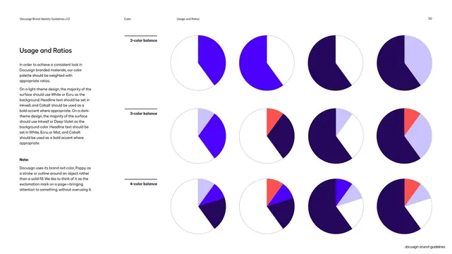
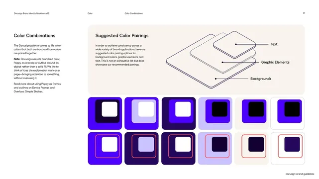
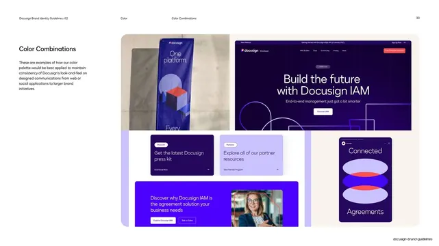
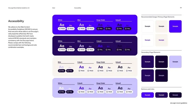
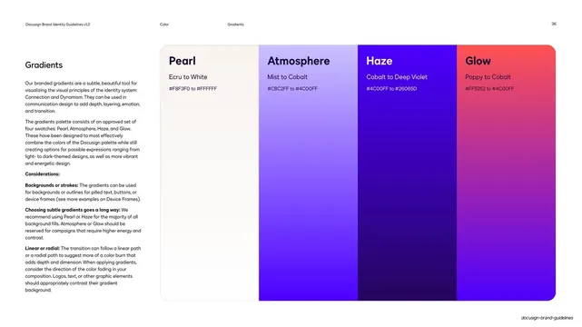
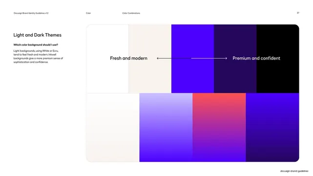
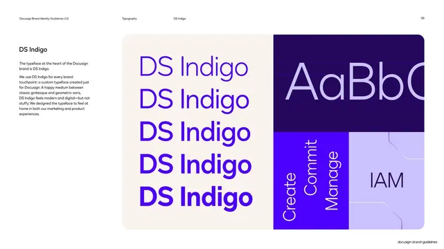
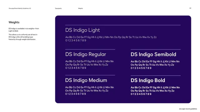
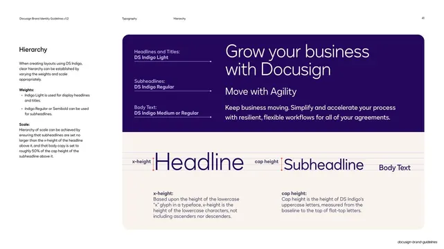
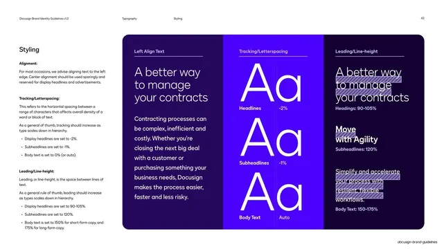
Slides run 16:9. The color system pairs a saturated electric cobalt-violet (#4C00FF) and a near-black deep indigo (Inkwell, ~#1B0A3A) as the dominant grounds, with a coral "Poppy" red (#FF5252) and crisp white as accents, a warm off-white cream (#F5F2EC) for light panels, and an occasional mint-green status accent. Type is DS Indigo, a geometric sans, set light and oversized for display and used quietly at small sizes for body and a persistent running header. That header is consistent throughout: deck title at left ("Docusign Brand Identity Guidelines v1.2"), centered section / subsection breadcrumbs, and a page number at right, all in tiny type.
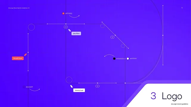
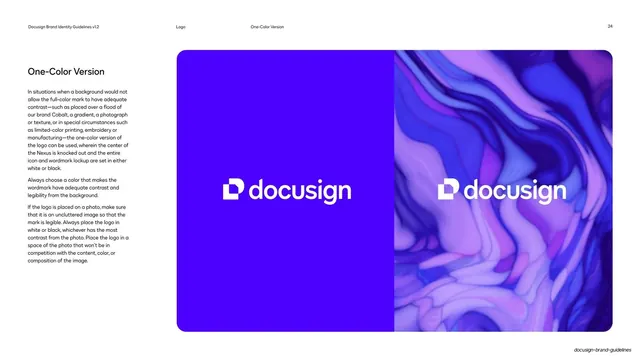
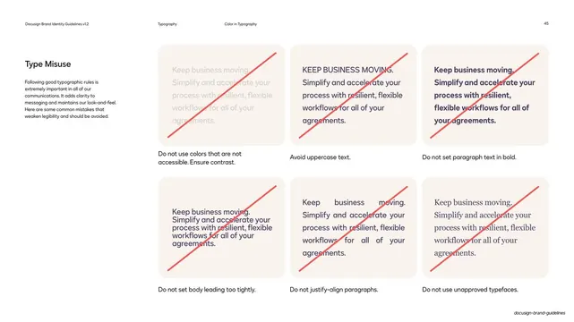
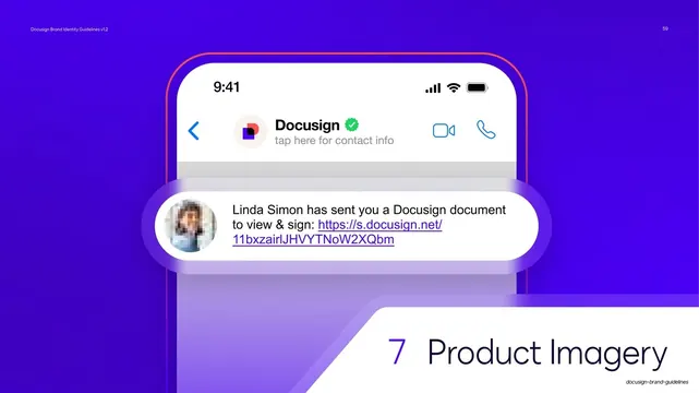
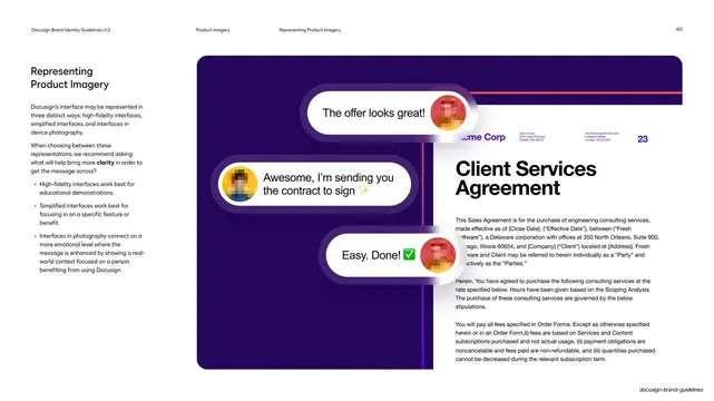
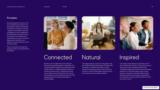
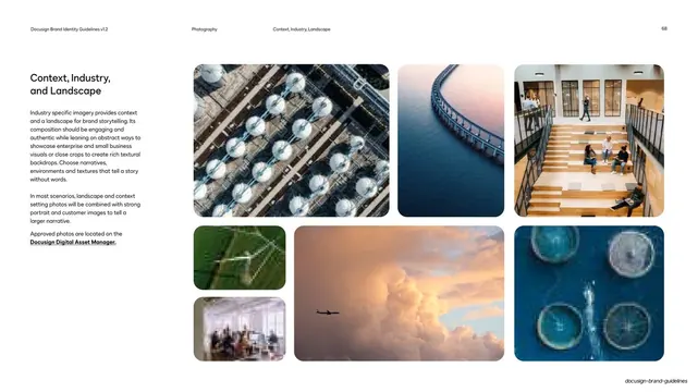
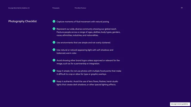
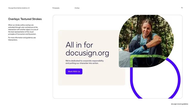
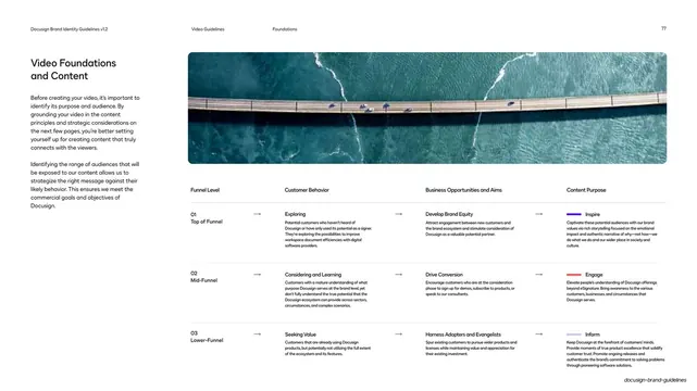
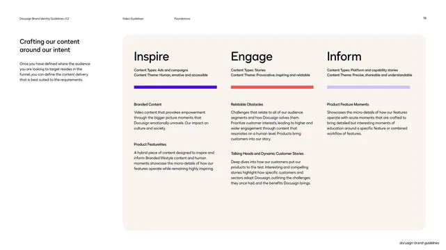
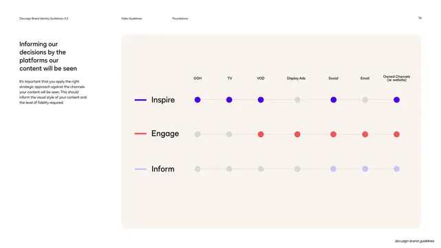
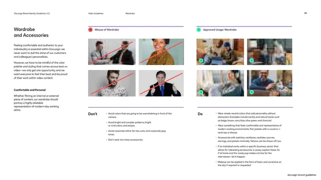
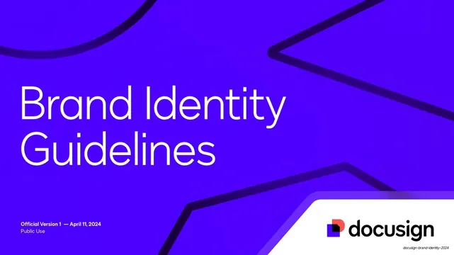
Two layout motifs carry the deck. First, content pages use a fixed label-left / content-right grid: a short bold label or heading and explanatory copy sit in a narrow left column while the demonstration (a diagram, a logo panel, a mockup, a do/don't pair) fills the right two-thirds, often inside a rounded cream or dark panel. Second, every chapter opens with a numbered full-bleed divider ("1 Introduction", "2 Brand Strategy", "3 Logo", and so on) where the chapter number and name sit on a small notched white corner tab, while the background varies per chapter, faint outlined brand geometry with gradient strokes, stacked translucent glassy panels, or a construction grid with hex chips and cursor-style name tags.
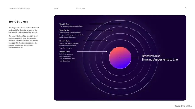
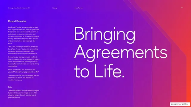
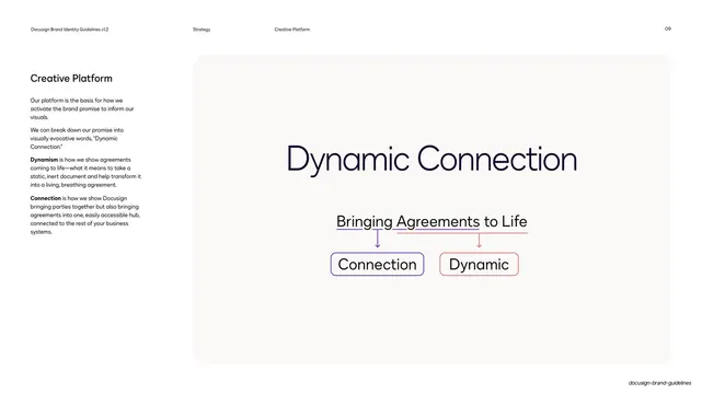
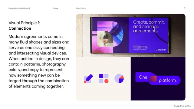
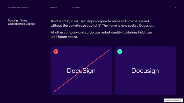
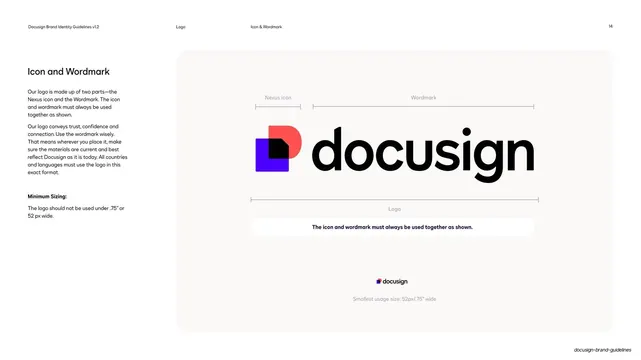
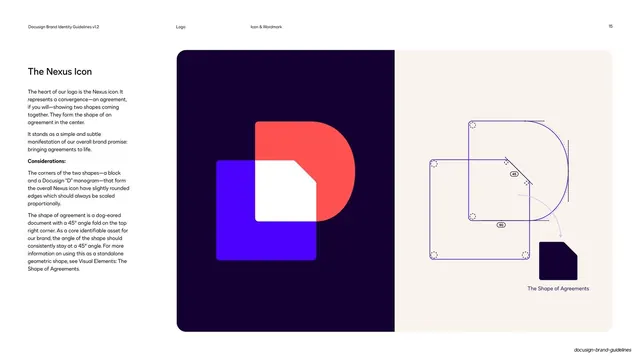
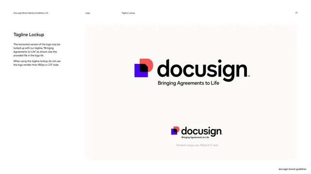
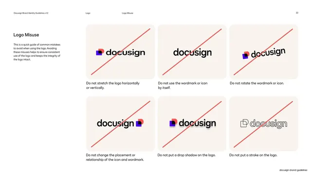
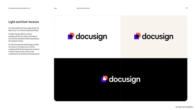
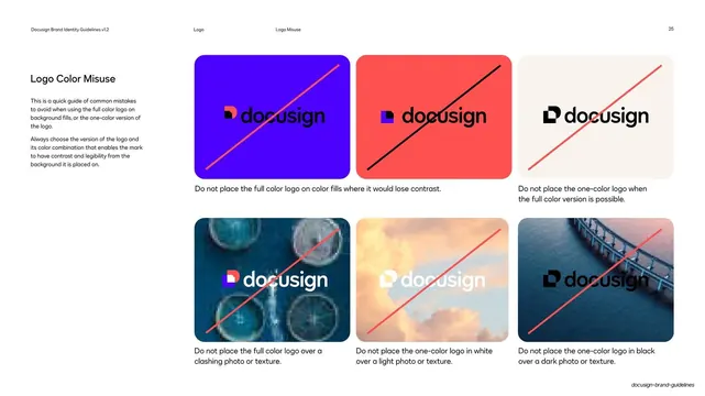
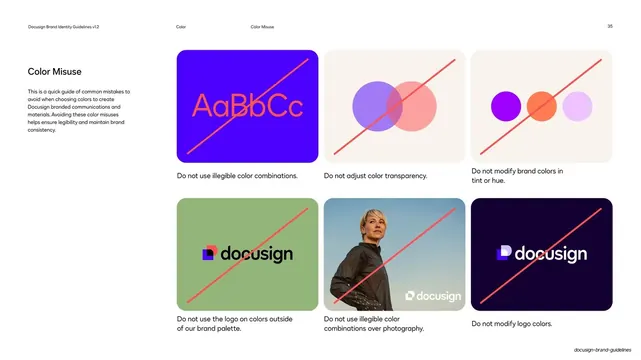
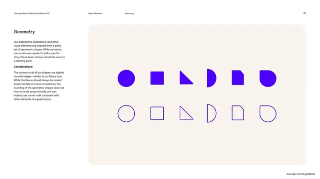
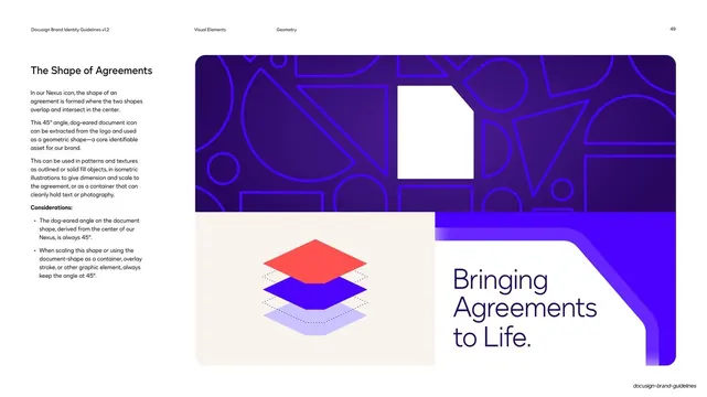
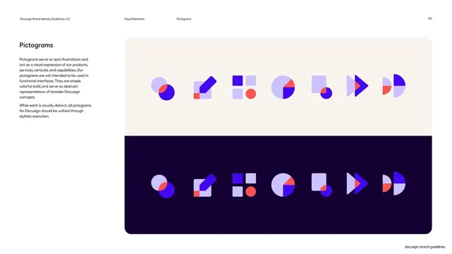
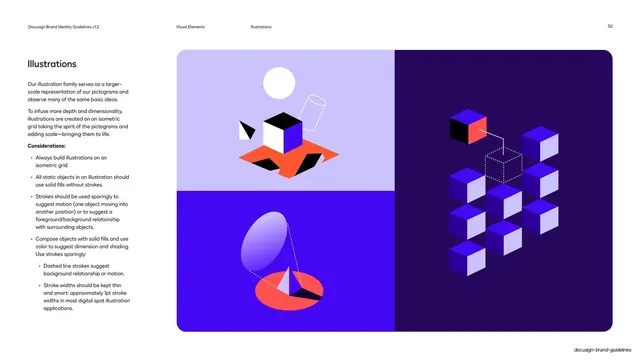
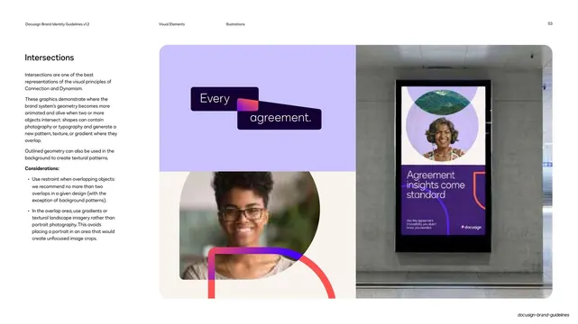
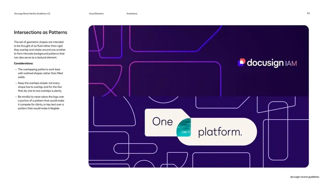
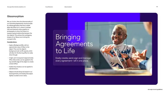
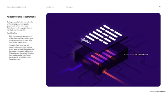
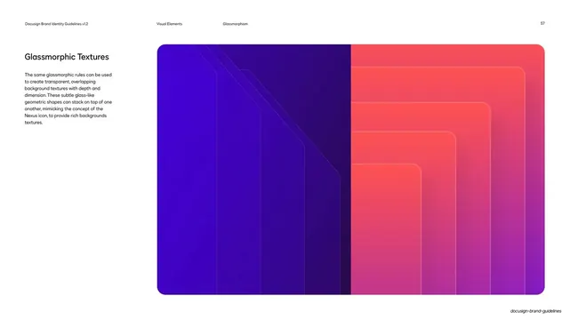
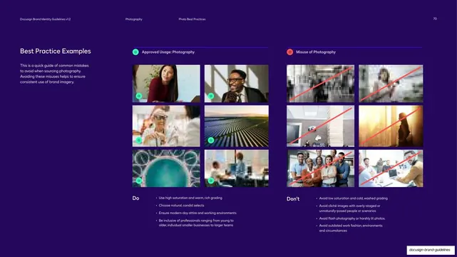
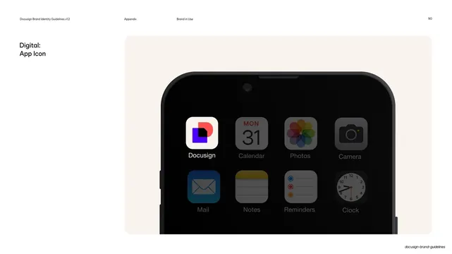
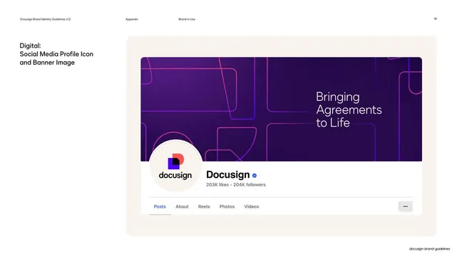
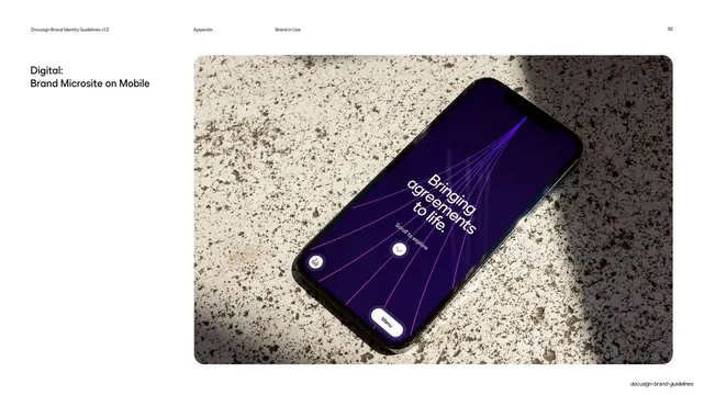
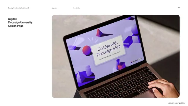
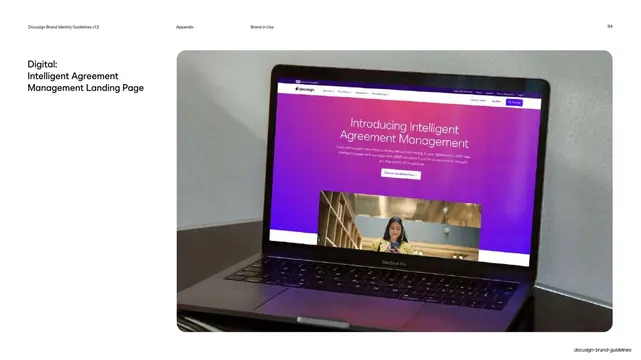
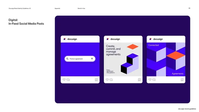
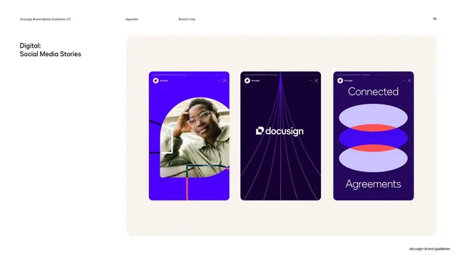
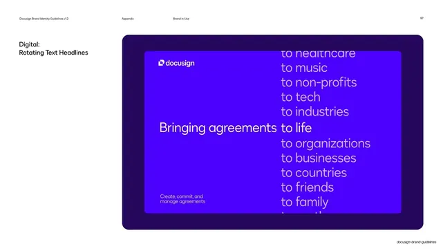
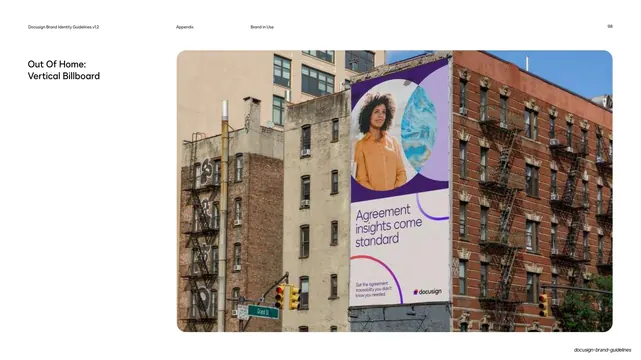
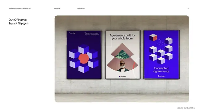
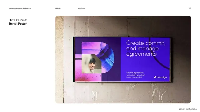
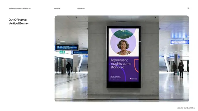
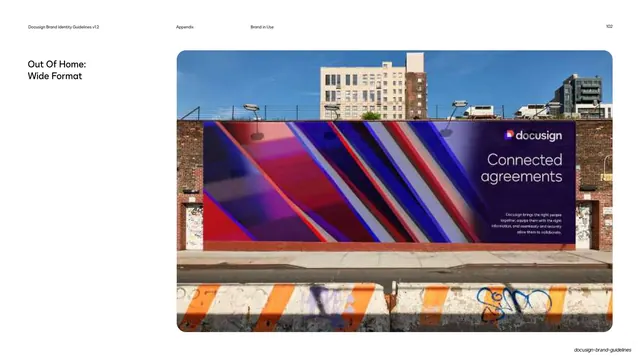
Recurring components and treatments include: the multi-color Nexus icon (a cobalt rounded square overlapping a poppy "D" monogram with a white dog-eared document in the negative space) shown both solid-on-dark and as line construction with 45/90-degree angle markers; the standalone dog-eared "Shape of Agreements"; oversized brand-promise statement slides ("Bringing Agreements to Life.") on vivid gradients; concentric-ring and phrase-breakdown diagrams; do-and-don't pages using red-cross / green-check corner chips and diagonal strikes; gradient stripe and glassmorphic graphic systems; isometric spot illustrations and pictograms (per the contents); and a Brand-in-Use appendix of real-world mockups (transit posters, vertical station banners, wide-format billboards) each shown one-per-page with a small left label.
Key takeaway
The fixed label-left / content-right grid that lets a 100-plus-page guideline stay legible and predictable while the right panel changes from diagram to mockup to rule. The numbered section dividers with a constant notched corner tab over a per-chapter background, variety and consistency at once. And the system thinking on display: a single owned shape (the dog-eared document) recurs from logo to icon to background geometry to graphic pattern, so the whole identity reads as one idea expressed at every scale.
Reuse notes
A reference-grade template for any full brand or design-system guideline, and for long structured decks generally (reports, playbooks, internal handbooks). The chapter-divider system, the breadcrumb running header, the do/don't chip language, and the one-mockup-per-page appendix are all directly reusable. It leans on a distinctive brand color, a clean geometric sans, and genuinely good mockups and illustration; swap the Nexus mark and DS Indigo for your own. The dark-heavy palette needs the occasional cream or light panel (as used here) to keep dense chapters from feeling oppressive.
From this deck: Docusign Brand Identity Guidelines 2024
View deck








More like this



Keep what you find
A free account saves references to boards and can send you a weekly email of picks based on what you save.
To see every result, go Pro.