Preview image. Unlock full-res
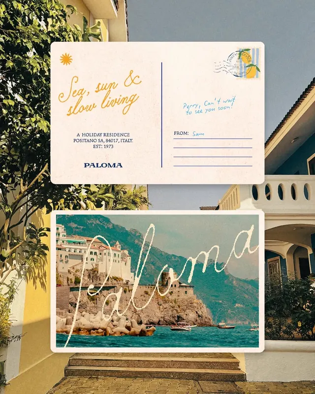
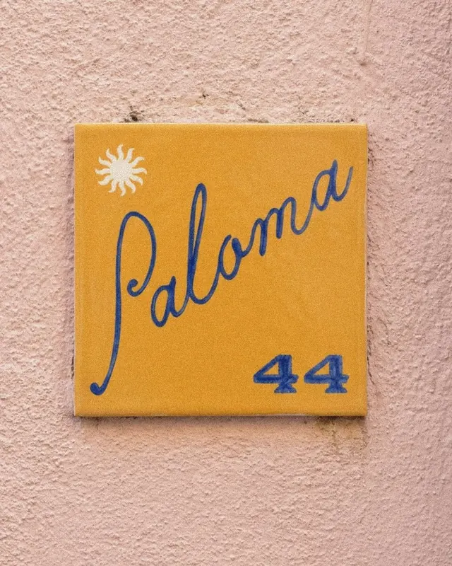
Ten-slide brand identity for Paloma, a Mediterranean holiday residence, with hand-drawn typography, warm warm palette, and architectural photography.
Summary
A warm, handcrafted brand identity for Paloma, a Mediterranean holiday residence in Positano, Italy, featuring hand-lettered wordmarks, golden sun imagery, muted blue accents, and lifestyle photography evoking sea, sun, and slow living.
Visual description
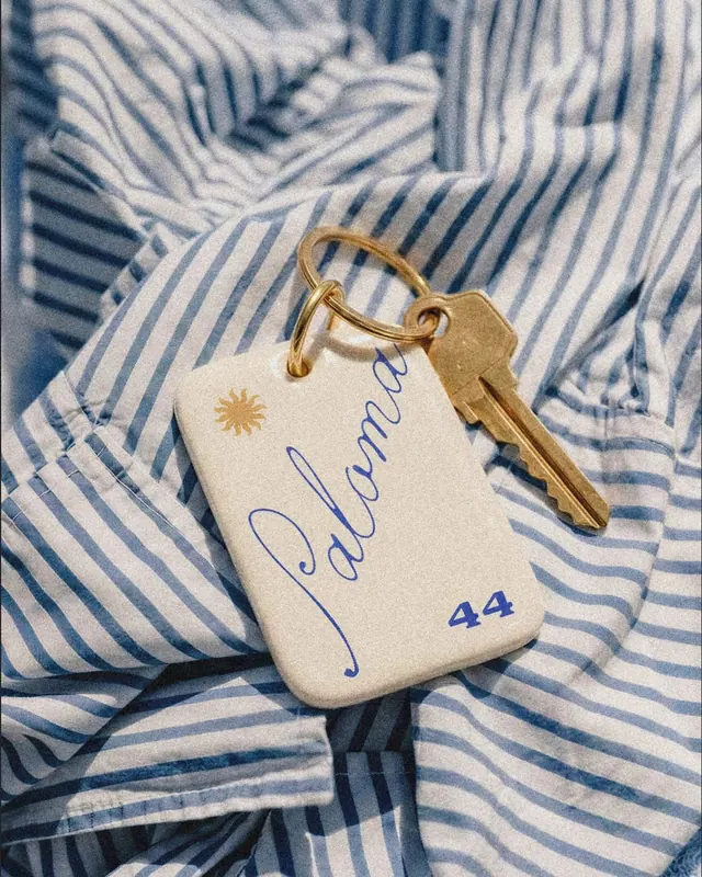
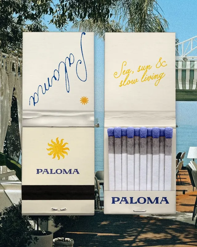
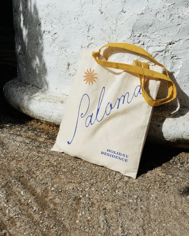
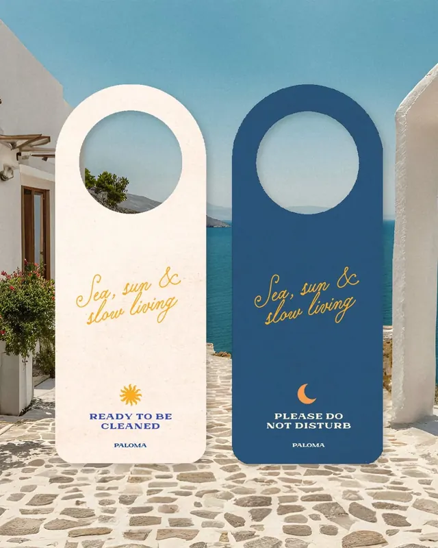
Ten slides present a cohesive warm aesthetic. The cover features cream-colored paper with a hand-drawn "Paloma" wordmark in navy blue brushstrokes, a gold sun icon, and small text noting the address and founding year (EST: 1973). Subsequent slides show branded collateral stacked and layered on matching cream backgrounds: key tags, matchbooks, grocery bags, and signage, all featuring the handwritten wordmark. Navy-on-cream watercolor strokes create a painterly visual language. Architectural photography of Mediterranean buildings and golden-hour details reinforce location and mood. Room keys, keychains, and do-not-disturb signage show craft in hospitality details.
Key takeaway
Hand-drawn letterforms and organic brushstrokes make a luxury brand feel accessible and personal. The restrained palette of cream, navy, and gold sustains elegance without visual noise. Subtle touches like matching the key design to the brand language unify the guest experience from arrival onward.
Reuse notes
Excellent reference for hospitality branding, luxury resorts, or slow-tourism positioning. The handcrafted approach appeals to premium markets valuing authenticity over polish. The golden sun and Mediterranean blue evoke specific geography; reusable pattern language but tailor color/imagery to locale. Videos show product styling and detail sequences. Sourced from Designerbriefs members' picks collection.
From this post: Paloma Mediterranean holiday residence brand identity
View post
More like this



Keep what you find
A free account saves references to boards and can send you a weekly email of picks based on what you save.
To see every result, go Pro.