Preview image. Unlock full-res
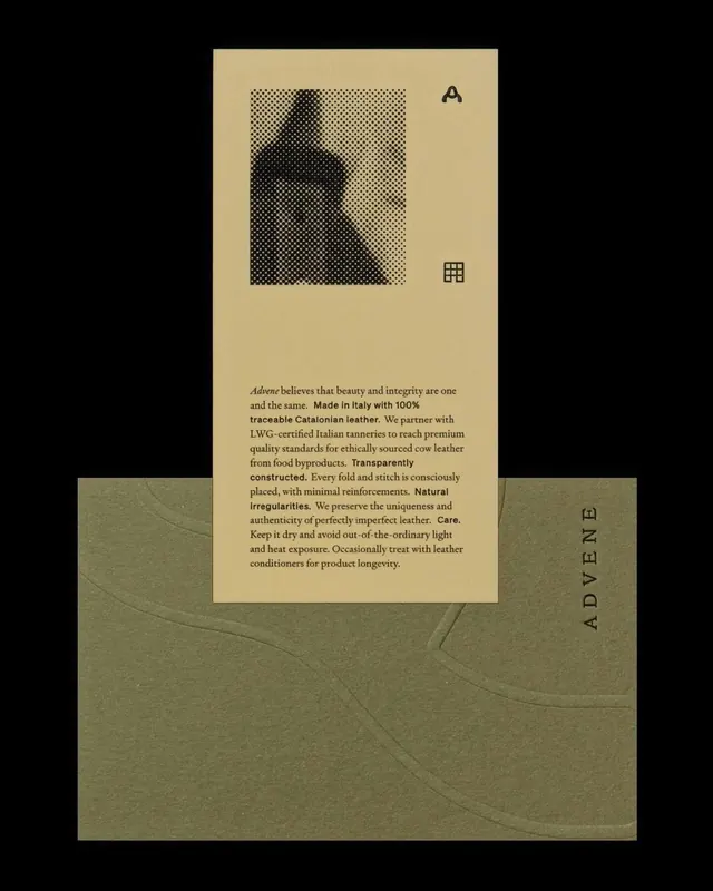
Cream brand card with a halftone portrait and serif story copy slotted into a blind-embossed olive sleeve carrying a vertical wordmark.
Summary
A piece of brand collateral photographed on black: a tan info card sliding out of an olive-green embossed sleeve. The defining detail is the tactile contrast of a coarse halftone photo and crisp serif copy on warm card stock against a blind-debossed sleeve.
Visual description
The composition centers a vertical cream-tan card whose top half holds a square, high-contrast halftone (dot-screen) portrait of a hooded figure. Below it, justified serif body copy tells a brand story, with key phrases like "Made in Italy", "Transparently constructed", "Natural irregularities" and "Care" set in bold to break the paragraph. Small black glyphs sit at the corners: an "A"-shaped logo mark top-right and a 3-by-3 grid icon mid-right. The card emerges from an olive-green sleeve embossed with soft blind-debossed curving lines, and the word "ADVENE" runs vertically in fine letterspaced caps up its right edge. Everything floats on a flat black background that exaggerates the warm earth tones.
Key takeaway
The earthy two-tone material palette (warm tan card plus muted olive sleeve) carried by texture rather than color saturation: a gritty halftone image, blind embossing on the sleeve, and a vertical letterspaced wordmark. Bolding individual phrases inside justified serif copy turns a paragraph into scannable brand pillars.
Reuse notes
Ideal reference for a sustainable, heritage, or craft product brand (leather goods, food, beauty) where tactility signals quality. The card-in-sleeve mechanic doubles as packaging and storytelling. Caveat: the look depends on real print finishes (emboss, halftone, uncoated stock), so it loses most of its impact rendered flat on screen. </content>
More like this
Keep what you find
A free account saves references to boards and can send you a weekly email of picks based on what you save.
To see every result, go Pro.