
Preview image. Unlock full-res
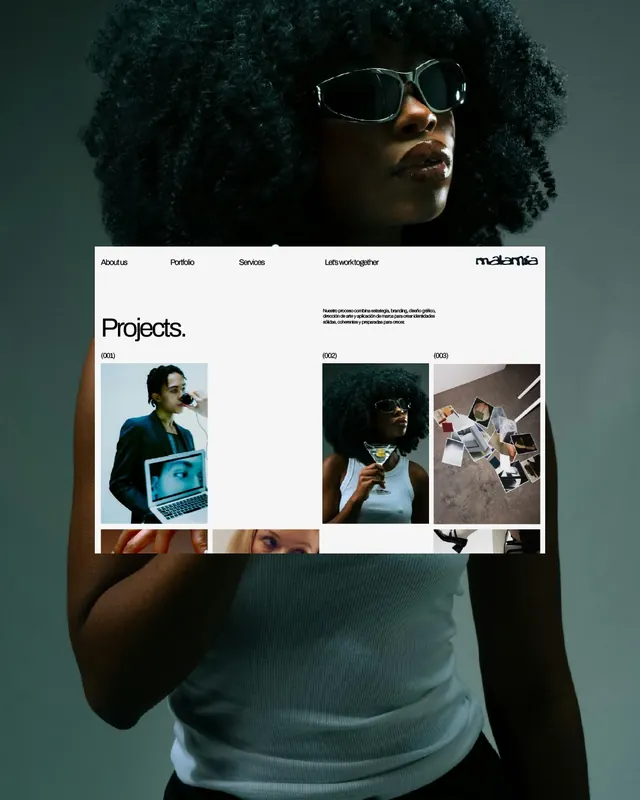
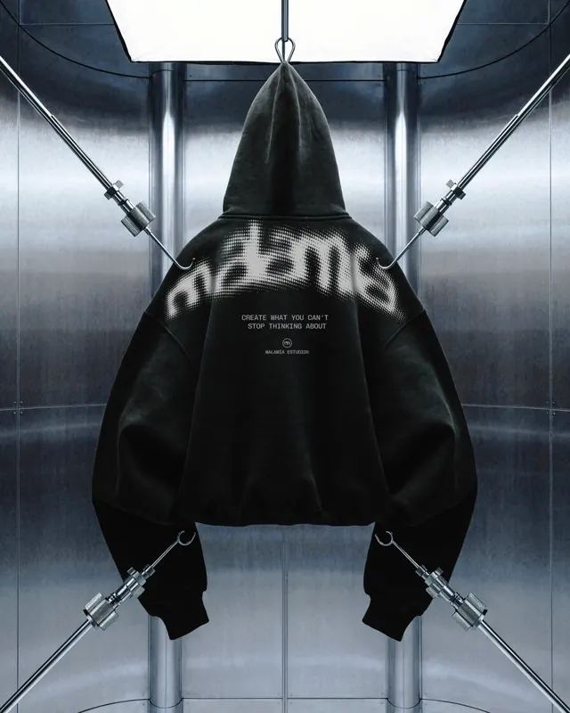
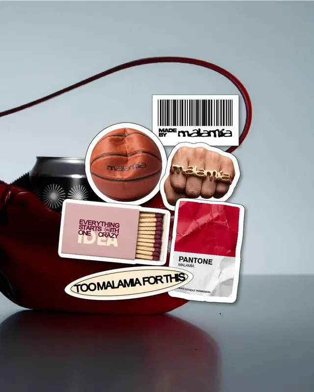
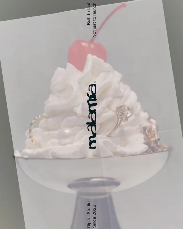
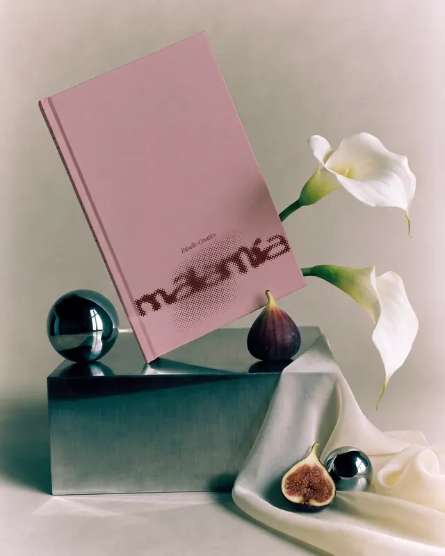
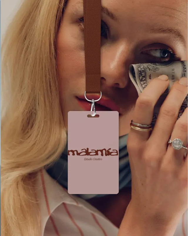
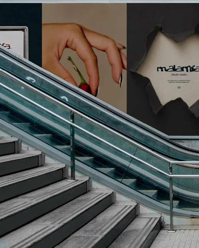
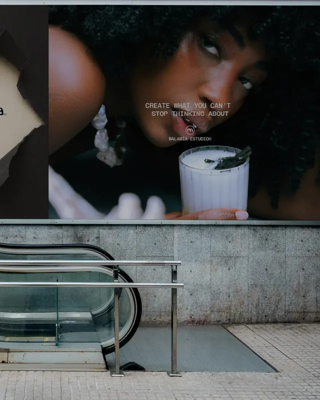
Dark, moody creative studio identity using cinematic photography, geometric grid overlays, and a distinctive modular wordmark system that rejects homogenization.

Summary
A Madrid-based creative studio's bold rejection of design homogeneity expressed through a cinematic visual system anchored by a distorted, modular wordmark and a pervasive grid overlay. The identity conveys creative confidence through dark, high-contrast photography and experimental typographic interventions.
Visual description
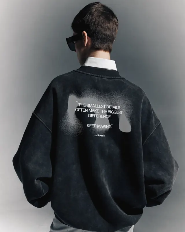
Black background dominates throughout. High-contrast, moody photography of textures, objects, and people in atmospheric lighting. A geometric grid overlay - white dotted lines creating rectangular cells - appears across many slides, organizing and fragmenting the composition. The MALAMÍA wordmark appears modular and distressed, sometimes split, rotated, or layered over photography. Supporting typography uses clean, condensed sans-serif in white or light gray against dark grounds. Colors are strictly limited to black, white, gray, and occasional warm-toned photography. Slides include object close-ups (fruits, materials, craft objects), architectural details, and studio documentation, all unified by the grid system and wordmark placement strategy.
Key takeaway
The grid overlay is not decorative - it becomes a methodology for dismantling and reconstructing visual content, embodying the studio's creative philosophy. The modular, sometimes broken wordmark signals that the studio is "too big to fit neatly," visually reinforcing the "no homogenization" positioning. The restrained monochrome palette and cinematic lighting elevate the studio beyond typical portfolio aesthetics into the realm of art direction.
Reuse notes
Excellent reference for creative services brands that want to assert bold, uncompromising positioning. The grid system is adaptable to many layouts and photography styles. The distorted wordmark technique risks looking dated if overused; best deployed when it genuinely reflects the studio's approach to projects. Works strongest on dark or neutral backgrounds. Motion content in the carousel (slide 2 video) adds cinematic dimension to what could be a flat type-heavy system.
From this post: MALAMÍA ESTUDIO creative studio branding
View post


More like this



Keep what you find
A free account saves references to boards and can send you a weekly email of picks based on what you save.
To see every result, go Pro.