Preview image. Unlock full-res
Woods Bagot identity system using stark black, vibrant green, and gray to structure comprehensive brand guidelines with clear hierarchy and documentation.
Summary
Woods Bagot identity system using stark black, vibrant green, and gray to structure comprehensive brand guidelines with clear hierarchy and documentation.
Visual description
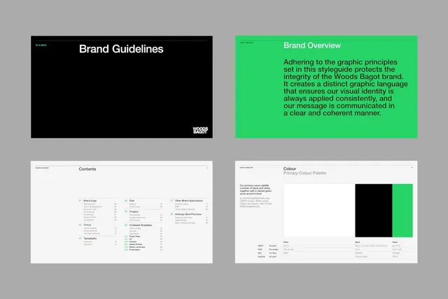
A four-panel spread showing branded guideline documentation. Top left is a black cover page with "Brand Guidelines" in white sans-serif and the Woods Bagot logo in bottom right. Top right features bright lime green background with black type reading "Brand Overview" and a dense paragraph of running text explaining the brand's graphic principles and visual-identity integrity. Bottom left shows a contents page with hierarchical listing of sections (Brand Logo, Colour, Grid, Imagery, Typography, etc.) with page numbers, using small colored bullets to indicate categories. Bottom right displays the color palette specification page with primary colors shown as large swatches: black, white, and the same bright green, accompanied by CMYK and RGB values. Layout is grid-based with consistent margins and type sizing throughout.
Key takeaway
Using a single accent color (vibrant green) to break hierarchy and draw focus through otherwise neutral layouts is powerful and economical. The contents page structure with color-coded bullets creates a scannable visual index without needing large illustrations. Showing color specifications alongside the applied color (green background + green swatch) reinforces brand application rather than just abstractly defining it.
Reuse notes
Ideal for architecture, design, or agency brands where systematic documentation and clear process are selling points. The high contrast and organization also work well for tech company guidelines. The bright accent color prevents corporate guidelines from feeling sterile. Works best with a clear value proposition or mission statement that justifies the green background on one panel (here it grounds the brand overview).
More like this





Keep what you find
A free account saves references to boards and can send you a weekly email of picks based on what you save.
To see every result, go Pro.