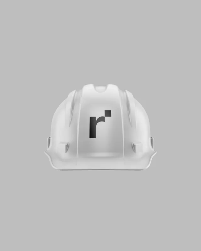
Preview image. Unlock full-res
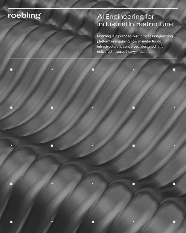
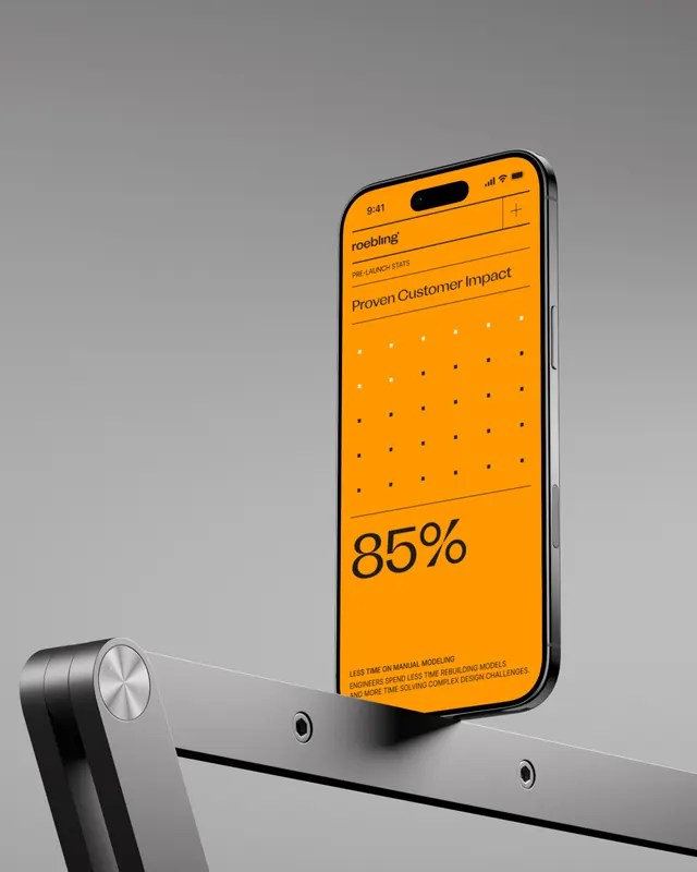
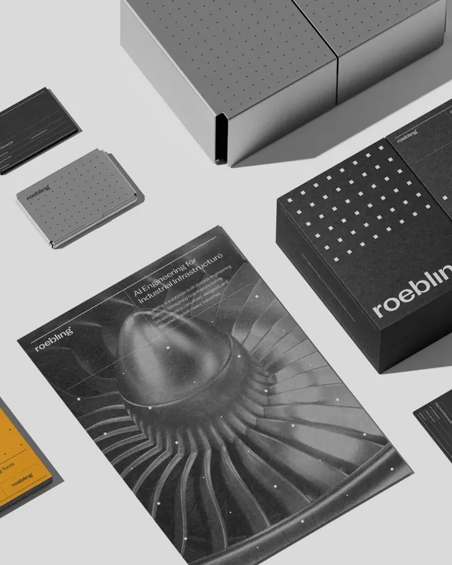
Technical SaaS branding for an AI-powered process engineering platform, where a single dot from the wordmark becomes the foundational design system element, scaling into dashboard grids and network visualizations.

Summary
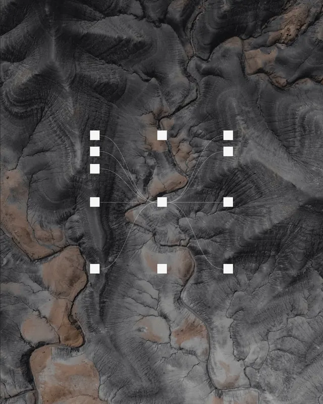
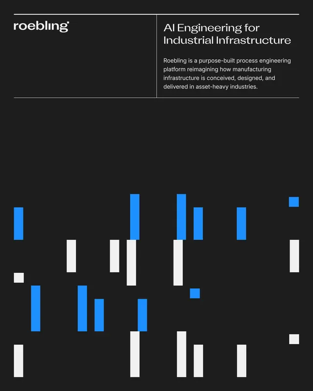
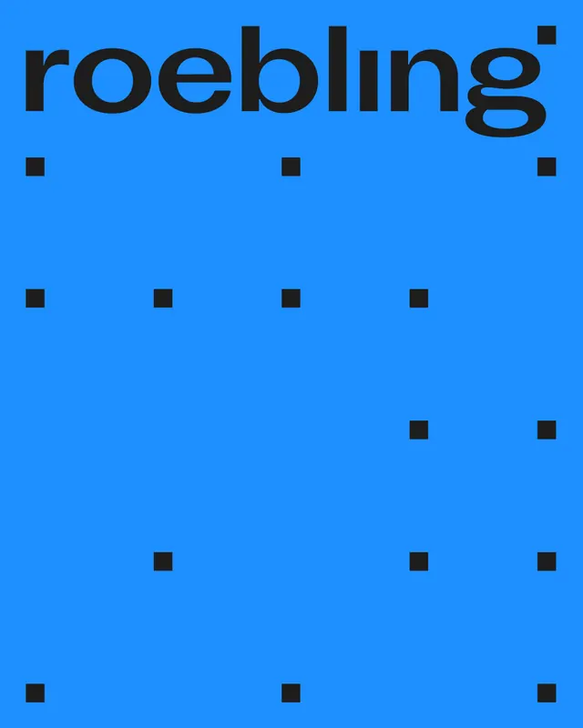
An industrial engineering SaaS identity where a single dot borrowed from the wordmark's i becomes the cornerstone of an entire visual system. The dot evolves into a node-based language, manifesting as dashboard grids, connection topologies, and process flow networks that directly reflect the product's core visualization paradigm.
Visual description
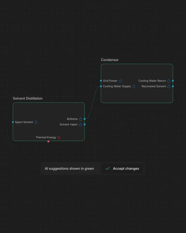
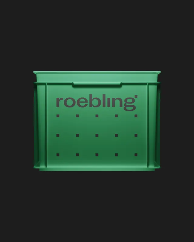
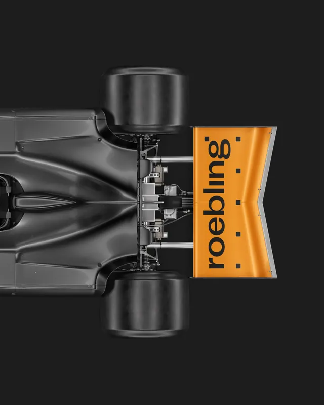
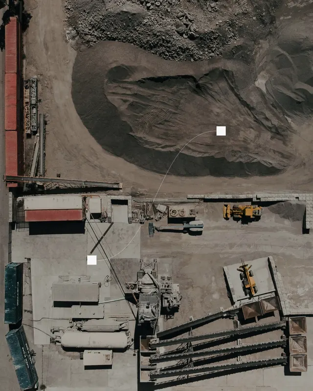
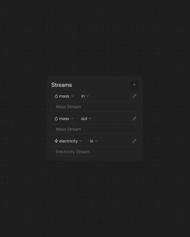
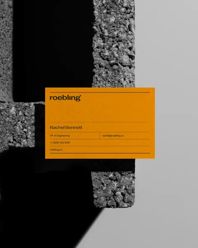
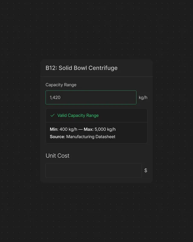
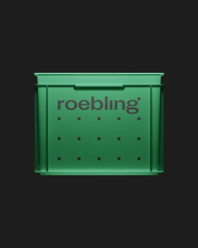
Light gray and white backgrounds create a minimal, technical foundation. Bright blue wordmark "roebling" in heavy geometric sans-serif set against neutral grounds, surrounded by and punctuated with small black squares arranged in grid patterns - representing nodal connection points. Slides expand the system through: architectural mockups of dashboard interfaces showing grid systems with node-to-node connections via white dotted lines and curves; aerial/satellite imagery of industrial infrastructure annotated with the dot-and-connection language; product interface screenshots; technical documentation layouts; and industrial equipment photography. Monochromatic execution (white, gray, black) with bright blue serving as a high-contrast accent. The dot-as-node motif appears consistently whether at typography scale or spanning building-scale contexts.
Key takeaway
The restraint and elegance of building an entire system from a single functional unit. The dot is borrowed from the i in "roebling" - not an external decoration but an integral part of letterform construction. This constraint-based thinking forces every application back to the core principle: nodes and connections, precision and networks. The minimal color palette and geometric precision communicate technical confidence without requiring illustration or complex iconography.
Reuse notes
Exemplary model for B2B/technical/SaaS brands where visualization and systems thinking are core to the product promise. The dot-as-node motif is particularly effective for platforms involving infrastructure, networks, workflows, data mapping, or spatial planning. The restrictive palette (light backgrounds, dark accents, single bright blue) ensures international legibility and sophisticated reproduction across print and digital. The system scales elegantly from business card to environmental graphics without losing coherence. Best suited to services with inherently visual/diagrammatic components. No embedded video in parent carousel; video likely appears in individual slides or as supporting content.
From this post: Roebling industrial engineering identity by Daniil Sergeev
View post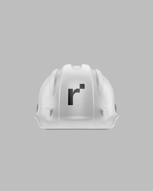




More like this

Keep what you find
A free account saves references to boards and can send you a weekly email of picks based on what you save.
To see every result, go Pro.