Preview image. Unlock full-res
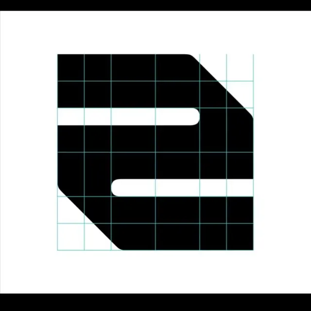
A chunky black lowercase 'a' letter-mark with rounded white channels, shown on a cyan construction grid that exposes how the glyph is built.
Summary
A heavy black geometric letter-mark reading as a lowercase 'a', cut by two rounded white channels and overlaid on a cyan construction grid that shows the glyph's underlying proportions. The defining move is presenting the finished mark together with its build grid.
Visual description
Centered on a white field is a near-square black glyph with two corners clipped on a 45-degree diagonal, giving it a beveled, almost floppy-disk silhouette. Two horizontal white slots with fully rounded ends are carved into the black mass, one across the upper-middle and one in the lower-middle, their negative space forming a stylized lowercase 'a'. A thin cyan-teal modular grid of equal squares runs across the whole mark, extending slightly beyond the black shape to read as a construction or sizing guide. Top and bottom black bands frame the composition. The palette is strictly black, white, and the single cyan grid line color.
Key takeaway
Showing the logo on its construction grid as the presentation itself, which signals craft and precision while doubling as a usage spec. Also carving the letterform from a solid block using two rounded slots, so negative space does the identifying work rather than drawn strokes.
Reuse notes
A good template for a single-letter app icon or developer-tool mark, and for a brand-guideline page that documents logo geometry. The grid overlay suits technical, SaaS, and tooling brands; drop it for the final lockup. The bevelled-square block style reads best for letters that tolerate heavy counters.