Preview image. Unlock full-res
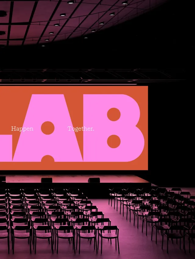
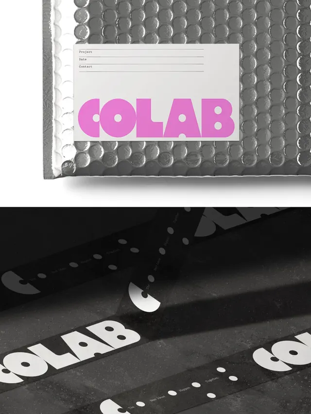
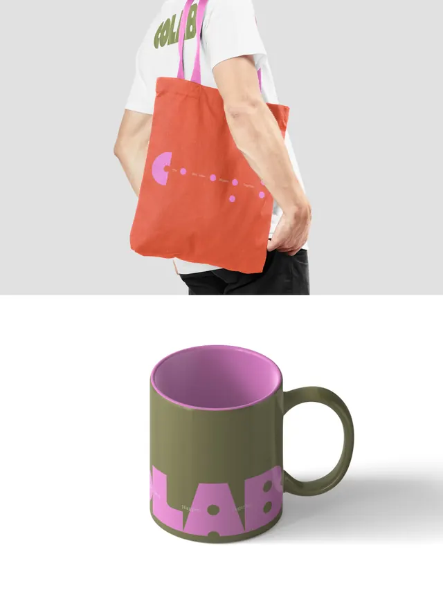
A kinetic, playful brand identity system for COLAB, a creative partnership studio, featuring an olive-green base with asymmetrically scattered hot-pink accent dots and flexible typographic treatments.

Summary
A vibrant, kinetic brand identity for COLAB, a creative partnership studio, built around an earthy olive-green palette punctuated by hot-pink accent dots arranged in organic, asymmetric patterns. The system conveys collaborative energy and creative partnership through playful, flexible design applications.
Visual description
Slides showcase a consistent but fluid identity system. Base color is a muted olive or sage green used as a primary background. Bright hot-pink circular dots are scattered asymmetrically across compositions, suggesting movement and connection. Typography is clean sans-serif, often centered or dramatically sized. Early slides display the mark and dot system in isolation or paired with simple text. Later slides show real-world applications: printed materials, environmental graphics, branded packaging (mugs, bags, posters), and digital mockups. The dot pattern shifts across slides, never the same twice, suggesting a generative or flexible system that feels alive. One slide includes video elements, adding motion to the visual language. Overall mood balances minimal, organized design with playful, spontaneous energy.
Key takeaway
An identity system that uses asymmetric patterning to suggest spontaneity and partnership while maintaining visual cohesion through a tight color palette and consistent mark. The flexibility of the dot placement shows how a simple system can feel fresh across many applications. The color choice, warm and muted rather than bright, positions the studio as accessible and human-centered.
Reuse notes
Perfect for creative agencies, design studios, and partnership-focused organizations seeking to signal both professionalism and friendliness. The flexibility of the dot system allows for unique applications on each touchpoint, preventing brand monotony. Works particularly well across digital, print, and environmental contexts. The playful energy pairs well with bold typography and generous white space. May feel less formal than suited for highly conservative industries.
From this post: COLAB creative studio brand identity
View post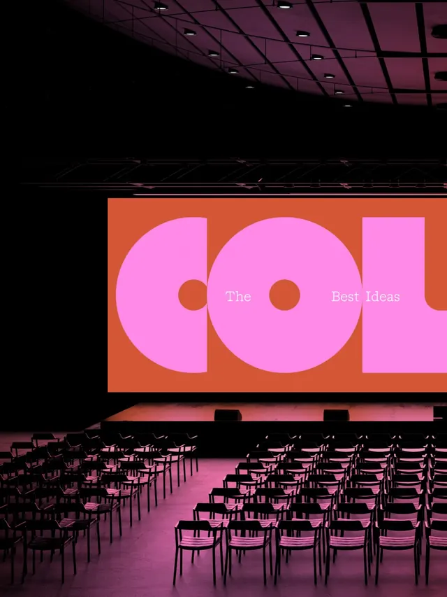
More like this


Keep what you find
A free account saves references to boards and can send you a weekly email of picks based on what you save.
To see every result, go Pro.