Preview image. Unlock full-res
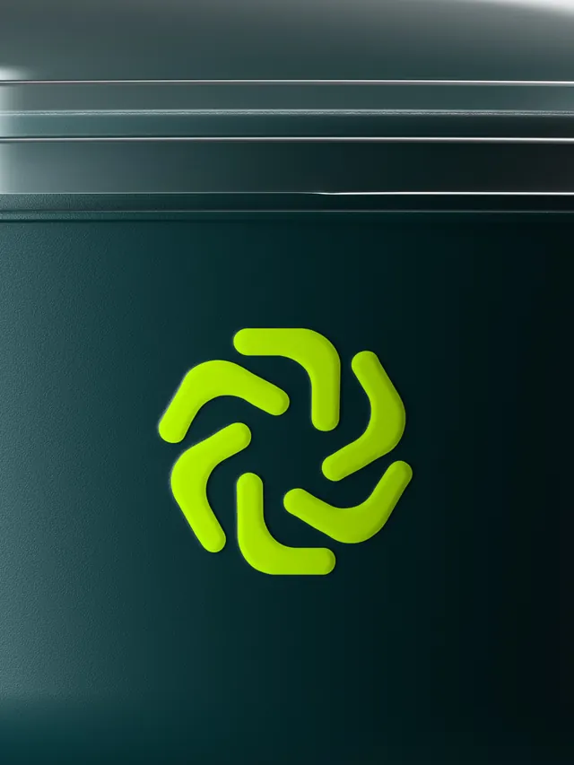
Vibrant rebranding for Bumerang, a B2B platform for reusable beverage containers in hospitality, centered on an abstract curved mark in neon yellow-green and teal.

Summary
A playful rebrand for Bumerang, shifting focus from the container itself to the cycle of reuse through a curved, dynamic mark. The new identity trades the old container-centric aesthetic for an energetic system centered on motion and return, expressed in neon color and sculptural form.
Visual description
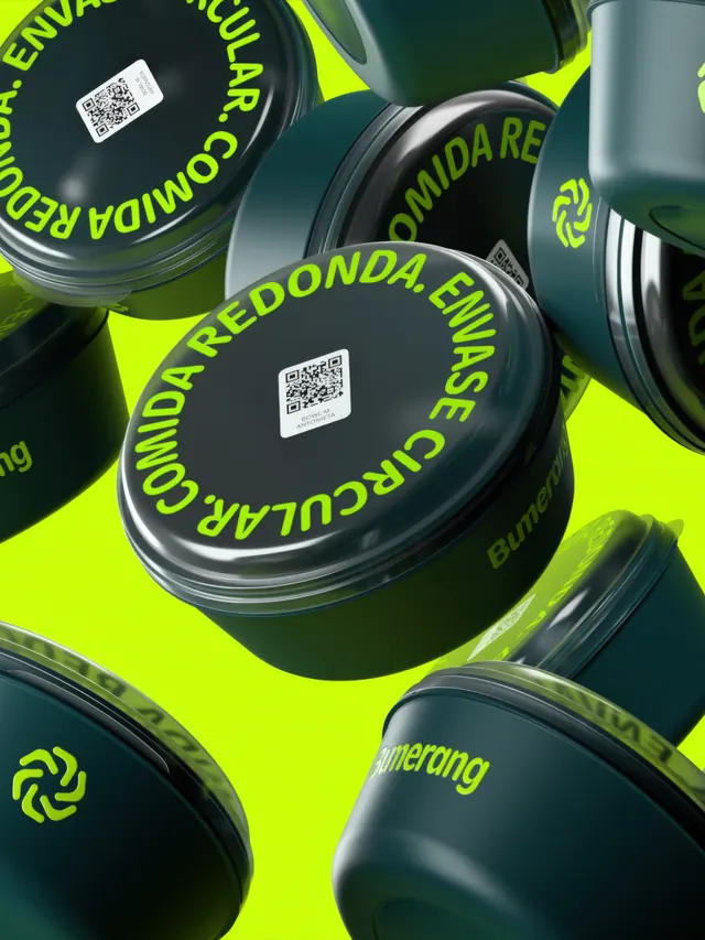
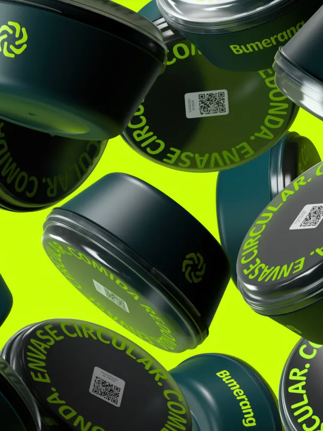
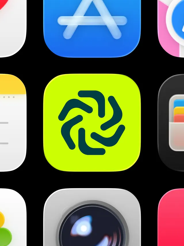
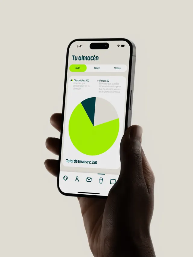
The primary mark is an abstract, flowing curved shape rendered in teal-green against neon yellow backgrounds. The poster slide displays the mark centered at scale. Product photography shows it applied to cylindrical reusable containers labeled in the platform's vibrant color scheme, with QR codes and the wordmark positioned on curved surfaces. The system includes supporting typography and various applications from collateral to digital interfaces, all maintaining the high-contrast neon and teal palette. The video component suggests animated applications. The curves evoke both a forward-turning motion and cyclical closure, reinforcing the sustainability message.
Key takeaway
Using abstract, gestural forms and high-saturation color to make a B2B sustainability product feel approachable and energetic rather than corporate or didactic. The curved mark works at multiple scales and on product surfaces, demonstrating how sculptural design can integrate into physical manufacturing.
Reuse notes
Effective for sustainability and circular-economy platforms targeting hospitality and food service. The vibrant palette demands careful color management on physical products to avoid appearing cheap or overwhelming in real-world contexts. Works best paired with clean, minimal typography to balance the expressive mark.