Preview image. Unlock full-res
Comprehensive brand identity and visual system for AidKit, a platform delivering aid with dignity through clean typography, vibrant accent color, and connected linework.

Summary
A brand identity for AidKit featuring a bold red accent color, connected linework pattern, and minimalist sans-serif typography that emphasizes the brand's focus on community connection and delivering aid with dignity.
Visual description
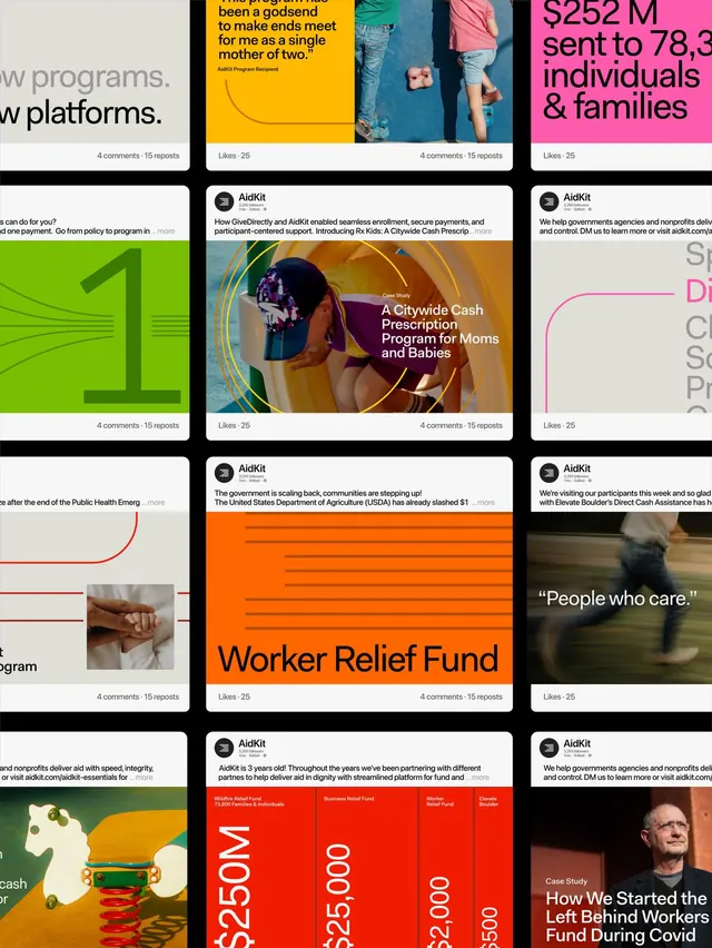
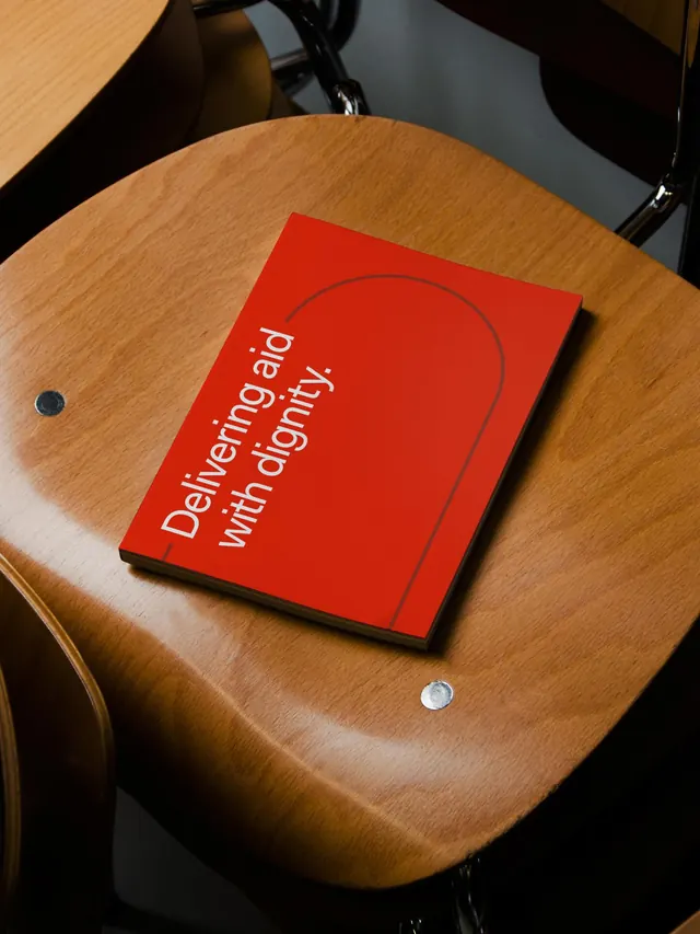
The carousel opens with an animated red curved line against a gradient background (video frames), followed by a systems view showing AidKit's core values in stacked text layout: "Platform Purpose Speed Dignity Clarity Scale Programs Care Efficiency" in muted gray sans-serif on a light background. Typography appears within a grid of Instagram posts showcasing various program initiatives. A red binder or folder on a wooden surface bears the tagline "Delivering aid with dignity" in clean sans-serif, demonstrating the identity applied to physical collateral. The red used throughout (#FF4500 or similar) provides strong visual continuity.
Key takeaway
The connecting linework strategy creates visual unity across a system without requiring a literal logo, and the single vibrant accent color grounds the identity while keeping the overall system minimal and accessible.
Reuse notes
Strong model for nonprofits, social impact organizations, or mission-driven platforms that need a flexible system balancing professionalism with warmth. The emphasis on connected lines rather than a single mark offers flexibility for marketing and collateral applications. Works well when paired with case study layouts and program photography.