Preview image. Unlock full-res
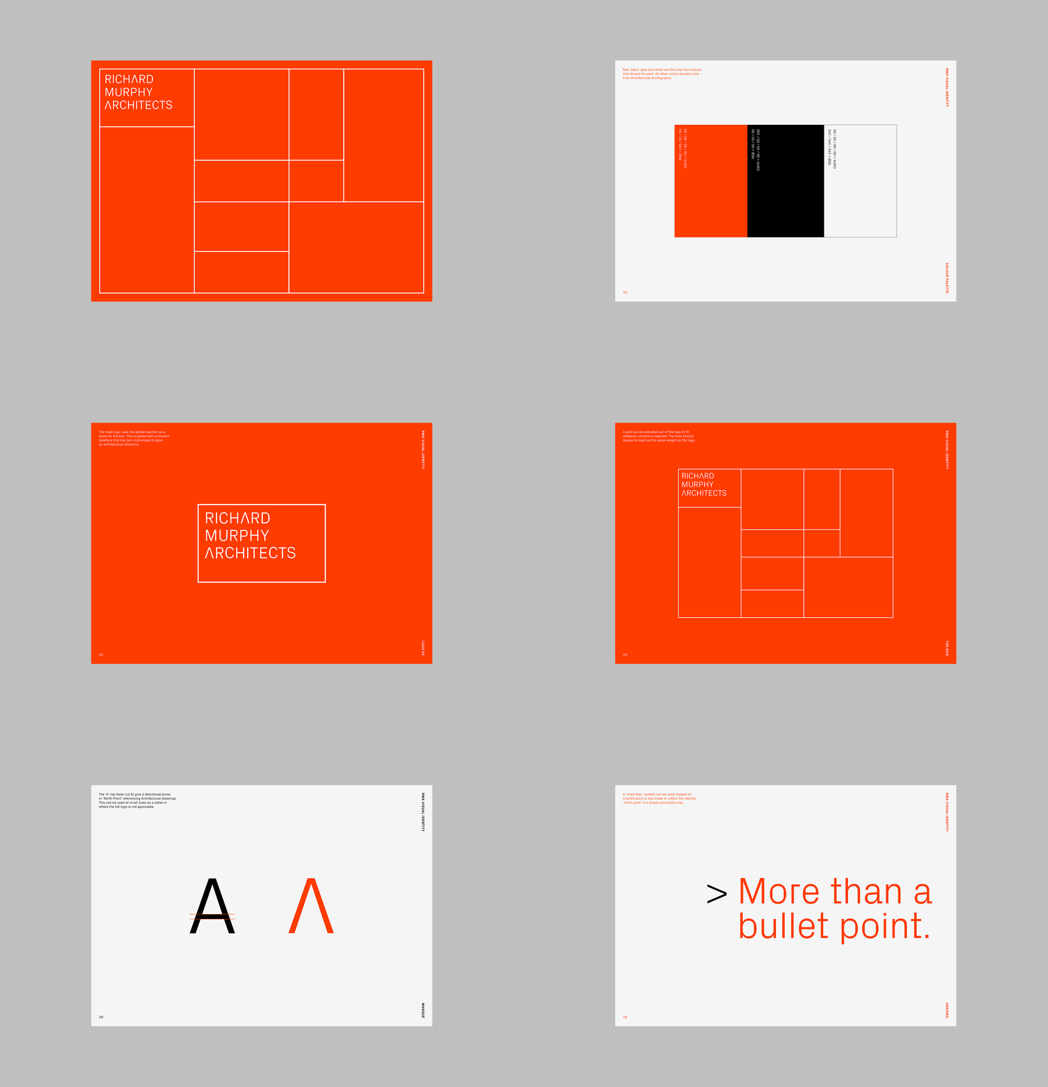
Modular architectural identity system using a bold orange field divided by white gridlines, with logotype placed in the top-left compartment.
Summary
A modular identity system for an architecture firm using a bold orange field subdivided by white gridlines into irregular rectangular compartments, demonstrating how the grid can flexibly contain logos, imagery, and layered brand elements.
Visual description
A bright orange background divided by white lines into a modular grid of uneven rectangles across three rows and four columns. The top-left compartment contains "RICHARD MURPHY ARCHITECTS" in stacked uppercase sans-serif, white on orange. The remaining compartments are empty orange fields, establishing the system's capacity to hold diverse content (photography, additional type, illustrations) within a consistent spatial framework. The grid proportions vary intentionally, creating visual rhythm while maintaining geometric discipline. Medium gray border frame encloses the entire composition.
Key takeaway
A modular grid system that lets one color and one typeface flex across multiple layouts and content types. The irregular but purposeful compartment proportions feel structured yet adaptive. Using white lines and a single bright accent color creates immediate visual hierarchy and professional credibility without complexity.
Reuse notes
Strong reference for architecture, real estate, or professional services where you need a system that accommodates both text and imagery. Works well when you have a dominant brand color worth repeating boldly. The grid approach signals competence and precision; best paired with substantial, high-quality photography or layered content that justifies the compartments.
More like this




Keep what you find
A free account saves references to boards and can send you a weekly email of picks based on what you save.
To see every result, go Pro.