Preview image. Unlock full-res
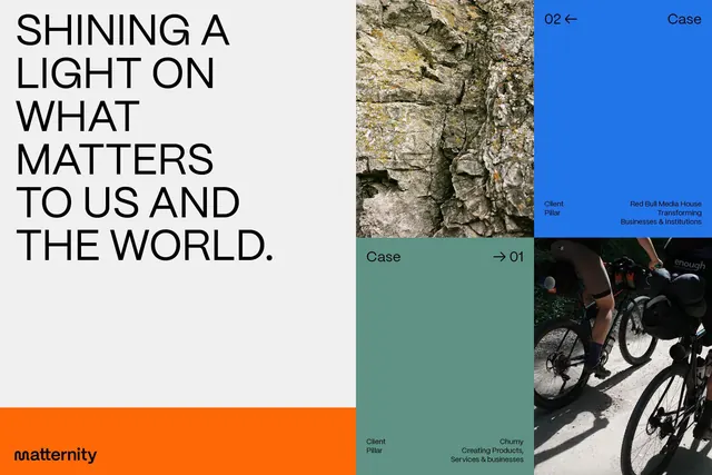
Maternity brand visual identity using bold color blocking: bright blue, teal, orange, and charcoal segments with photography, case examples, and a sans-serif wordmark.
Summary
A nonprofit or consulting brand identity for Maternity using asymmetric color-blocked sections: a bold headline on white, bright blue navigation, teal case tiles with photography and client labels, orange footer band, and paired dark-on-light typography.
Visual description
The composition is divided into irregular quadrants using hard-edge color blocking and geometric section breaks. The dominant left section is white with a large left-aligned headline in black sans-serif reading "Shining a light on what matters to us and the world." Below that, the orange band and Maternity wordmark sit in the lower left. The right side splits into four zones: upper-right is a bright cobalt blue with navigation labels (Case, Client Pillar, Red Bull Media House) and right-arrow indicators. The lower-right quadrants contain teal-green backgrounds with photography overlays (textured stone, bicycle on pavement) and metadata labels (Case 01, Client Pillar, Cherry, Creating Products). The typography is clean sans-serif in black and white. Navigation numbers and labels are minimal and modern.
Key takeaway
Asymmetric color blocking creates visual hierarchy and emotional punch without grid formality. The palette moves from cool (blue, teal) to warm (orange), creating energetic movement. Hard-edge transitions between color zones feel contemporary and confident. Layering photography under semi-transparent or adjacent color fields adds depth. The sans-serif is legible at multiple sizes and weights, pairing strong headlines with small utility labels effectively.
Reuse notes
Ideal for nonprofits, consultancies, and impact-focused brands that need to communicate transformation and client success. The visual system works at multiple scales (case studies, presentations, websites). The color intensity reads as hopeful and forward-thinking rather than corporate-sterile. Caveat: the asymmetric layout requires careful planning to avoid chaotic overflow; label and photography placement is critical to legibility. Strong choice for presentation slides and annual reports.
More like this





Keep what you find
A free account saves references to boards and can send you a weekly email of picks based on what you save.
To see every result, go Pro.