Preview image. Unlock full-res
Multi-slide brand identity renewal for a 42-year Korean environmental conservation campaign, featuring hand-drawn heart-shaped emblem with forest and river, applied across collateral and environmental activism.

Summary
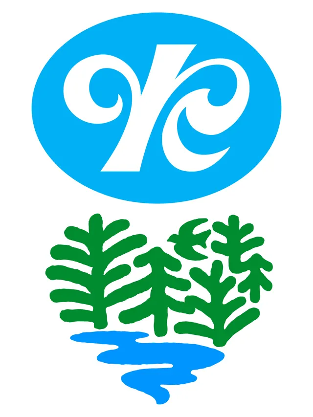
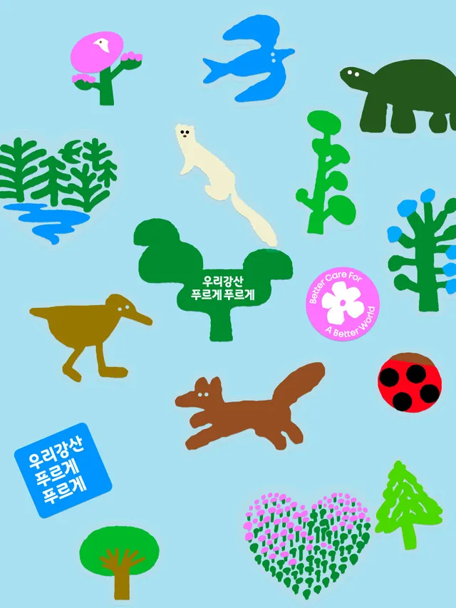
A heritage brand redesign for a 42-year Korean environmental conservation campaign, updating the 1984 heart-and-birds emblem with hand-drawn illustration of forest, river, and returning birds connected within a heart shape, applied across campaign materials, merchandise, and public engagement.
Visual description
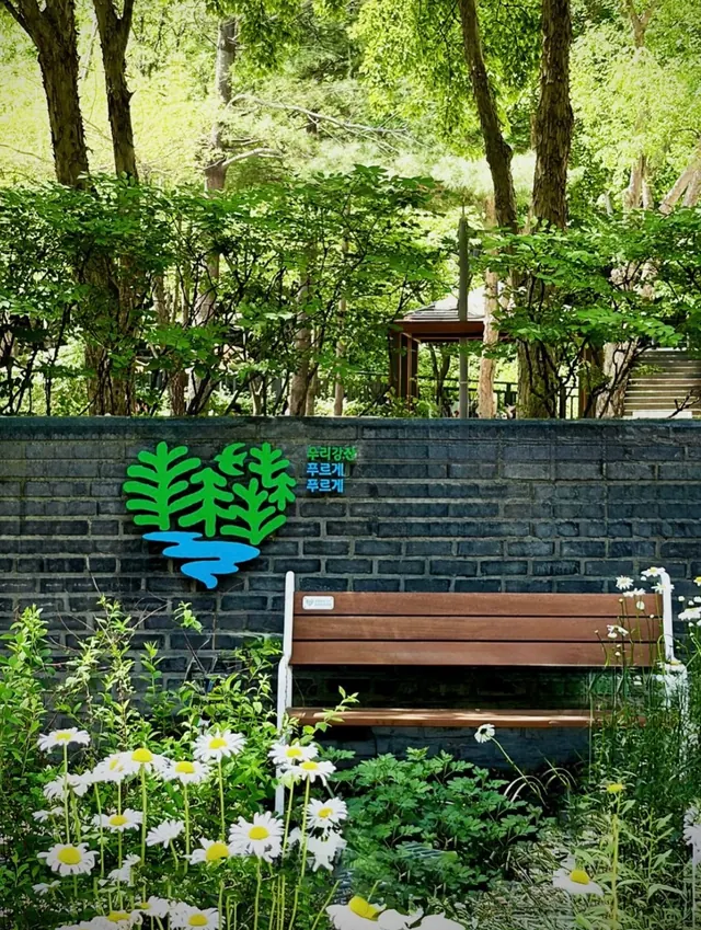
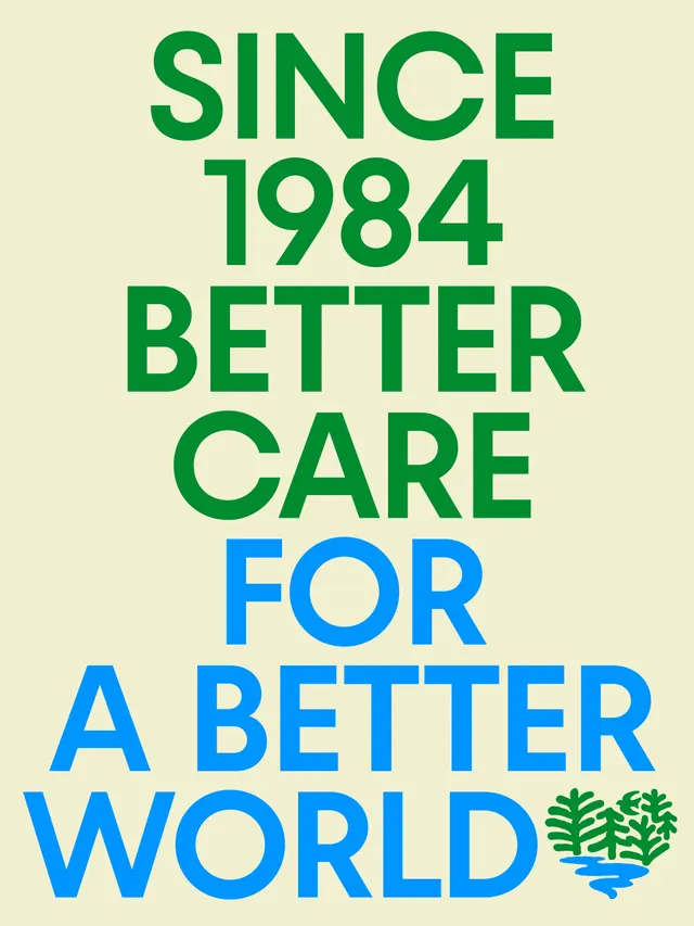
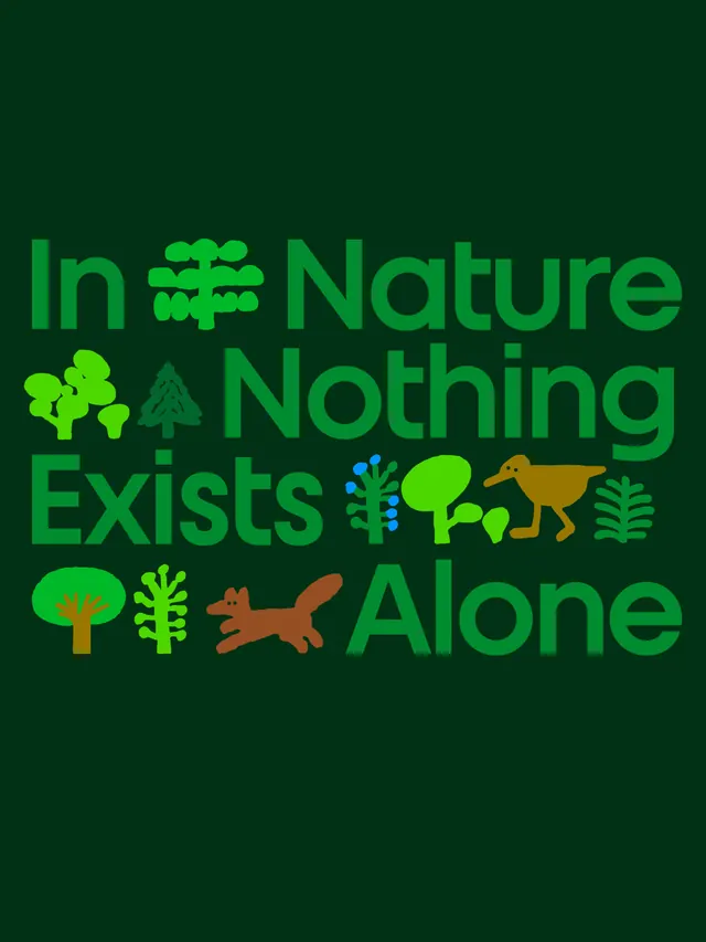
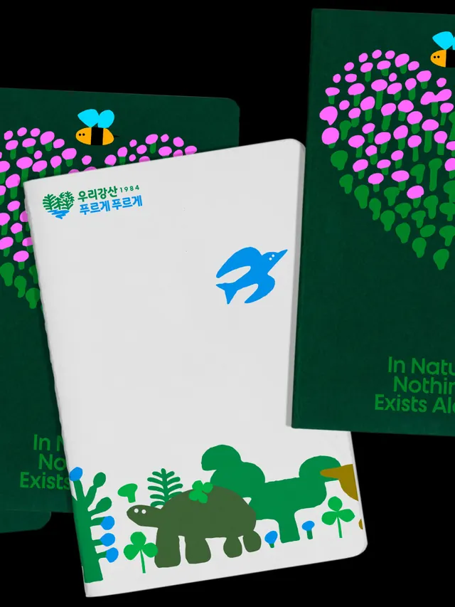
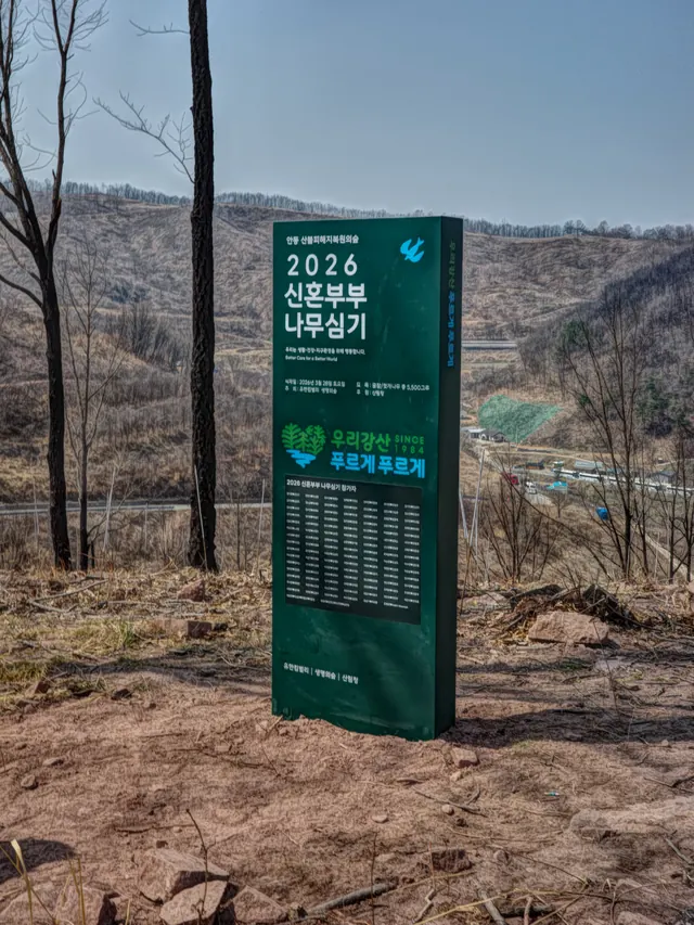
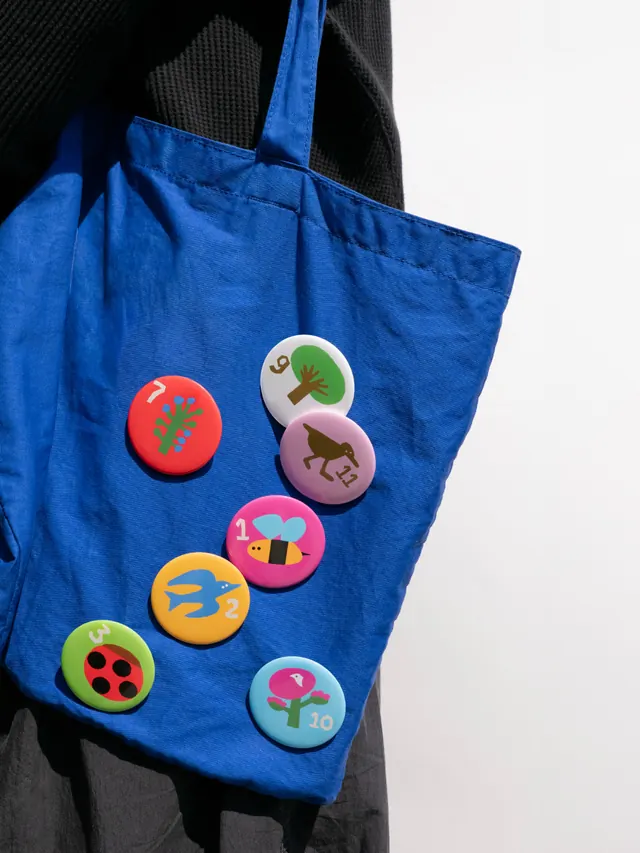
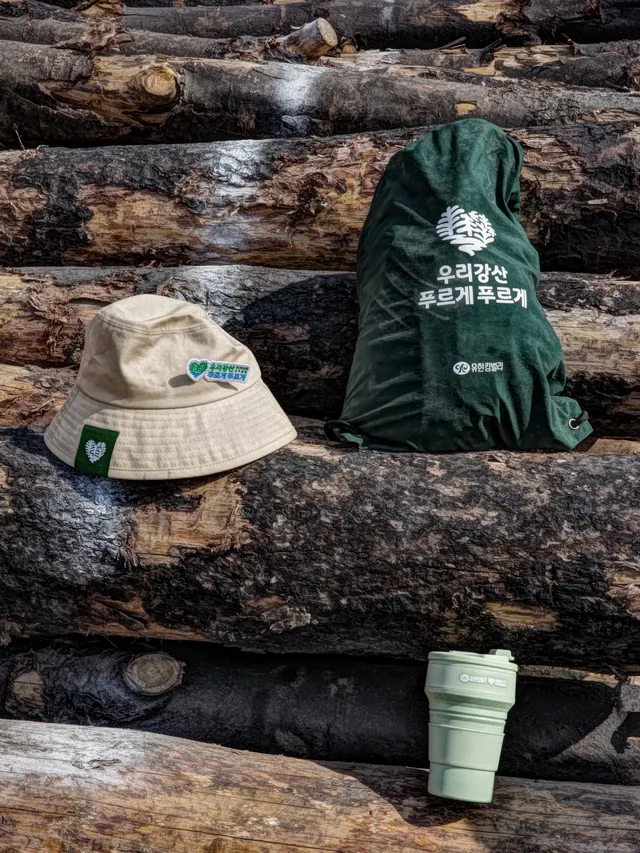
Slide 1: Video of campaign heritage and emblem evolution. Slides 2-13 show: a history timeline documenting design evolution from 1984 to 2026; environmental messaging and sustainability statistics; the new emblem-a heart shape composed of hand-drawn trees (green), a flowing river (blue), and a returning bird, rendered with tactile, informal line work suggesting human touch; the same emblem on environmental campaign materials, park signage, and typography; product applications including tote bags and merchandise; outdoor photography from reforestation efforts; close-ups of emblem detail; and supporting copy about the campaign's evolution from corporate tree-planting to citizen engagement in ecosystem restoration.
Key takeaway
Updating a legacy environmental brand by honoring original intent (heart-shaped landscape, returning birds) while modernizing execution through hand-drawn illustration that humanizes corporate sustainability messaging. The tactile, imperfect line work communicates genuine care and citizen participation rather than corporate polish.
Reuse notes
Essential case study for nonprofits and sustainability organizations needing heritage brand refreshes. The hand-drawn approach and emphasis on ecosystem symbolism (trees, water, birds, heart) creates emotional resonance that purely corporate or geometric approaches miss. Works across multiple languages and cultural contexts due to universal symbolism. The connection between emblem history and current action (documented reforestation trips) demonstrates authentic brand practice, not just visual refresh. Ideal for campaigns seeking to mobilize community participation in environmental stewardship.
From this post: Korean environmental campaign identity redesign carousel
View post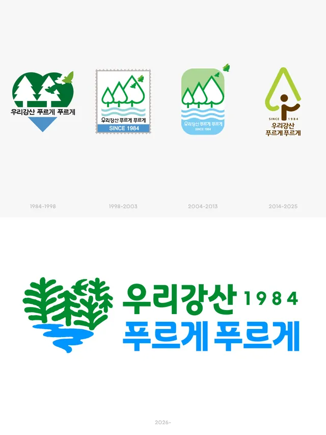
More like this



Keep what you find
A free account saves references to boards and can send you a weekly email of picks based on what you save.
To see every result, go Pro.