Preview image. Unlock full-res
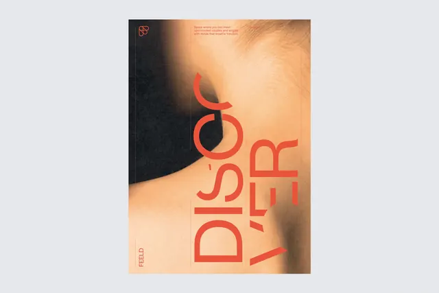
Feeld dating app brand identity system featuring large coral geometric letterforms over warm, intimate photographic background with skin tones and organic textures.
Summary
Feeld's dating app branding overlays a bold coral geometric wordmark reading "FEELD" across a warm, intimate photograph of human skin and fabric, demonstrating confident type hierarchy over sensory imagery.
Visual description
A vertical poster composition overlays large coral-red geometric sans-serif letterforms spelling "FEELD" against a sensual photographic background of warm skin tones, hair, and textured fabric. The background shifts from dark charcoal shadow on the far left to warm, peachy-tan tones across the center and right. A distinctive small coral logo mark—two overlapping curved shapes forming an abstract double loop—sits in the upper left corner above tagline text in small coral type. The left edge displays "FEELD" vertically in a condensed serif font in coral. The bold wordmark typography anchors the composition while the organic photographic background humanizes and softens the geometric forms.
Key takeaway
Pairing oversized geometric type with intimate, sensory photographic imagery creates emotional depth and memorability. The high contrast between the clean coral letterforms and organic textures conveys confidence without coldness. The small supporting logo and tagline establish hierarchy without competing for attention.
Reuse notes
Effective approach for dating, lifestyle, and consumer apps seeking to balance modernity with human warmth. The sensual photographic background works because it is specific to Feeld's positioning—apply this technique only when authenticity to brand values is paramount. The coral-on-warm-tone color relationship requires careful color tuning for legibility. The composition's poster-like quality translates well to social, print, and app store contexts but demands high-quality source photography to carry the visual weight.
More like this




Keep what you find
A free account saves references to boards and can send you a weekly email of picks based on what you save.
To see every result, go Pro.