Preview image. Unlock full-res
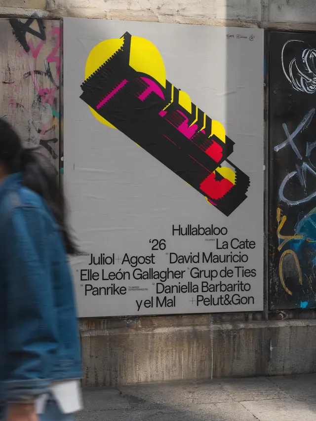
Evolving visual identity for Hullabaloo, an independent music festival that rejects a fixed logo in favor of a flexible graphic system using bright geometric shapes and high-contrast color.

Summary
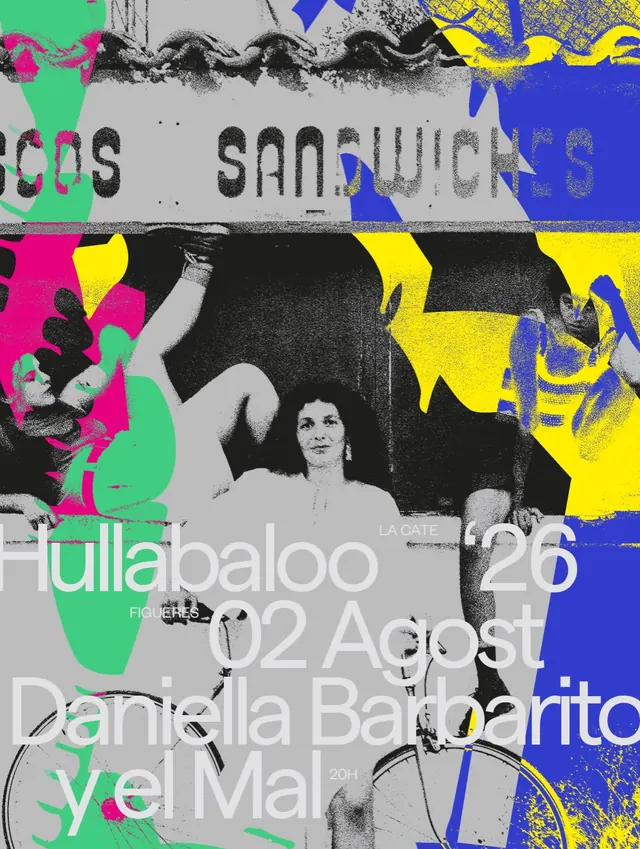
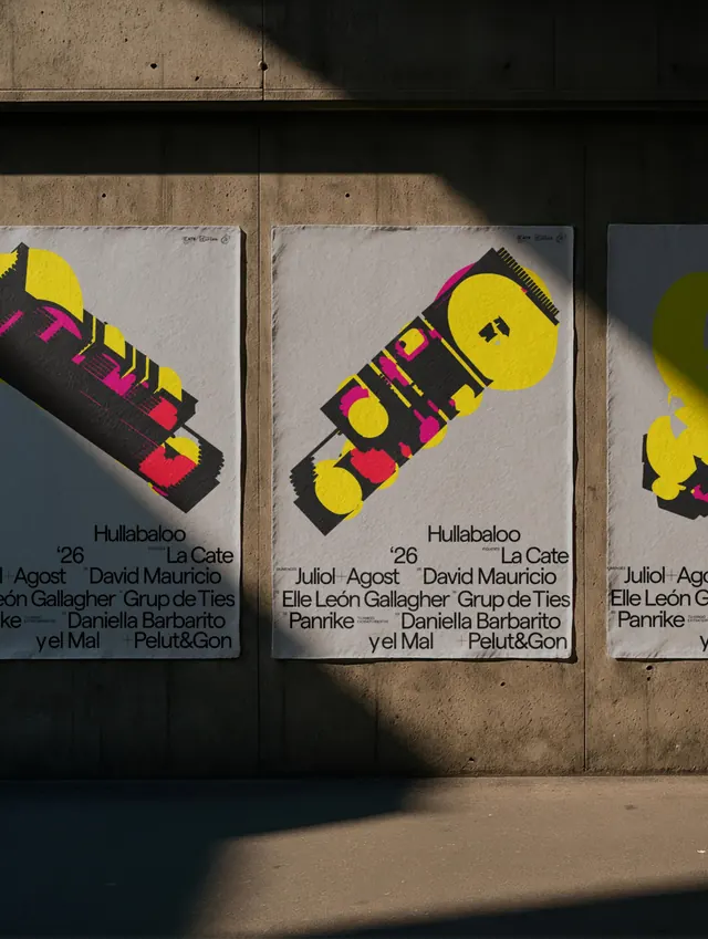
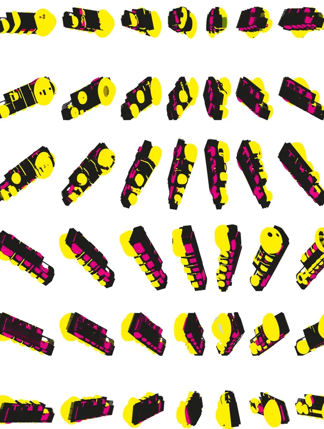
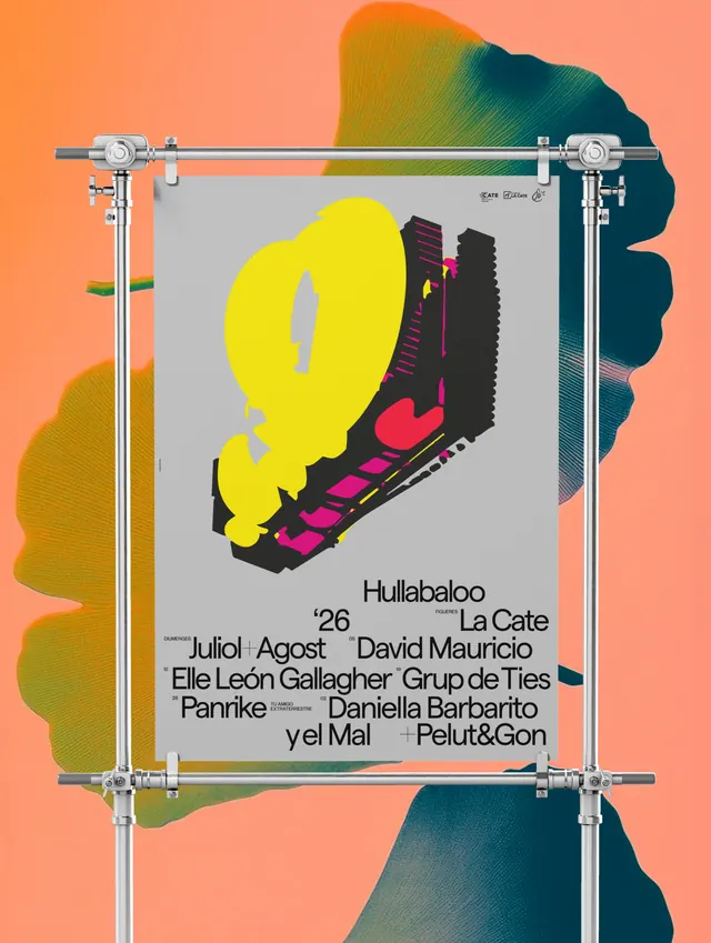
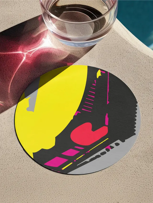
Visual identity for Hullabaloo, a music festival that deliberately eschews a fixed logo in favor of an evolving graphic system. Using bright geometric abstraction in yellow, magenta, red, and black, the identity appears across posters, collateral, and environmental graphics, with the system itself as the brand rather than any single mark.
Visual description
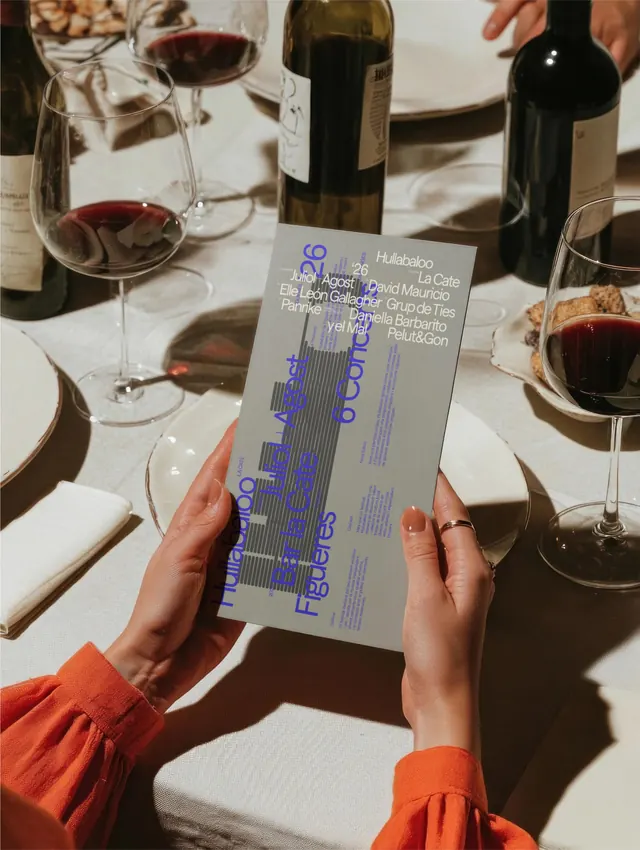
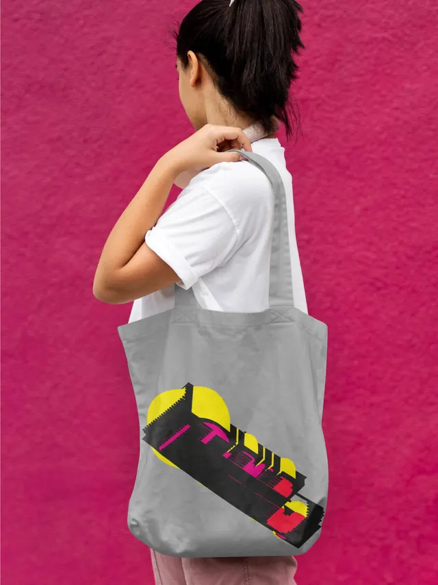
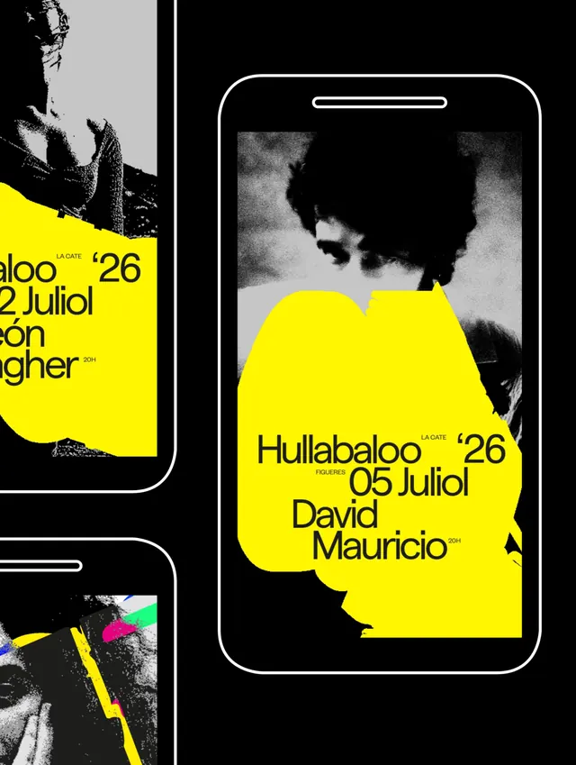
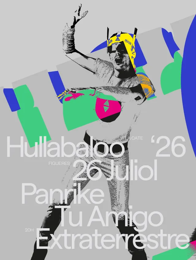
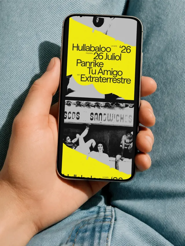
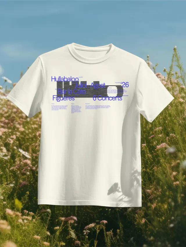
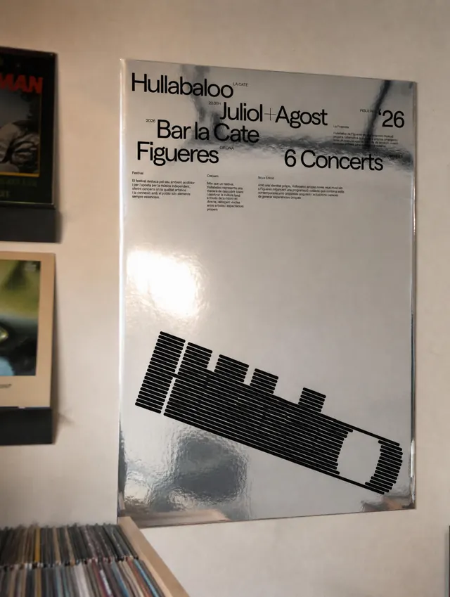
The cover image shows a geometric composition of bold, colorful abstract shapes: circles, rectangles, and curved forms in yellow, magenta, red, and black arranged on a light gray background at a diagonal angle. The poster slides reveal expansive applications: large-scale printed posters combining the geometric elements with the festival name, dates, location (Figueres, La Cate, Juliol/Agost), and lists of performers and collaborators in layered sans-serif type. Collateral includes wine glasses with printed elements, apparel and merchandising, printed bags, records, and environmental graphics on walls and street surfaces. The system remains visually cohesive through its restricted but vibrant color palette and geometric language, with no traditional logo, allowing infinite variation while maintaining family resemblance. Video component suggests animated or motion applications.
Key takeaway
A festival identity that uses systematic geometric abstraction and color constraint rather than a singular mark or wordmark. This approach signals creative independence, allows fresh expressions each year, and creates a system flexible enough to adapt to any format while remaining instantly recognizable through color and compositional style.
Reuse notes
Exemplary for music festivals, cultural events, and organizations that value artistic expression and evolution over brand consistency. The high-saturation palette demands careful application in print to avoid posterization or color shift. Works exceptionally well on large environmental and poster formats. Would require clear guidelines to prevent the system from becoming chaotic with excessive variation. Less suitable for professional or corporate contexts where fixed recognition is critical.