Preview image. Unlock full-res
Complete brand architecture system for a global infrastructure company, showcasing corporate identity guidelines, typography, color palette, and branded collateral applications.

Summary
A comprehensive brand identity system for Cantord, transforming a fragmented industrial presence into an authoritative corporate asset. The presentation documents engineering-focused brand architecture, typography choices, strategic color palette, and real-world application examples.
Visual description
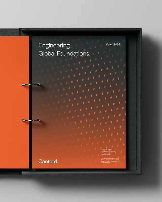
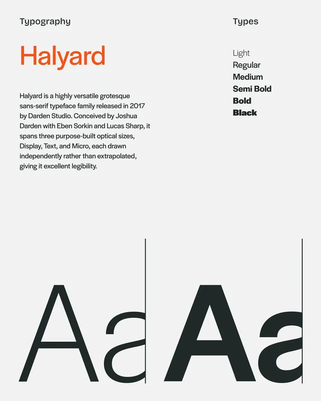
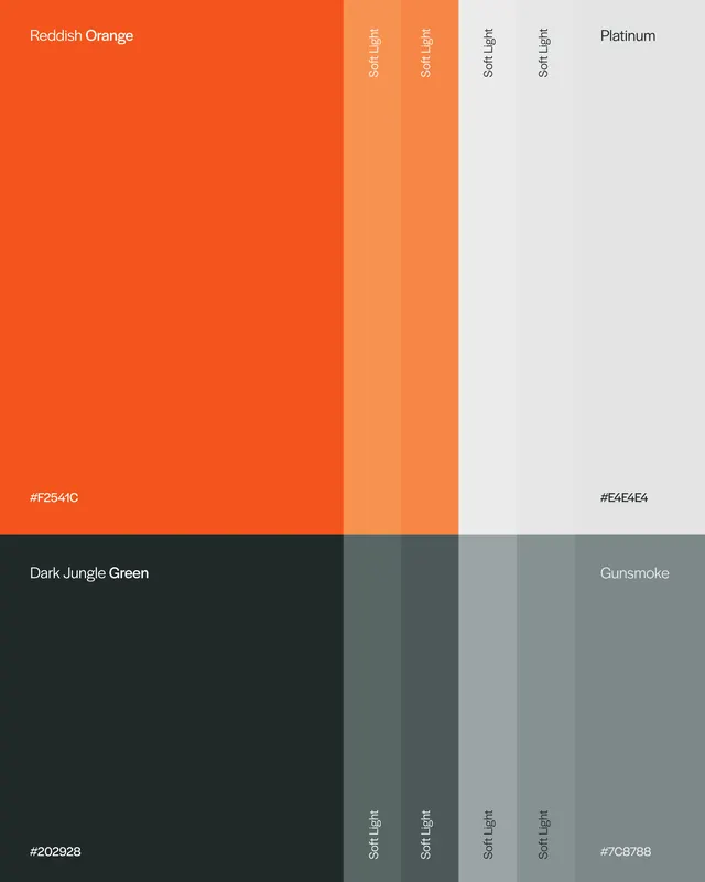
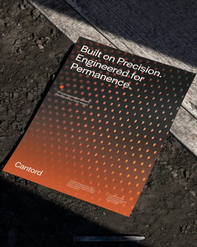
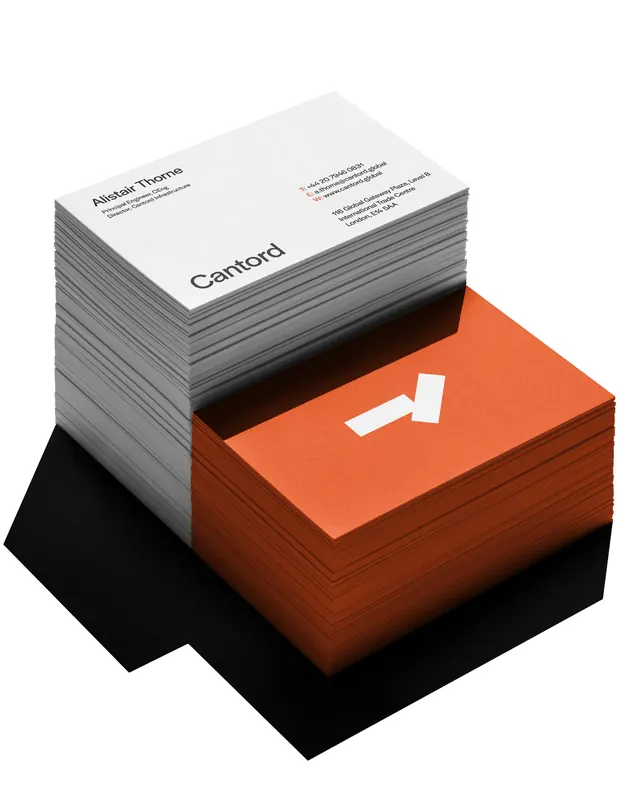
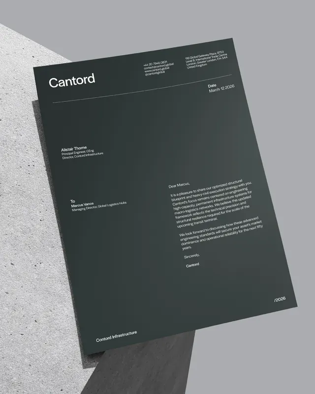
The carousel opens with the Cantord mark, an angular geometric "R" in white against a vibrant reddish-orange background, with the registered trademark symbol. Subsequent slides reveal a complete identity system: a binder-style brand guidelines document with the mark and core messaging, wall-mounted campaign posters showing the tagline "Built on Precision. Engineered for Permanence" alongside infrastructure photography, a typography breakdown showcasing Halyard sans-serif in multiple weights (Light through Black), a structured color palette card with hex values including reddish-orange primary, platinum, dark jungle green, and neutral grays with softlight variants, printed collateral applications (letterhead with company contact information), and a hand-written letter from a company representative on branded stationery.
Key takeaway
The identity succeeds through structural discipline: a bold primary color paired with neutral and dark tones, supported by one versatile typeface across multiple weights. The system works equally well at corporate scale (letterhead, business correspondence) and installation scale (large posters, environmental graphics). The constraint of precision and engineering language strengthens rather than narrows the application.
Reuse notes
Strong reference for B2B corporate identity work, particularly for technical or infrastructure-focused companies needing institutional authority. The color-first approach and geometric wordmark create memorable, scalable assets. Works best with real-world photography and serious messaging; guard against using this as a template for playful or consumer brands without substantial adaptation.