Preview image. Unlock full-res
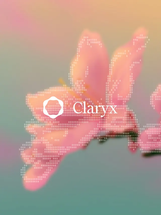
A warm, geometric brand identity for a cybersecurity company featuring pixelated hand shapes, gradient backgrounds, and a playful color palette of pinks, corals, and soft yellows.

Summary
A warm, geometric brand identity for Claryx, a cybersecurity company built to challenge industry conventions. The system uses pixelated hand shapes, soft gradients, and a playful color palette to convey trust and accessibility instead of fear.
Visual description
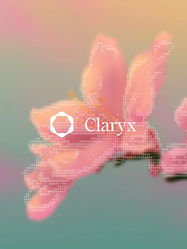
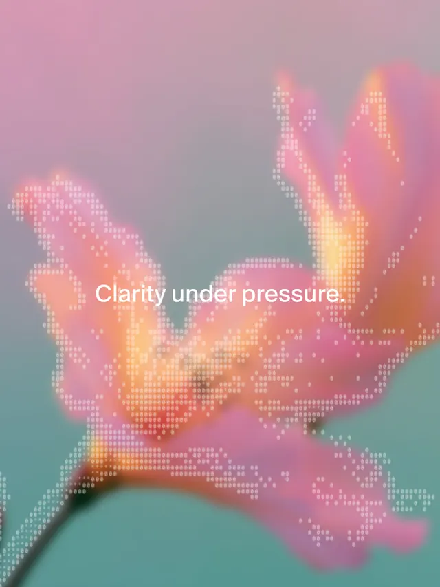
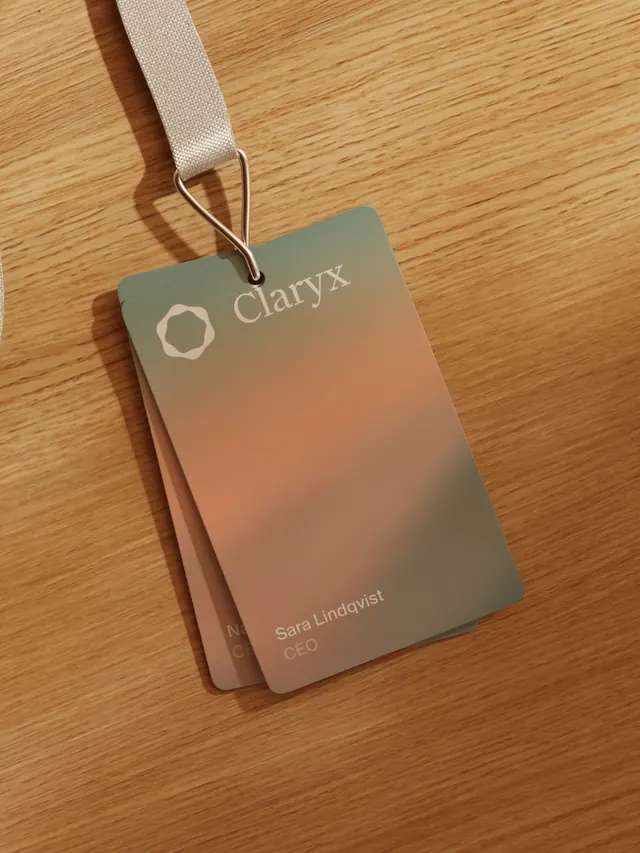
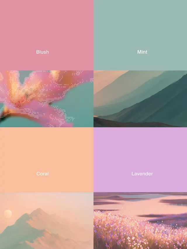
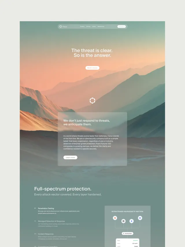
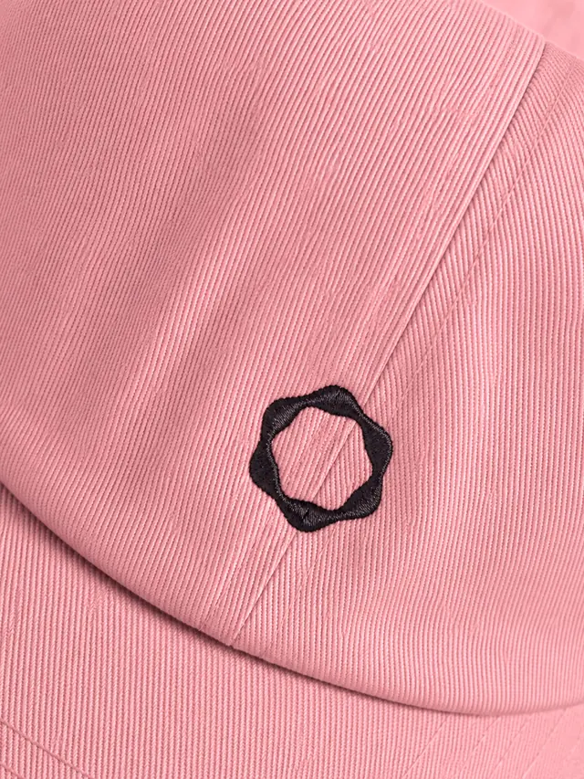
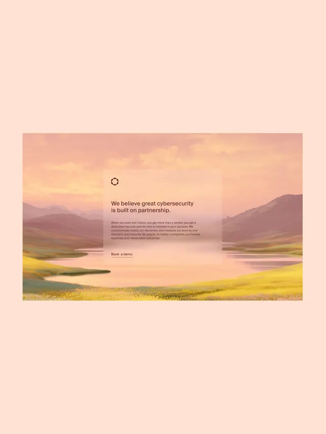
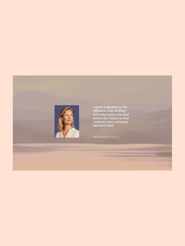
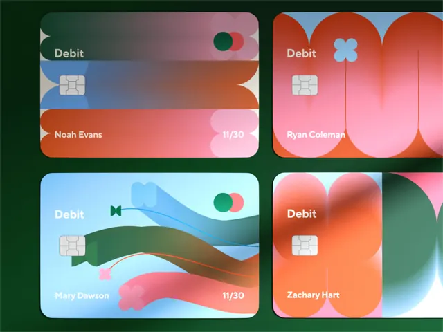
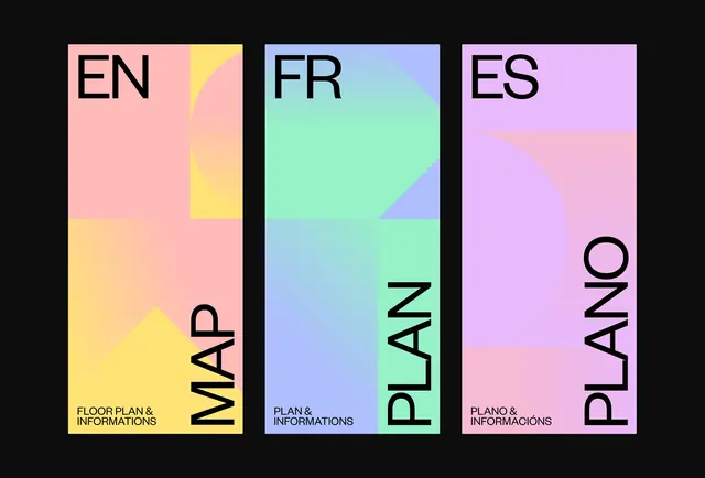
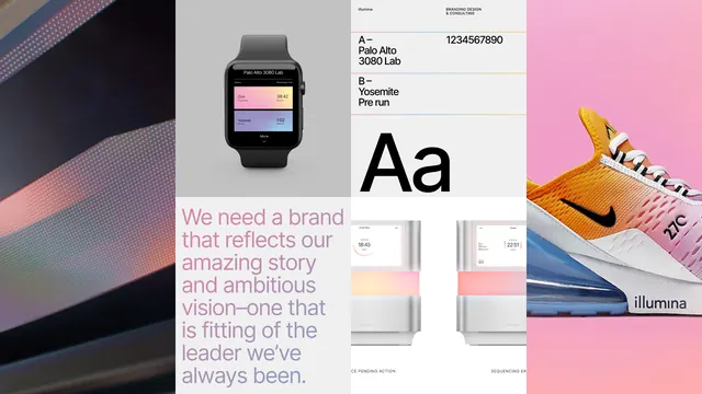
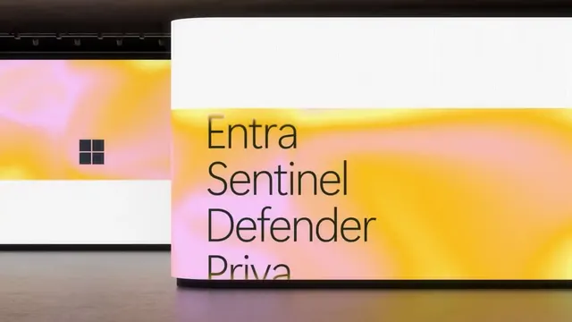
The carousel opens with a pixelated hand shape in soft pinks and peach tones against a gradient background that shifts from coral and pink to soft green and blue tones. The Claryx logo appears as a clean, rounded mark beside lowercase wordmark type in white. Subsequent slides show the identity applied across displays, cards featuring team member names (Sara Lindqvist, CEO), a color palette card with named colors (Blush, Mint, Coral, Lavender), UI applications on screens, physical branded objects, and printed collateral including a magazine spread with the brand's visual system and messaging.
Key takeaway
The power of warm, trusting design in an industry dominated by dark, technical aesthetics. The pixelated geometric elements create visual interest while the soft, blended gradient palette signals approachability without sacrificing confidence or professionalism.
Reuse notes
Strong reference for B2B security or technical products targeting both enterprise and startup audiences. The warm color choices and playful geometric treatment work well for brands wanting to humanize complex technology. The gradient mesh technique and pixelated hand shapes are specific techniques worth borrowing for similar identity projects.