Preview image. Unlock full-res
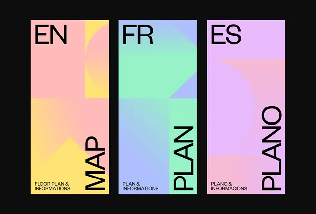
Three-panel graphic with different language labels—MAP (English), PLAN (French), PLANO (Spanish)—each with distinct pastel-to-neon gradient color blocks and vertically rotated type.
Summary
Three vertical panels displaying the same concept in three languages—MAP (English), PLAN (French), PLANO (Spanish)—each featuring a unique pastel-to-bright-gradient color scheme and vertically rotated typography.
Visual description
Black background with three tall rectangular panels side by side. Left panel (pink/yellow gradient): "EN" label top left, "MAP" rotated vertically on the right side, "FLOOR PLAN & INFORMATIONS" small text bottom left. Center panel (blue-to-green gradient): "FR" label top left, "PLAN" rotated vertically on the right, "PLAN & INFORMATIONS" bottom left. Right panel (pink-to-purple gradient): "ES" label top left, "PLANO" rotated vertically on the right, "PLANO & INFORMACIÓNES" bottom left. Geometric triangular shapes accent each panel's gradient transition.
Key takeaway
Using color and language variants to create visual rhythm and hierarchy across multilingual content. Rotating the primary word vertically creates a distinctive reading experience and makes each panel visually distinct. Gradient color blocking provides both aesthetic appeal and functional differentiation.
Reuse notes
Excellent template for multilingual navigational or informational systems, particularly in design, architecture, or cultural contexts. Each language variant receives visual distinction through color while maintaining structural consistency. The vertical orientation of key terms is striking at large scale but may need alternatives for smaller or mobile applications.
More like this


Keep what you find
A free account saves references to boards and can send you a weekly email of picks based on what you save.
To see every result, go Pro.