Preview image. Unlock full-res
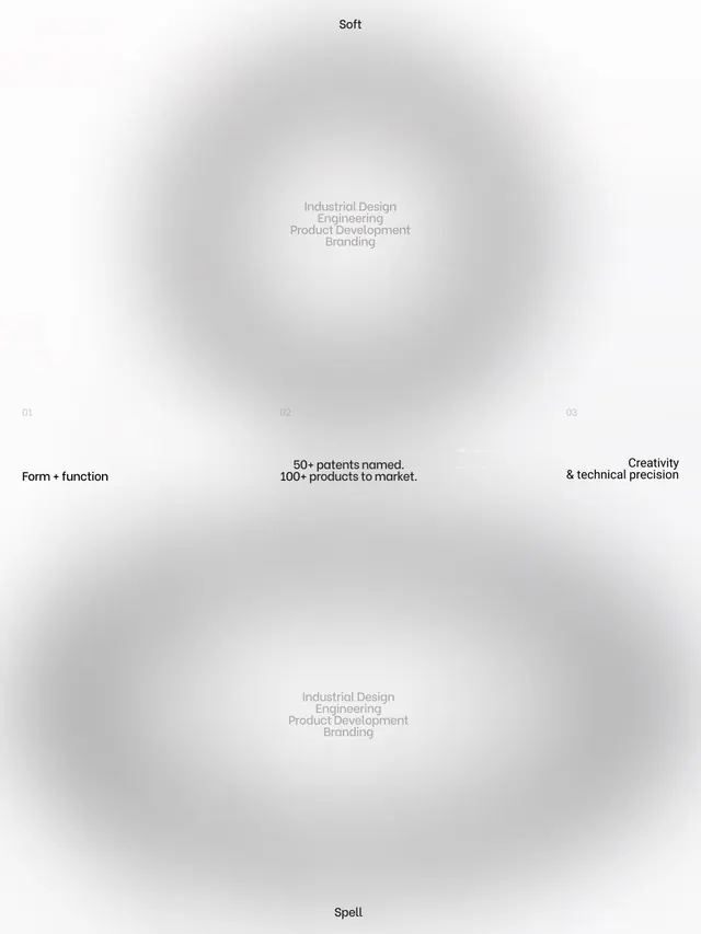
A ten-slide brand identity carousel for Soft Spell, a product-design studio. Showcases logo design, form+function philosophy, parametric product studies, and design principles through minimalist typography and refined layout systems.

Summary
A comprehensive ten-slide brand identity system for Soft Spell, balancing bold conceptual messaging with rigorous engineering focus. The identity emphasizes form+function through clean typography, parametric product documentation, and a modular cross mark symbol.
Visual description
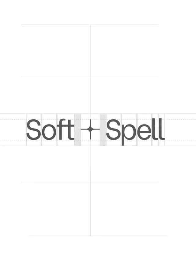
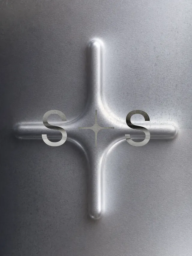
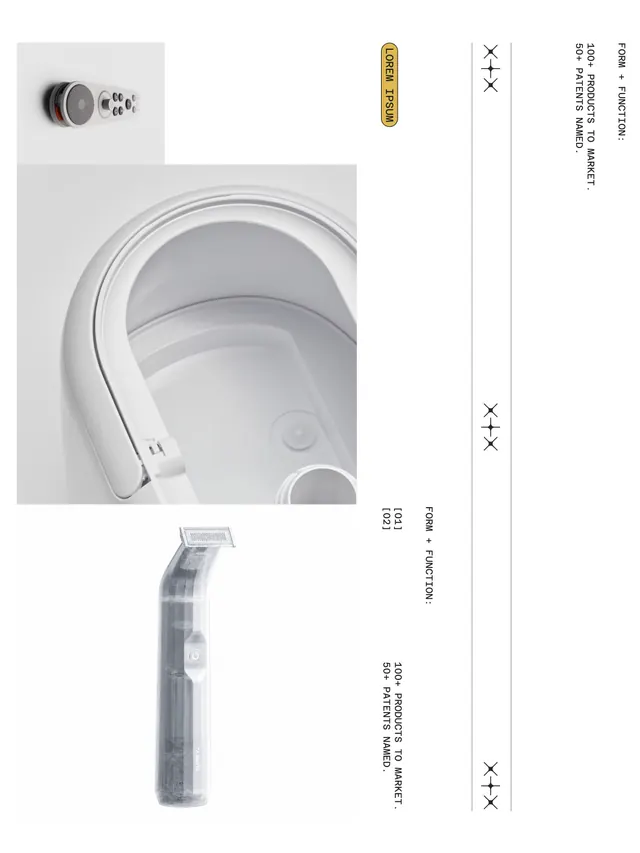
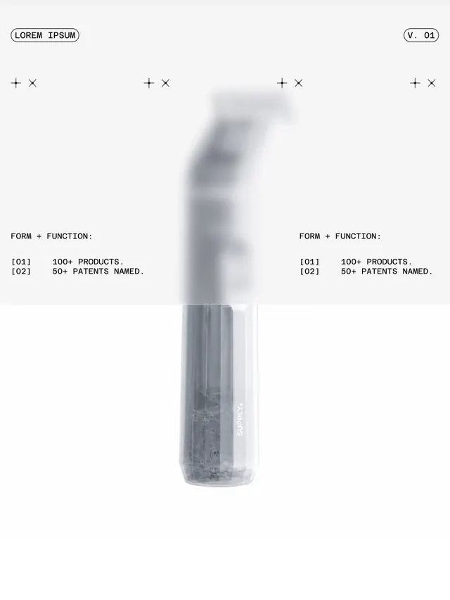
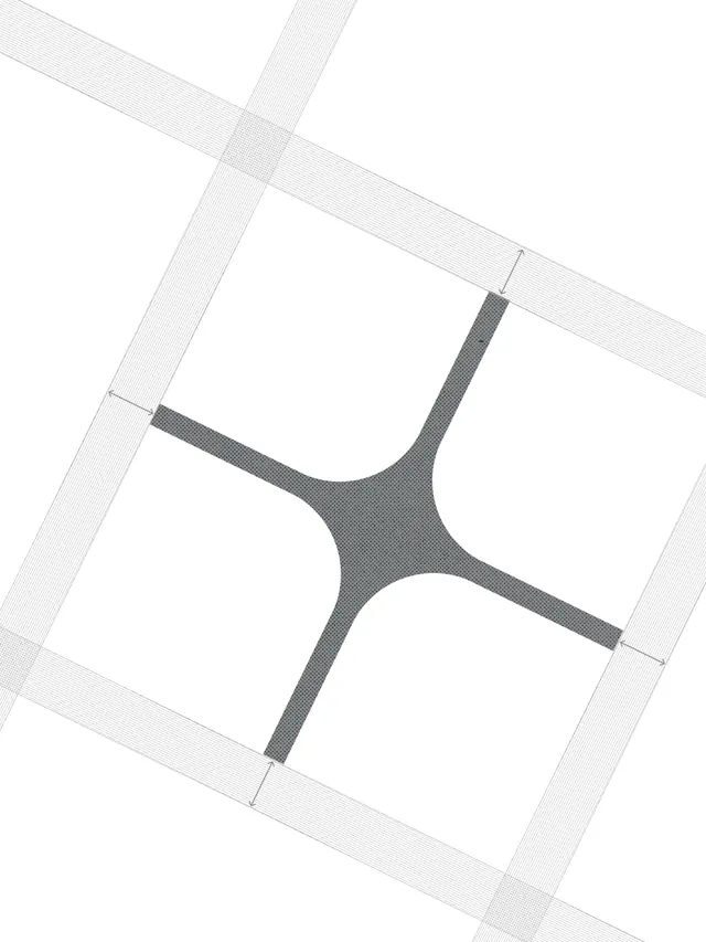
Slide 1: Motion graphic of the Soft Spell cross mark animating into form (video). Slide 2: Monochrome composition of a steel cross mark with flat "S" letterforms flanking the center, photographed against soft gray backdrop with directional lighting. Slide 3: Logo lockup and design grid; sans-serif "Soft Spell" with centered cross symbol on white background with construction guides. Slide 4: Product close-up (headphones or device detail) photographed in clean product shot with labeled parts, supporting "100+ products to market" claim. Slide 5: Engineering documentation aesthetic-cross-section diagrams, patent callouts, and parametric form studies annotated with technical copy ("form+function", "100+ products", "50+ patents"). Slide 6: Black and white composition of the mark alone against subtle textured ground. Slide 7: Parametric product studies showing form iterations and technical documentation in blueprint style. Slide 8: Product photography of a minimalist industrial object (coil or device) with "Rigorous Innovation" tagline. Slide 9: Technical blueprint showing design system relationships, product development phases, and engineering disciplines. Slide 10: Infographic synthesizing brand positioning: creativity, engineering, industrial design, product development, branding; circular flow emphasizing integration of disciplines.
Key takeaway
Credible brand identity grounded in demonstrable engineering rigor. The Swiss-grid foundation and monochromatic palette lend trust and discipline. Showing parametric iterations and patent counts validates the "form+function" philosophy rather than just stating it.
Reuse notes
Excellent template for hardware or product-engineering brands positioning on innovation and manufacturability. Works for B2B or industrial audiences that value precision documentation. The ten-slide format sustains narrative across multiple conceptual layers. Can feel intimidating if overused-best for brands with genuine technical depth to back up the visual severity. Pair with clear copy about the specific innovations.
From this post: The Offsite's Soft Spell brand identity system
View post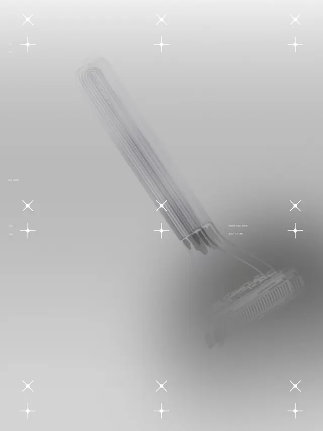
More like this

Keep what you find
A free account saves references to boards and can send you a weekly email of picks based on what you save.
To see every result, go Pro.