Preview image. Unlock full-res
Comprehensive brand identity for Sansi House, a contemporary lifestyle brand reinterpreting Peranakan culture through thoughtfully crafted home decor objects.

Summary
Studio Woork's complete brand identity system for Sansi House, a contemporary home decor brand that bridges centuries of Peranakan cultural heritage with modern minimalist design. The system spans logo, typography, packaging, stationery, and branded environments.
Visual description
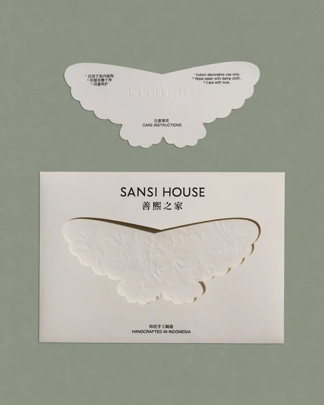
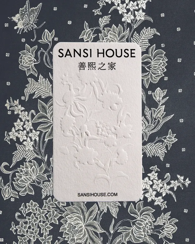
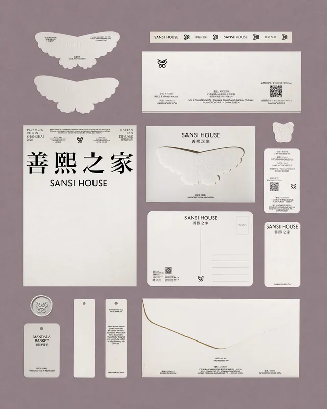
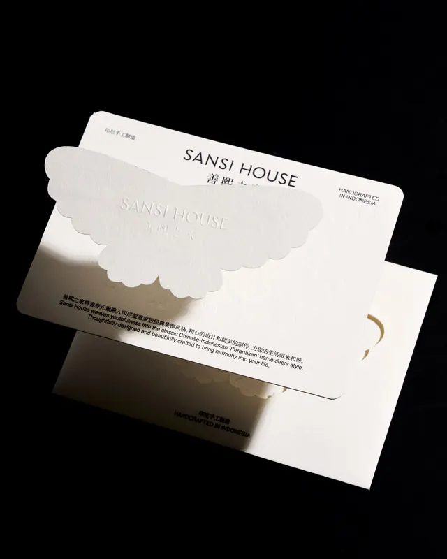
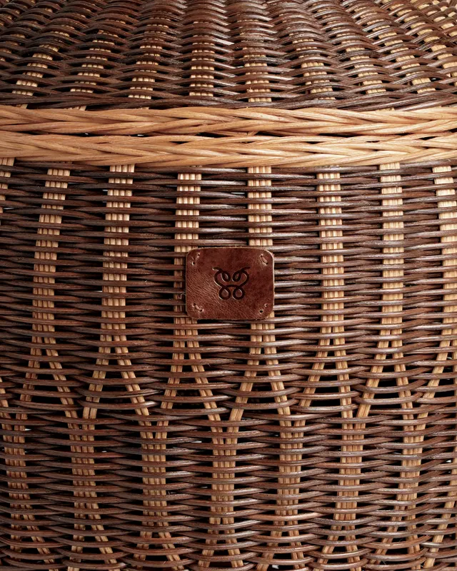
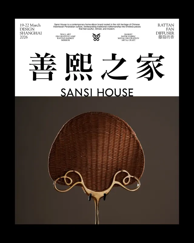
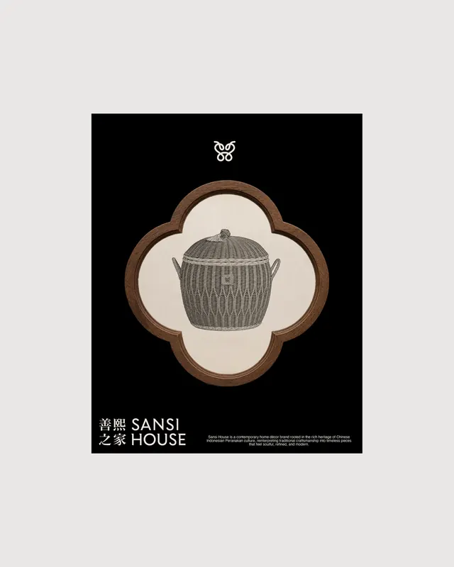
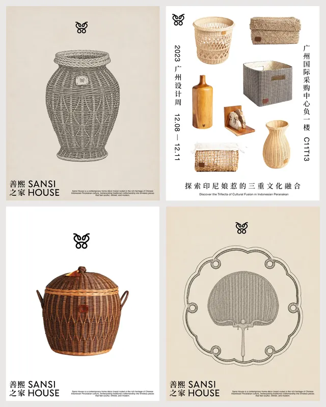
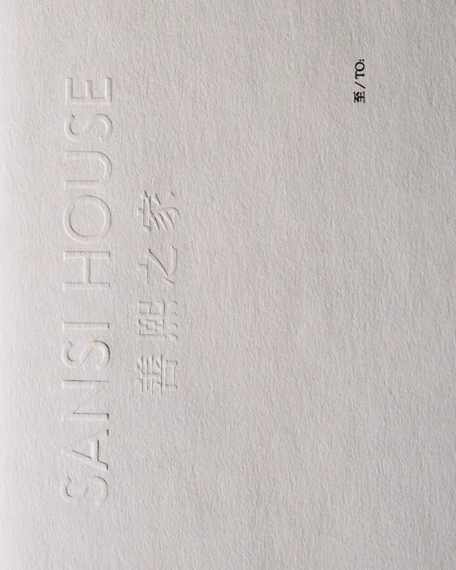
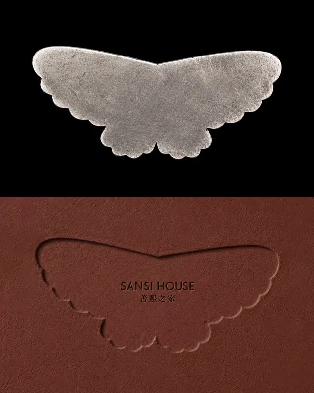
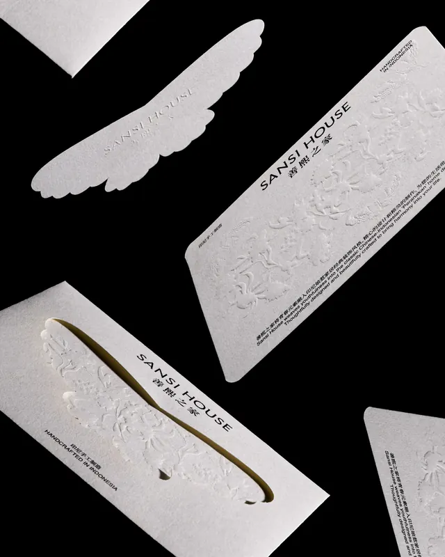
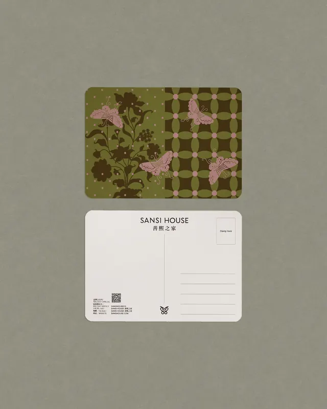
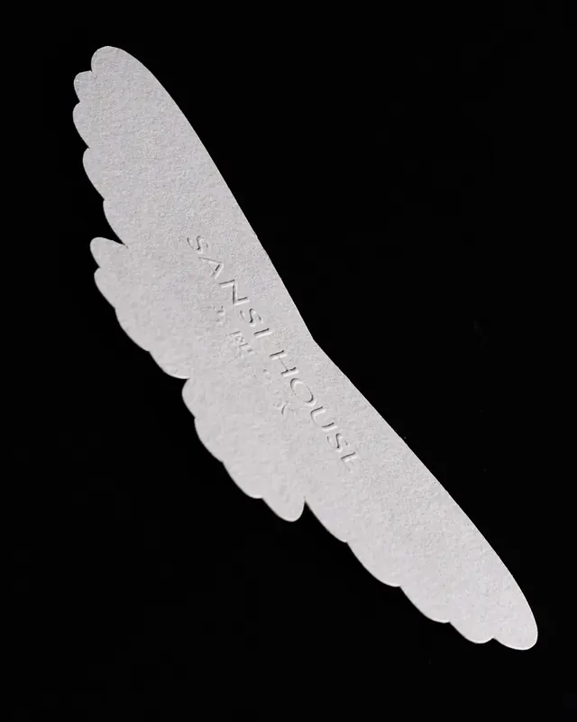
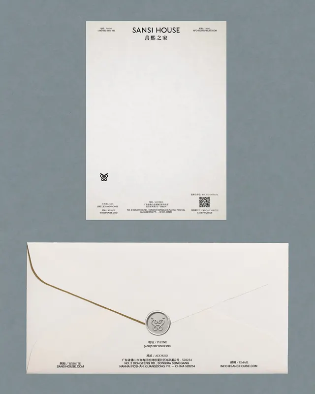
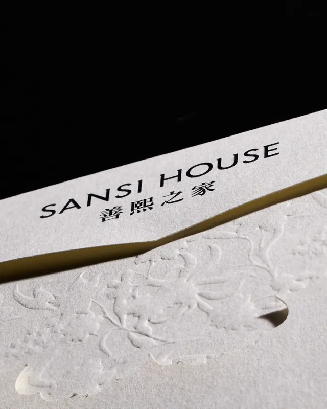
A curated brand book showing a cohesive visual language built around a sculptural butterfly or wing motif with textured detail lines-the primary mark in varied applications. The identity uses a restrained palette of warm whites, soft sage greens, terracotta, and muted browns paired with serif and sans-serif type mixing. Signature details include embossed botanical patterns, hand-woven baskets with branded stamps, die-cut envelope flaps shaped like the wing motif, postcards overlaid on deep indigo florals, and a branded lookbook cover featuring a dragon illustration against a warm mustard backdrop. Stationery is printed on cream stock with embossed logos; letterhead, business cards, and tags maintain the wing shape. Each piece is marked "Handcrafted in Indonesia." A campaign layout shows the full system applied to signage, environmental graphics, and product presentation.
Key takeaway
The restraint of the visual system-a single sculptural motif refined across every application, paired with generous white space and warm earth tones-creates a premium, cohesive identity that honors heritage craft while feeling contemporary. The embossed textures and hand-finished materials (woven baskets, thick paper stocks, die-cut shapes) reinforce the handmade quality central to the brand promise.
Reuse notes
Strong reference for brands attempting to bridge cultural heritage and modern living. The butterfly/wing motif becomes an invisible mark system-it is structural (envelope flaps, care cards, tags) rather than merely decorative, which makes the identity feel integrated rather than applied. The serif/sans mixing and botanical pattern references work well for lifestyle, home, and culturally-rooted brands. The embossed detail and material choices elevate a modest palette to premium perception. Best for thoughtfully craft-forward or heritage-conscious brands; the complexity of the system is justified when every product genuinely requires care instructions and origin stories.
From this post: Sansi House brand identity by Studio Woork
View post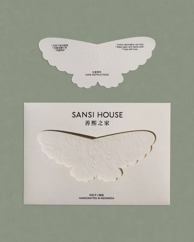
More like this
Keep what you find
A free account saves references to boards and can send you a weekly email of picks based on what you save.
To see every result, go Pro.