
Preview image. Unlock full-res
Comprehensive brand identity for Menkind healthcare by Analogue Design Agency, featuring 3D product renders, tone-of-voice applications, and color guidelines.

Summary
A comprehensive brand identity system for Menkind, an online healthcare service targeting men's health topics. The system combines clean geometric forms with photographic imagery and a restrained neutral palette anchored by light blue.
Visual description
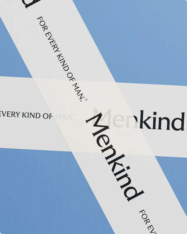
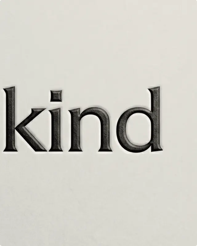
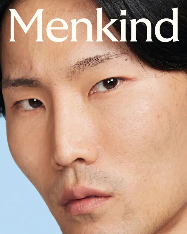
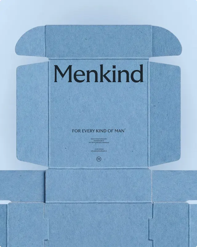
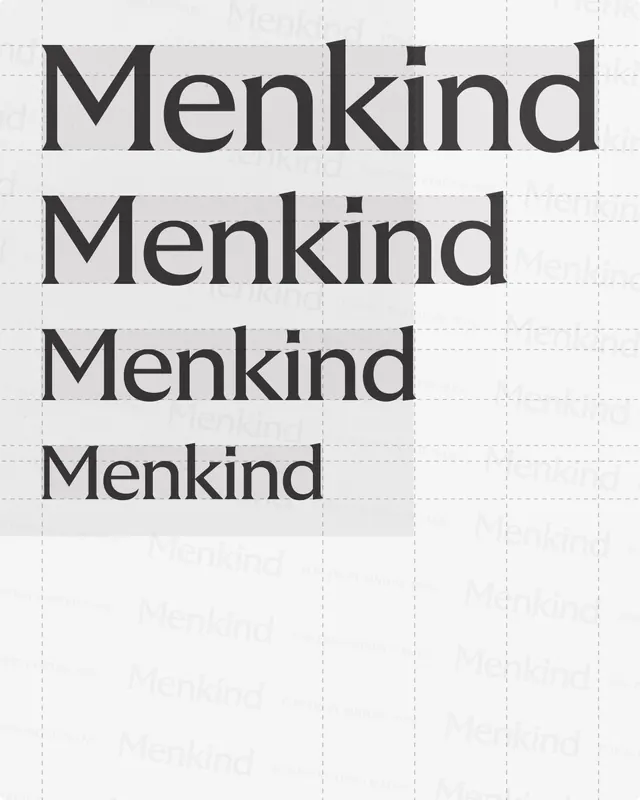
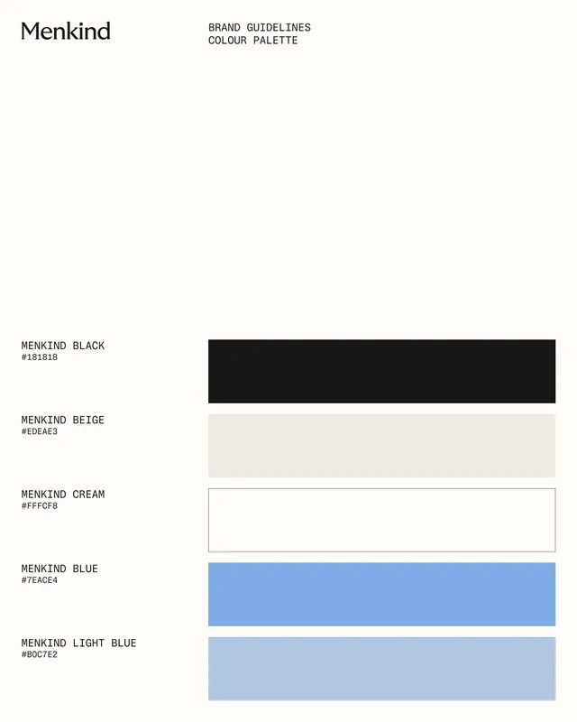
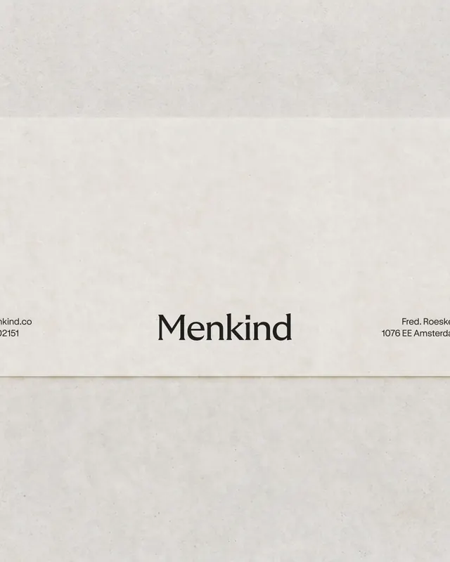
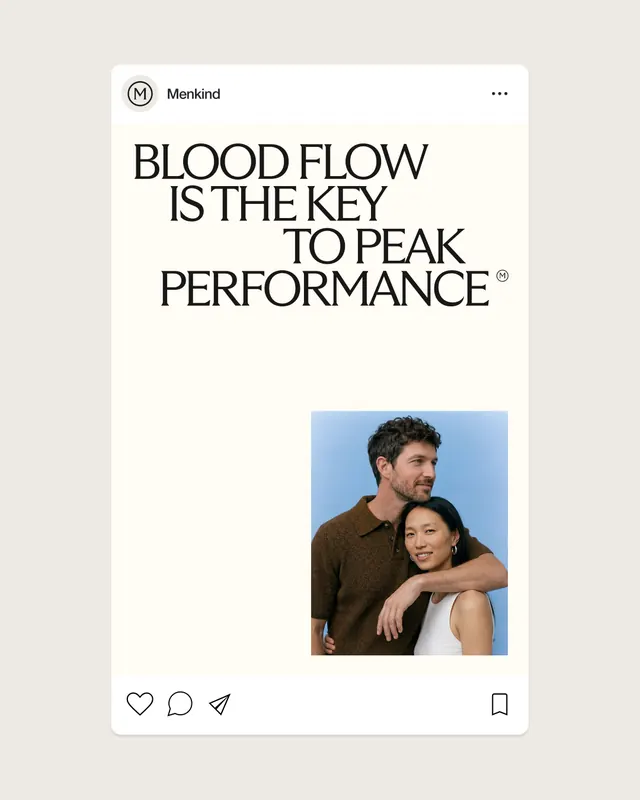
The carousel opens with stacked 3D rendered pharmaceutical objects against a light blue background-a cream capsule, white tablet with embossed logo, translucent blue disc, and burnt-orange sphere-establishing a product language. Slides 2–3 show video motion (posters visible). Slides 4–6 layer the Menkind wordmark diagonally across split compositions pairing cream/off-white with the blue, emphasizing the "for every kind of man" tagline in thin sans-serif. Slide 7 shows a model portrait with bold white logotype overlay. Slide 8 echoes the diagonal treatment as a typographic pattern. Slide 9 presents packaging/collateral stacked and photographed. Slide 10 returns to repetitive wordmark texture. Slide 11 is a clean brand-guidelines page documenting the official color palette: black (#181818), beige (#EDEAE3), cream (#FFFCF8), brand blue (#7EACE4), and light blue (#B0C7E2). Slides 12–14 show contextual applications on photography and editorial materials.
Key takeaway
The diagonal stripe device (wordmark layered at 45° across color blocks) is the primary visual organizing principle, creating dynamic tension against the otherwise minimal, grid-based typography. The restrained healthcare palette-warm neutrals and a soft blue-conveys trust and calm rather than clinical coldness, humanizing sensitive health topics through considered color and form.
Reuse notes
Strong model for healthcare or wellness brand systems balancing professionalism with approachability. The 3D product-still opening is particularly effective for establishing a tangible, pharmaceutical legitimacy. Use when the brand needs to feel both authoritative and accessible. The color palette translates well to UI and digital contexts. The diagonal-stripe device is memorable and reusable across collateral without being overwrought.
From this post: Menkind brand identity system
View post


More like this

Keep what you find
A free account saves references to boards and can send you a weekly email of picks based on what you save.
To see every result, go Pro.