Preview image. Unlock full-res
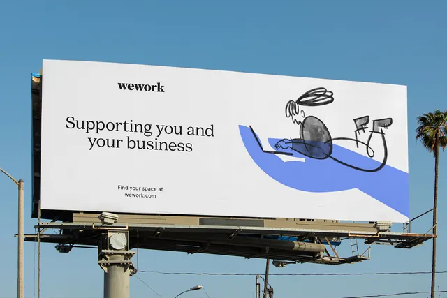
A WeWork outdoor billboard pairing a clean serif wordmark and headline with a loose scribbled figure-on-laptop illustration over a blue brushstroke.
Summary
A real-world photo of a WeWork billboard, where a crisp serif headline and wordmark are offset by a deliberately scribbly black-and-blue line illustration of a person working on a laptop.
Visual description
The image is a photograph of a large white billboard mounted on a steel structure against a clear blue sky with a palm tree at the right edge. On the white field the lowercase "wework" wordmark sits in a small bold serif at top, with the headline "Supporting you and your business" set large below it in the same serif. A small "Find your space at wework.com" line anchors the lower left. The right half holds a loose, hand-drawn illustration: a seated figure rendered in quick black scribbles tapping a laptop, resting on a single confident blue brushstroke shape that grounds the scene. The contrast between the polished typography and the casual sketch is the whole point.
Key takeaway
Setting a refined, serious serif against a deliberately rough, gestural illustration so a corporate brand reads as human and approachable. Using one flat blue brushstroke as the only color, doing double duty as ground plane and brand accent against an otherwise black-and-white composition.
Reuse notes
A good reference for B2B or workspace brands that want warmth without losing credibility, and for presenting identity work in a real out-of-home context rather than flat artwork. The casual illustration only works because the type around it is disciplined, keep that tension. Photographed mockups like this sell a system far better than the artboard alone.
More like this


Keep what you find
A free account saves references to boards and can send you a weekly email of picks based on what you save.
To see every result, go Pro.