Preview image. Unlock full-res
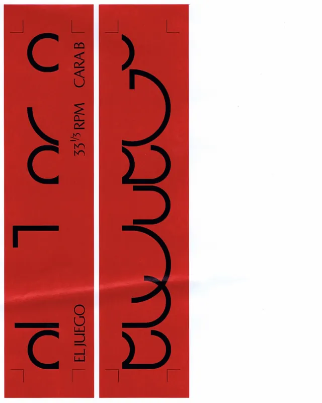
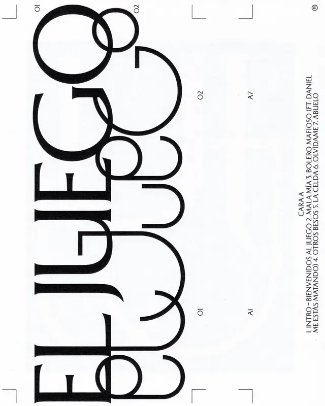
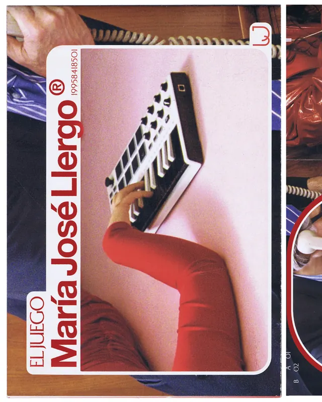
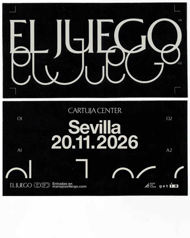
Comprehensive graphic identity system for María José Llergo's album featuring a formal typography layer and a custom lettering system that visually deconstructs the rigid grid.

Summary
A multi-layered graphic identity system for an album that juxtaposes formal, rigid typography with an expressive custom lettering system that progressively breaks down visual rules.
Visual description
The carousel presents a comprehensive identity built on two visual layers. The formal layer uses structured geometric forms-a deconstructed "ELJUEGO" typogram made of perfect circles and circular segments (slide 1), clean sans-serif uppercase lettering, and rigid symmetry. The second layer introduces a custom "El Juego" script that contradicts the grid-organic curves, broken strokes, and asymmetric forms that feel handmade yet precise. The posters combine these layers with photography (a woman in red vinyl, hands holding ties), concert venue listings, and album track listings. Color is minimal: black, white, and warm wood tones dominate. The identity scales across posters, album covers, tickets, and social applications.
Key takeaway
The core design move is the controlled tension between rigid and expressive-formal typography constrains the eye while the custom letterform releases it. This duality mirrors the album's conceptual theme of breaking free from constraint. The system demonstrates how a lettering invention can anchor an entire identity and evolve across applications.
Reuse notes
Ideal for music, arts, or cultural projects that need to express both structure and creative freedom. The two-layer system works for any brief requiring visual duality. The poster layouts are particularly strong for event promotion and venue listings. Works best when the custom lettering feels intentional as a contrast, not an accident.
From this post: El Juego album identity system
View post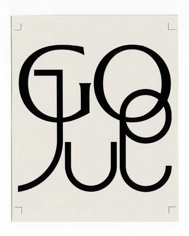




More like this


Keep what you find
A free account saves references to boards and can send you a weekly email of picks based on what you save.
To see every result, go Pro.